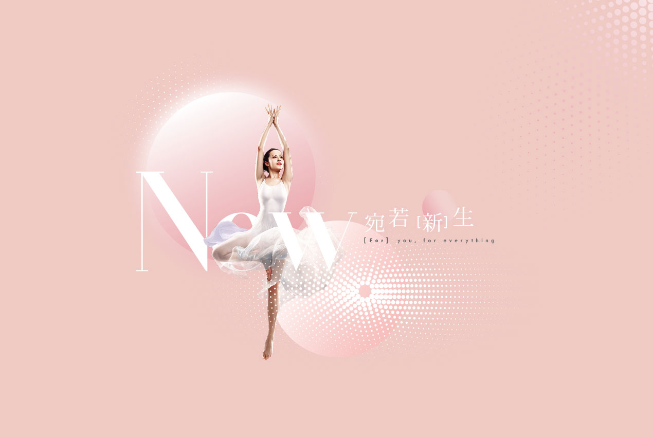
For·Diurnal science and technology beauty treatment center
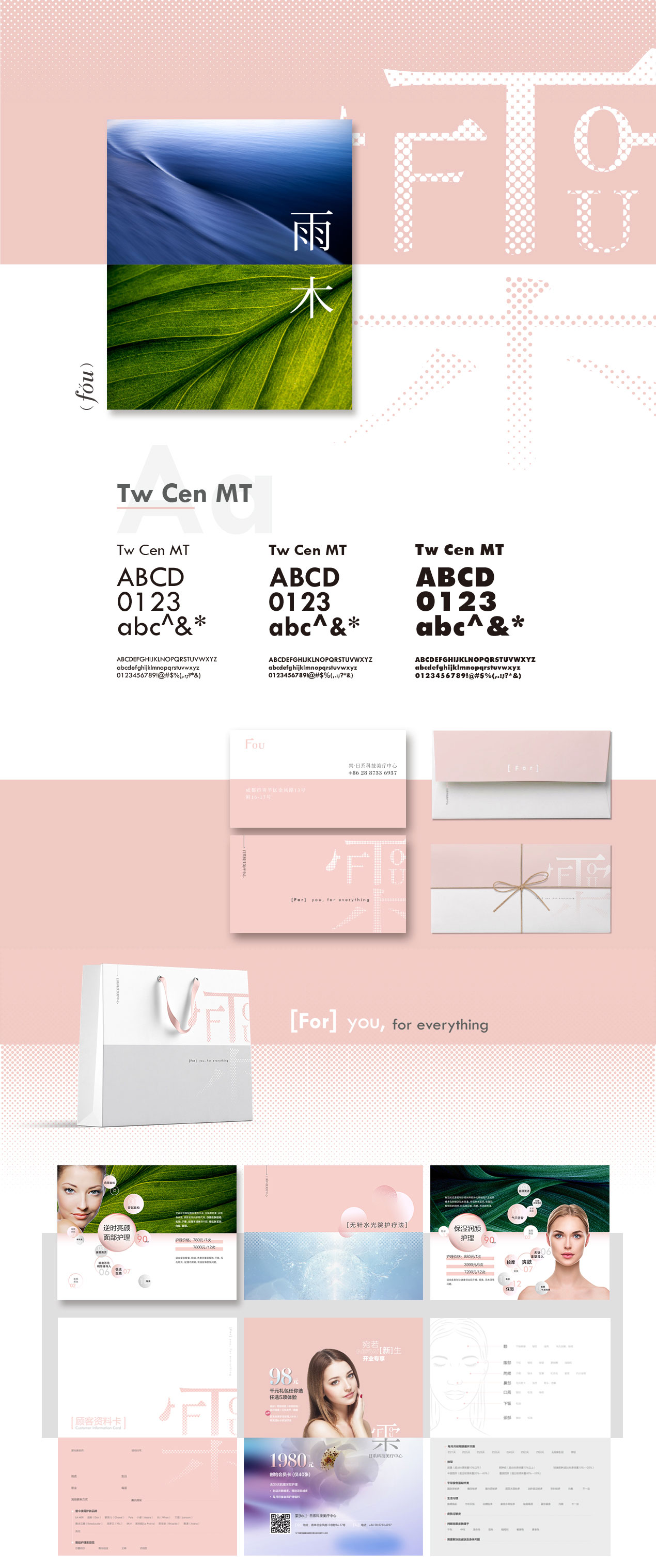
Upgrading the aesthetic involves building a bright, distinct branding image which reflects the core values of the company within its publishing materials and environment design. The character ‘雬’ (fǒu) within the branding combines both the character ‘雨’ (yǔ), meaning rain, and ‘木’ (mù) meaning wood which emphasize the impact of nature within the brand. The effect of above and below is mimicked within the promotional materials using a dual tone on each design.
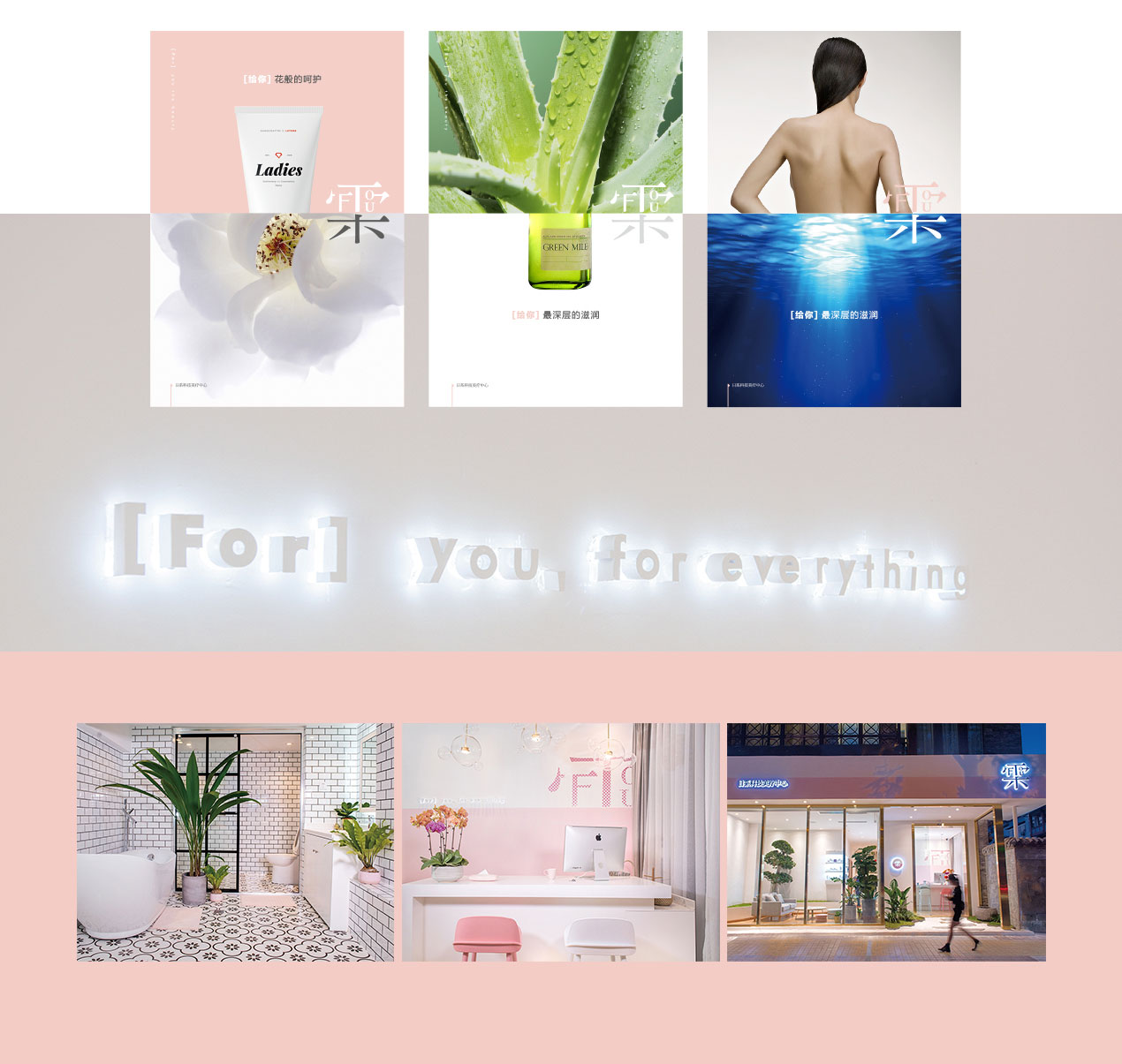
The designs blend of smooth pink tones highlight the concepts of producing a natural result of flawless skin, while the rich blues and green emphasize the importance of using natural ingredients within the company’s work. We selected a thick serif font for typography to express a clean, natural effect while also giving consumers a different sense of clarity.With its unique branding identity, For Diurnal Treatment Center’s environment design is also designed accordingly in line with its promotional materials.