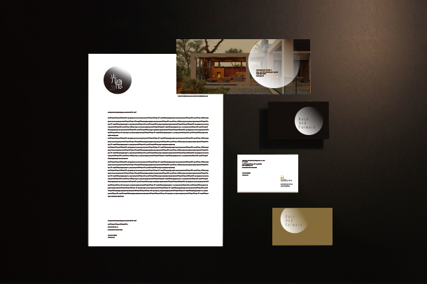
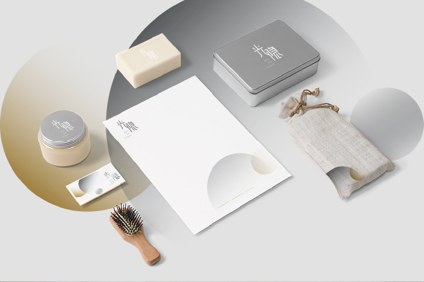
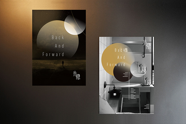
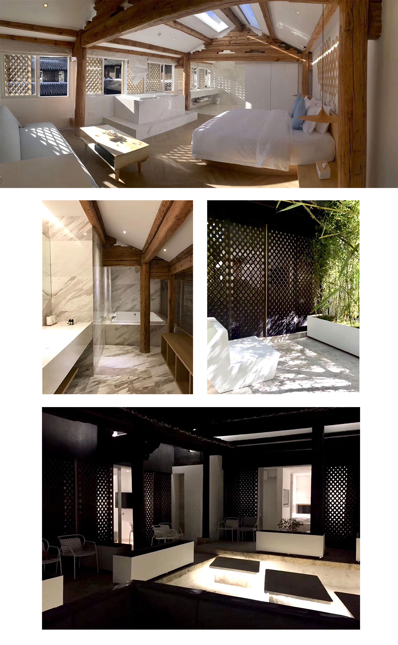
Guang Yin Architects Inn
Back And Forward Architect Inn updates the traditional elements of their hotel building from over 100 years ago with the class, elegance and comfort expected of the 21st century with a sleek and ethereal atmosphere to their branding.
read more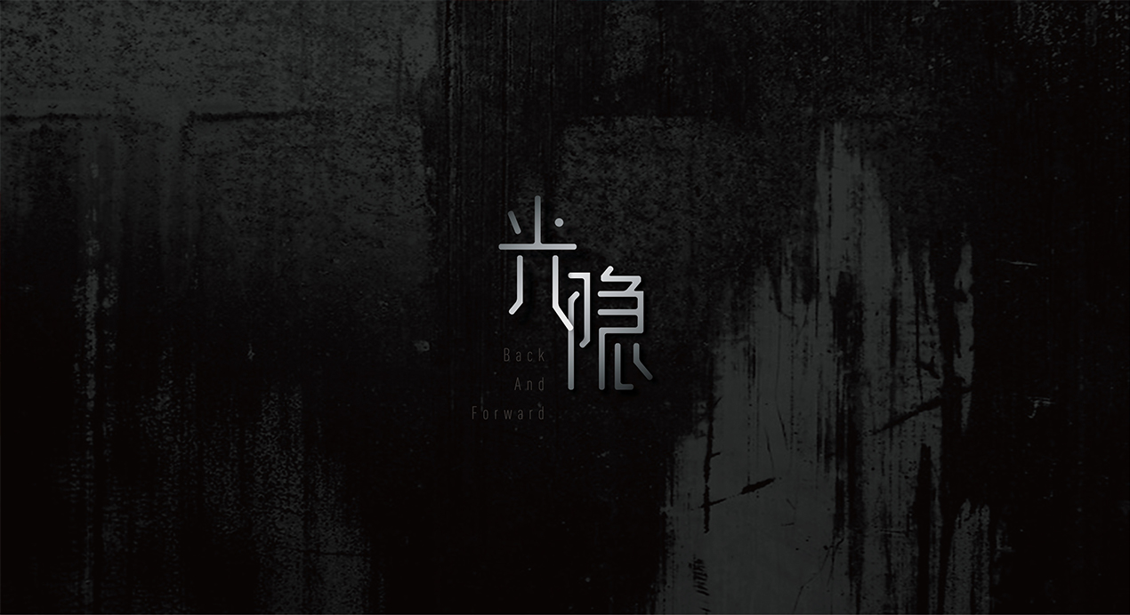
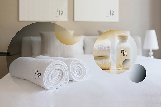
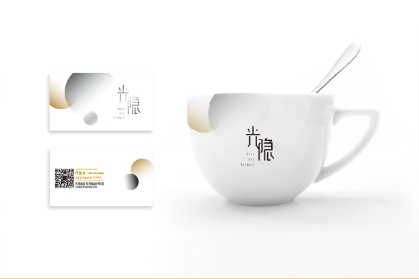
Upgrading the aesthetic involves creating bright branding imagery reflecting the serene and pleasant experience within a customer’s stay at the hotel.
The characters within the branding are ‘光’ (fǒu) meaning lights, and ‘隐’ (yǐn), meaning dark or to conceal, which has been further explored through the colours scheme and gradients used within the work. The effect of light and dark carries through from the brand planning to the final designs, representing the concept further with imagery of the moon and sun setting around each other.