-
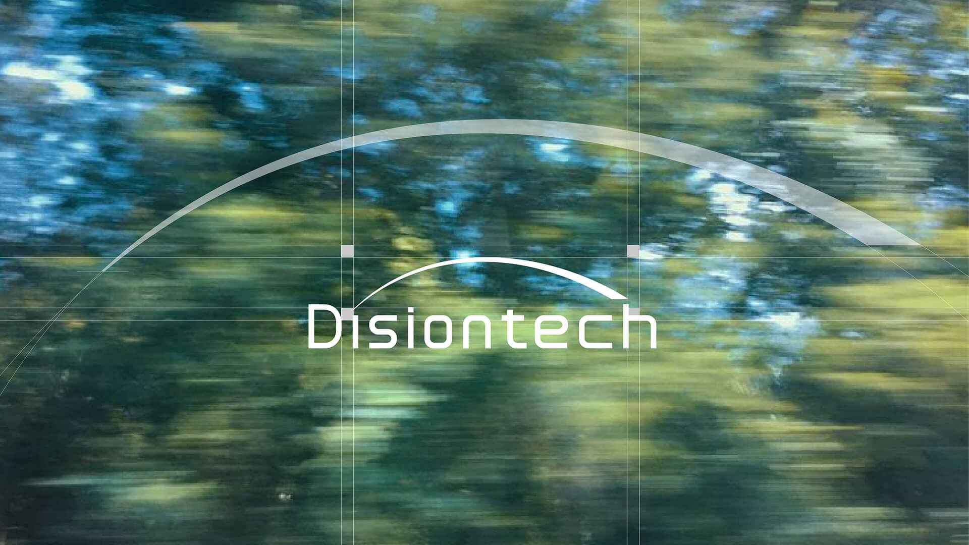
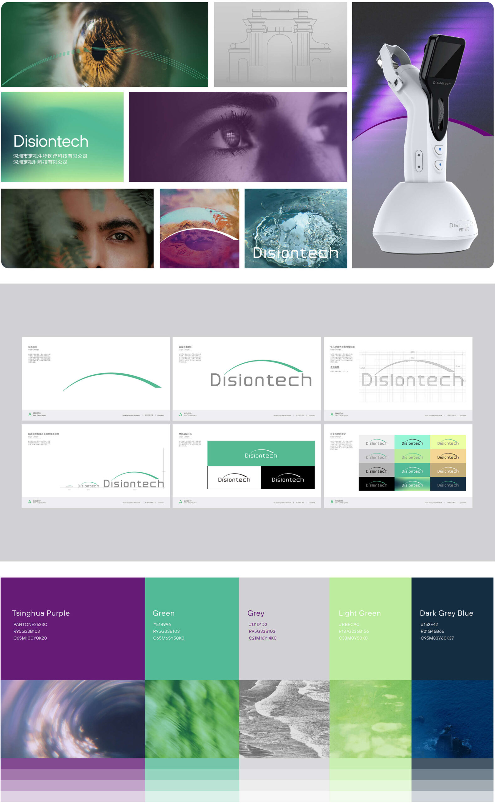
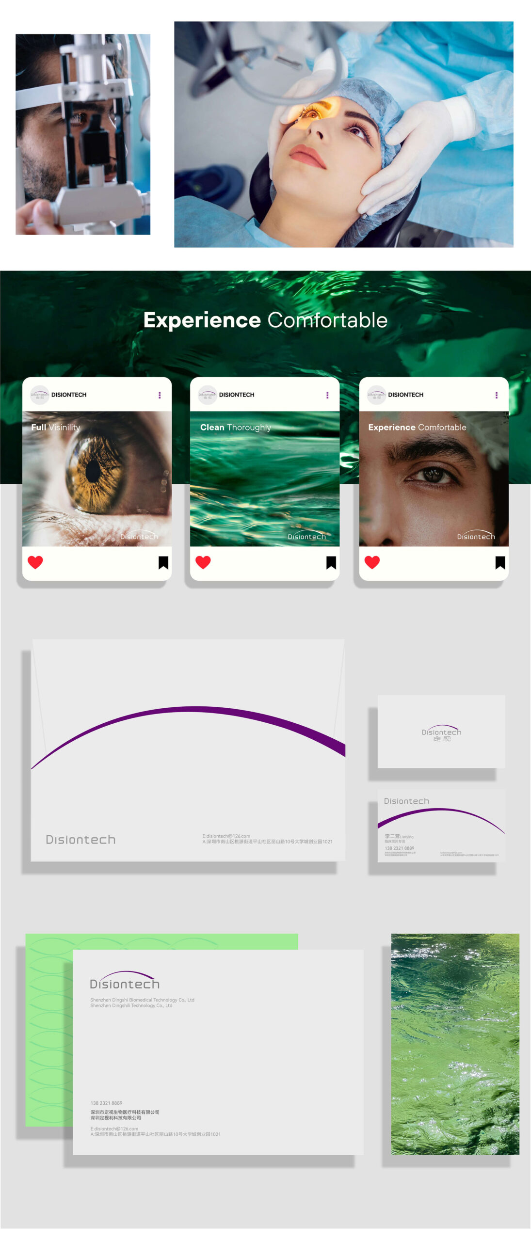
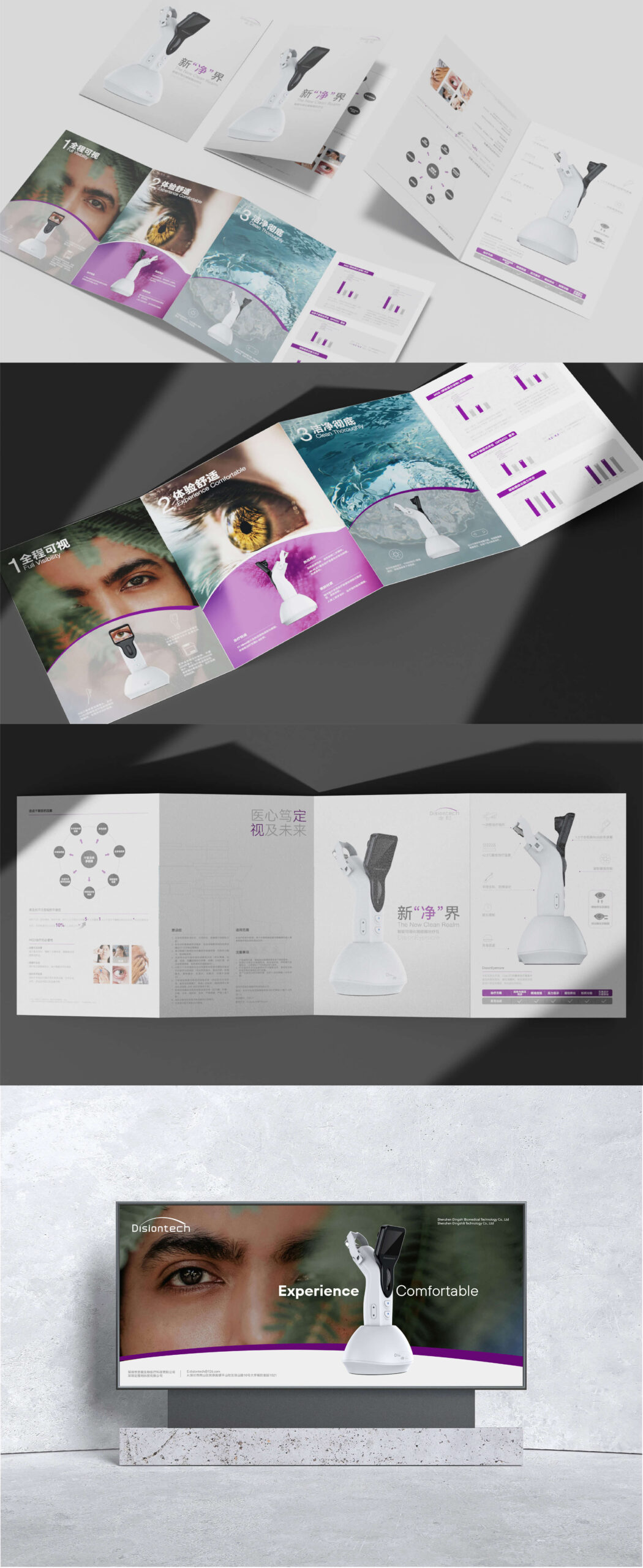
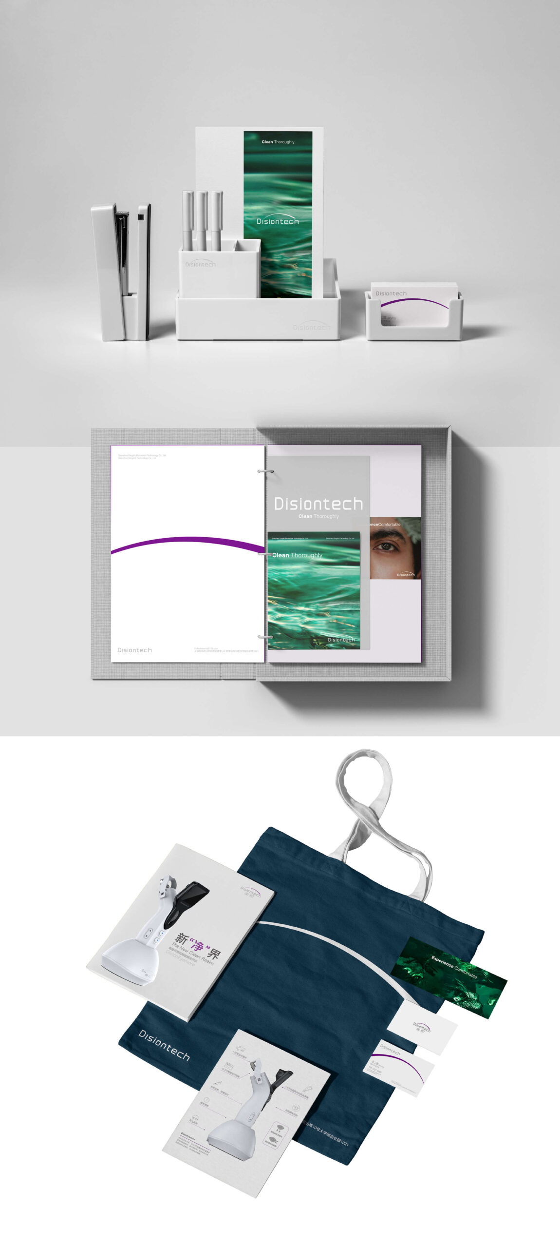
Shenzhen Disiontech Biomediacal
Shenzhen Disiontech Biomediacal 2024 Brand Identity Design/Brand Strategy
-
Chengdu No.7 High School
Chengdu No.7 High School 2025 Album Design
-
Shanghai SynBio Innovation Center
Shanghai SynBio Innovation Center 2024 BRANDING/WAYFINDING
-
Chengdu Art Museum
Chengdu Art Museum 2024 CREATIVE PRODUCTS
-
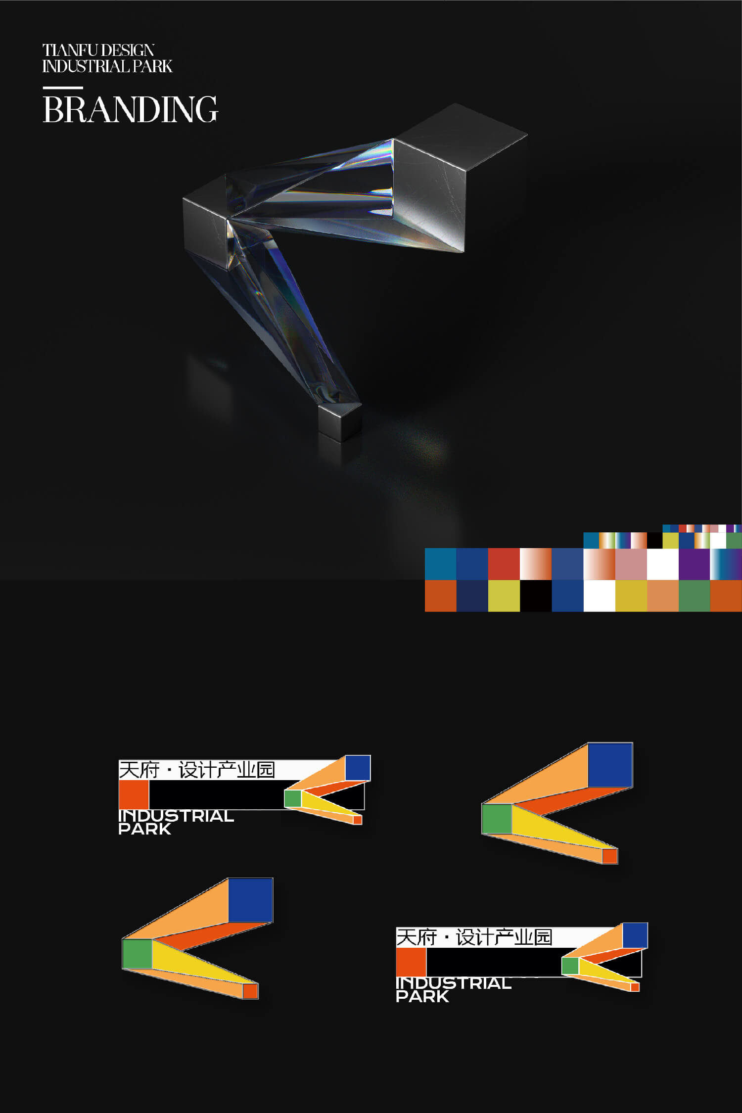
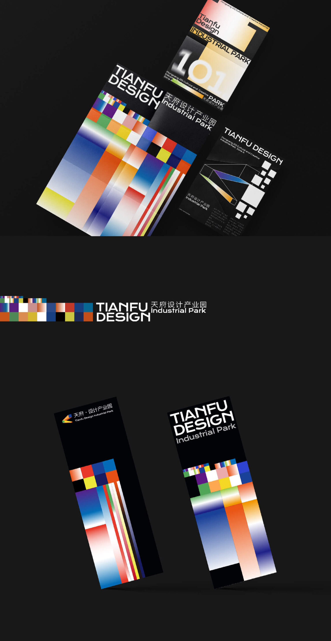
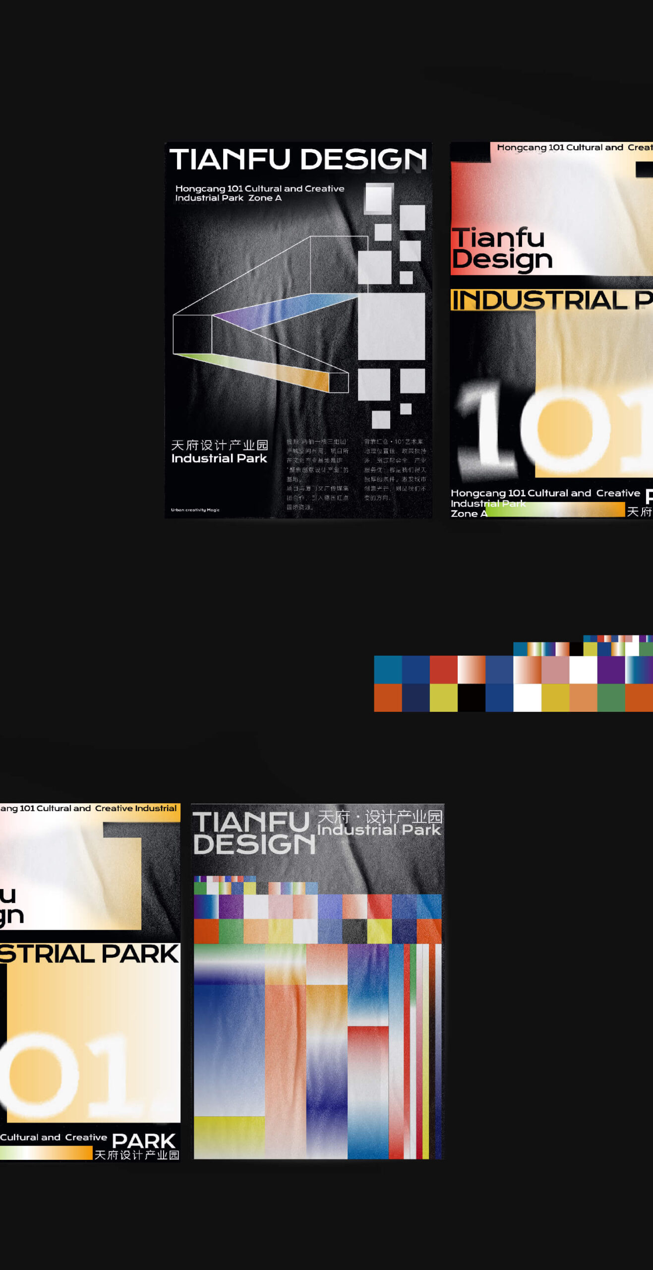
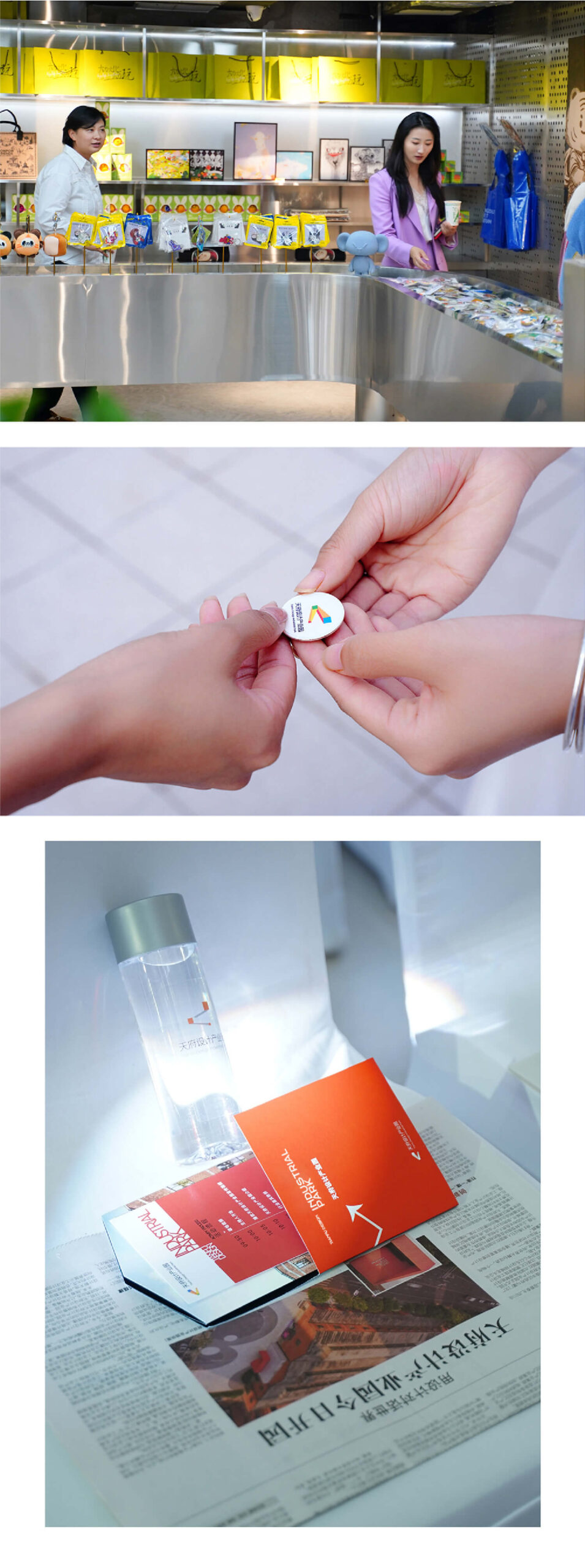
Tianfu Design Industrial Park
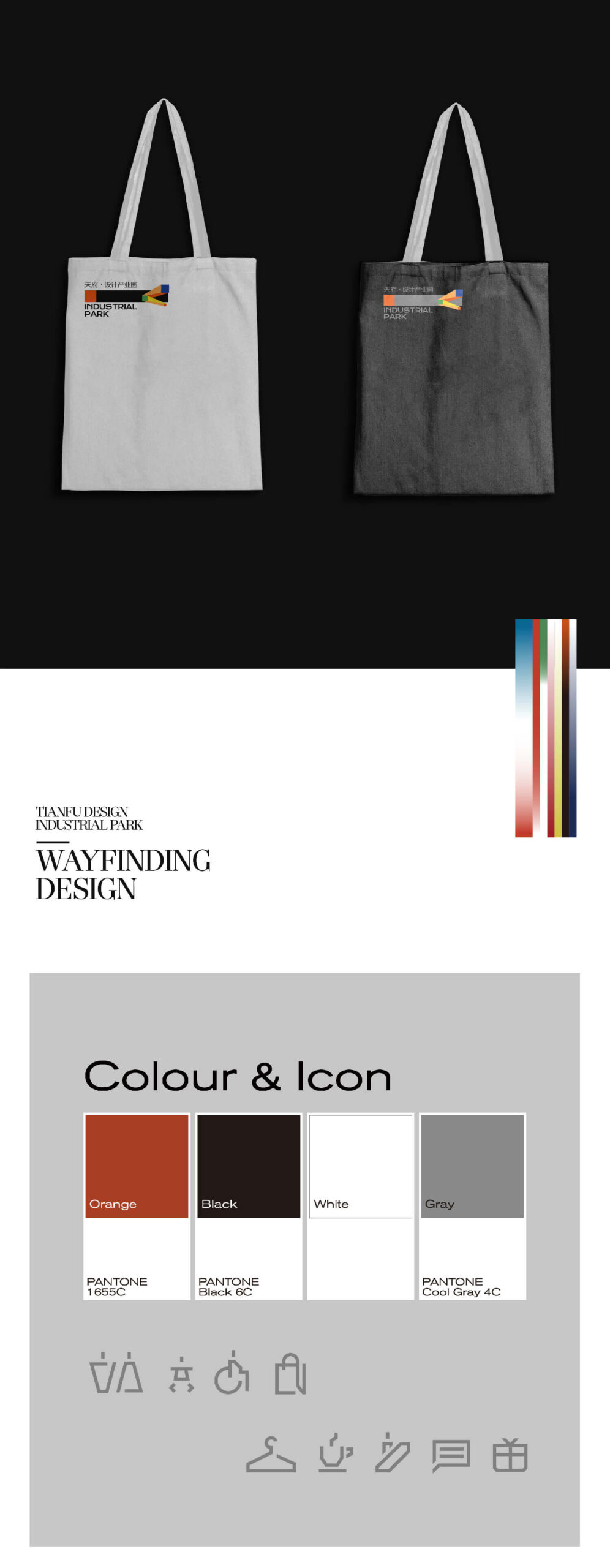
Tianfu Design Industrial Park 2023-2024 BRANDING/WAYFINDING
-
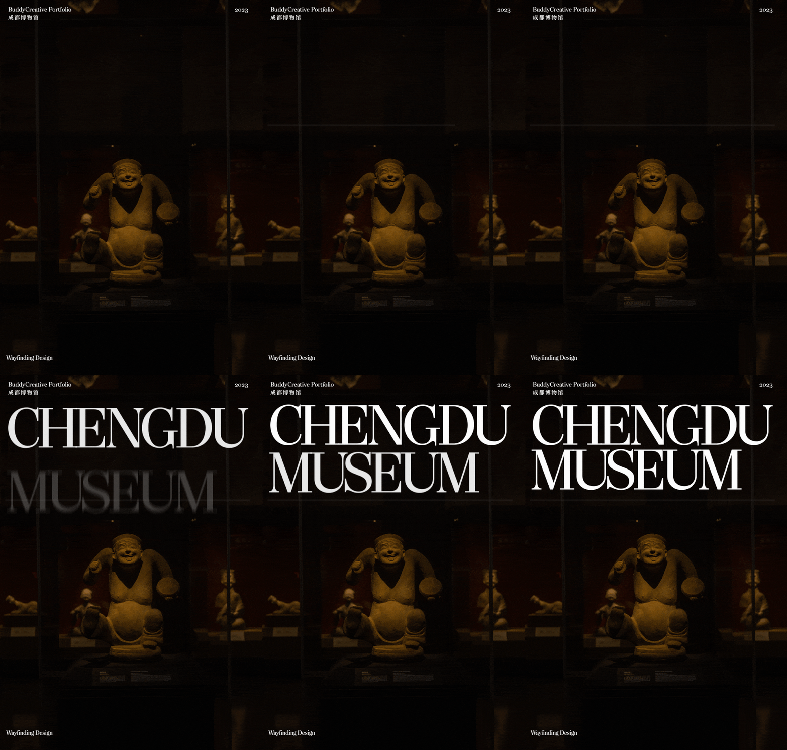
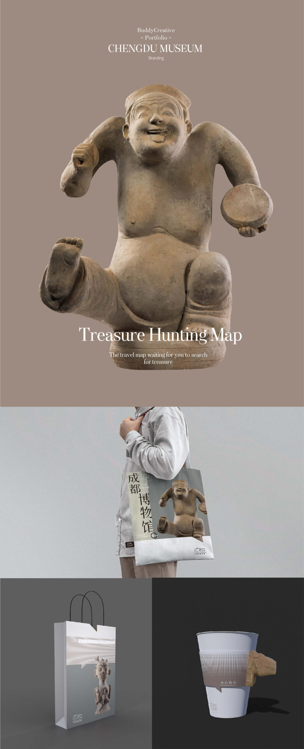
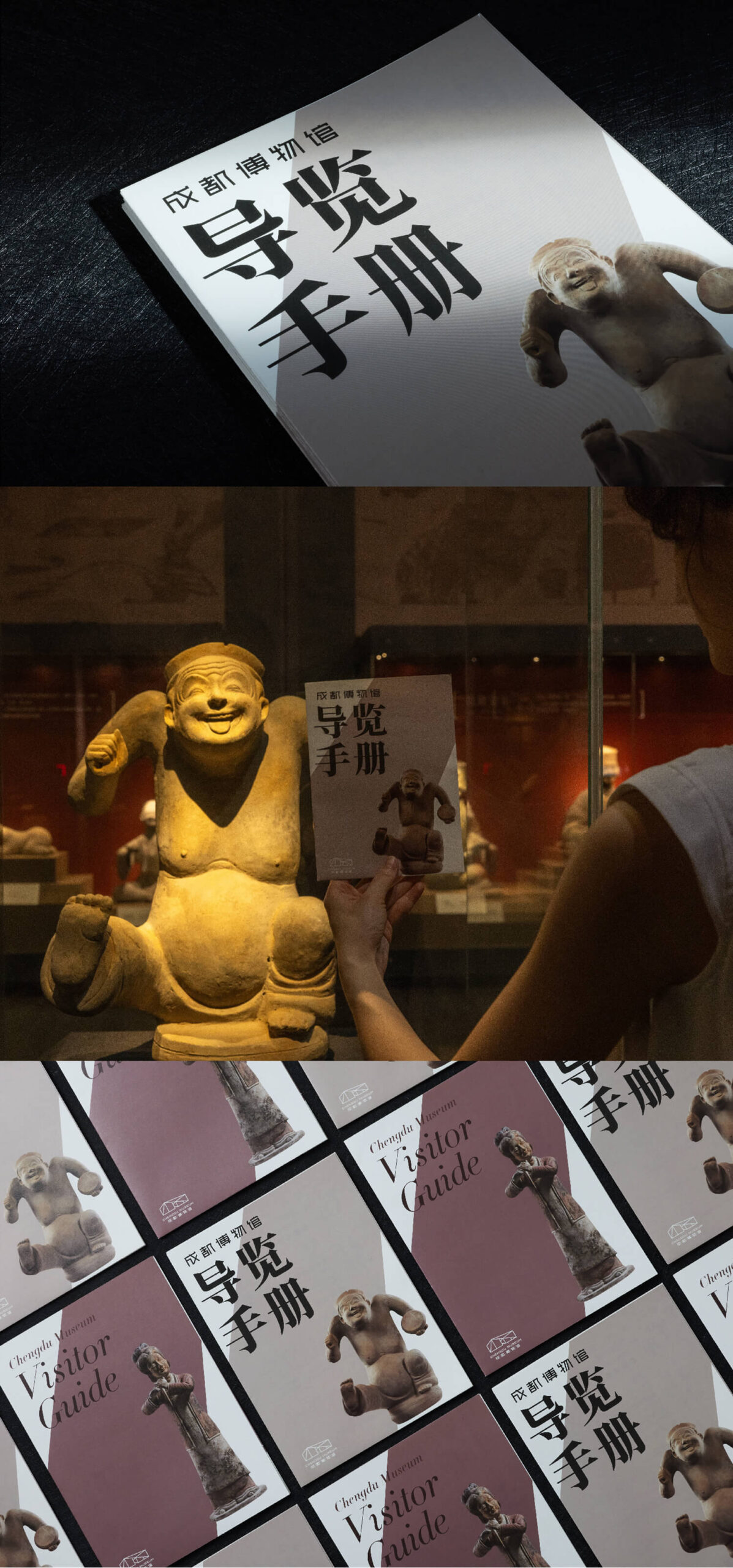
CHENGDU MUSEUM
CHENGDU MUSEUM 2021-2023 BRANDING/PROMOTIONAL MATERIAL/WAYFINDING
-
SANXINGDUI MUSEUM
SANXINGDUI MUSEUM 2023 BRANDING/WAYFINDING
-
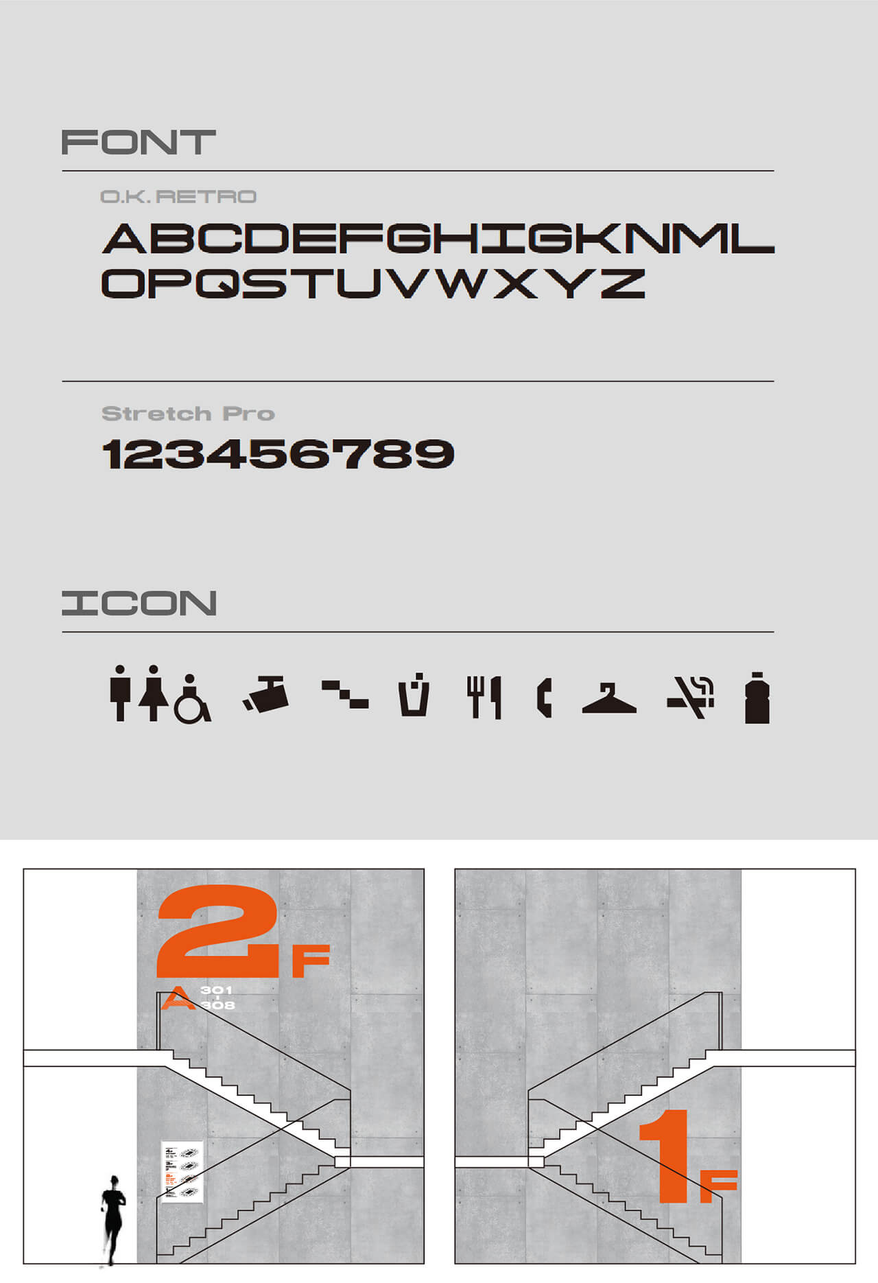
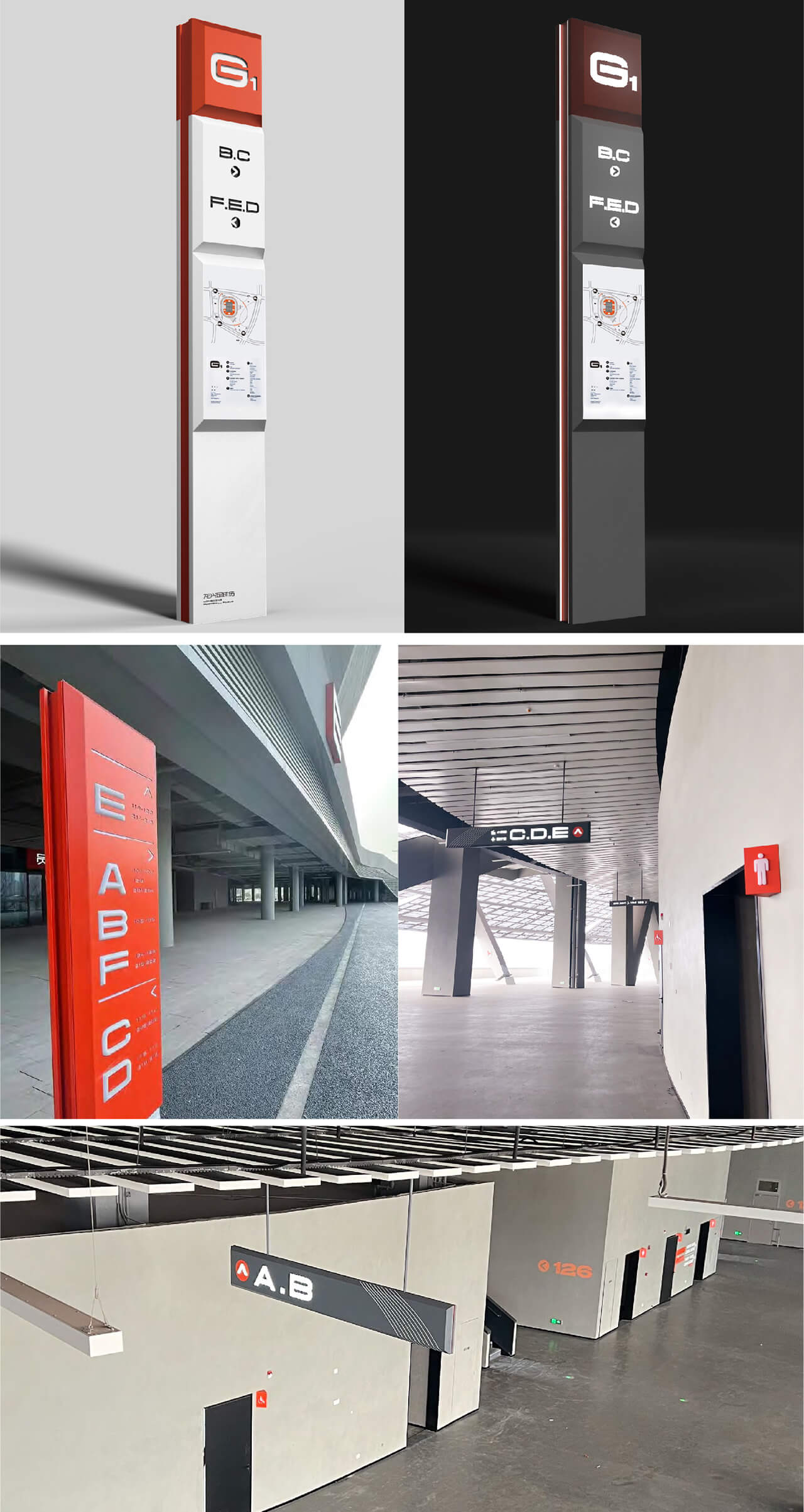
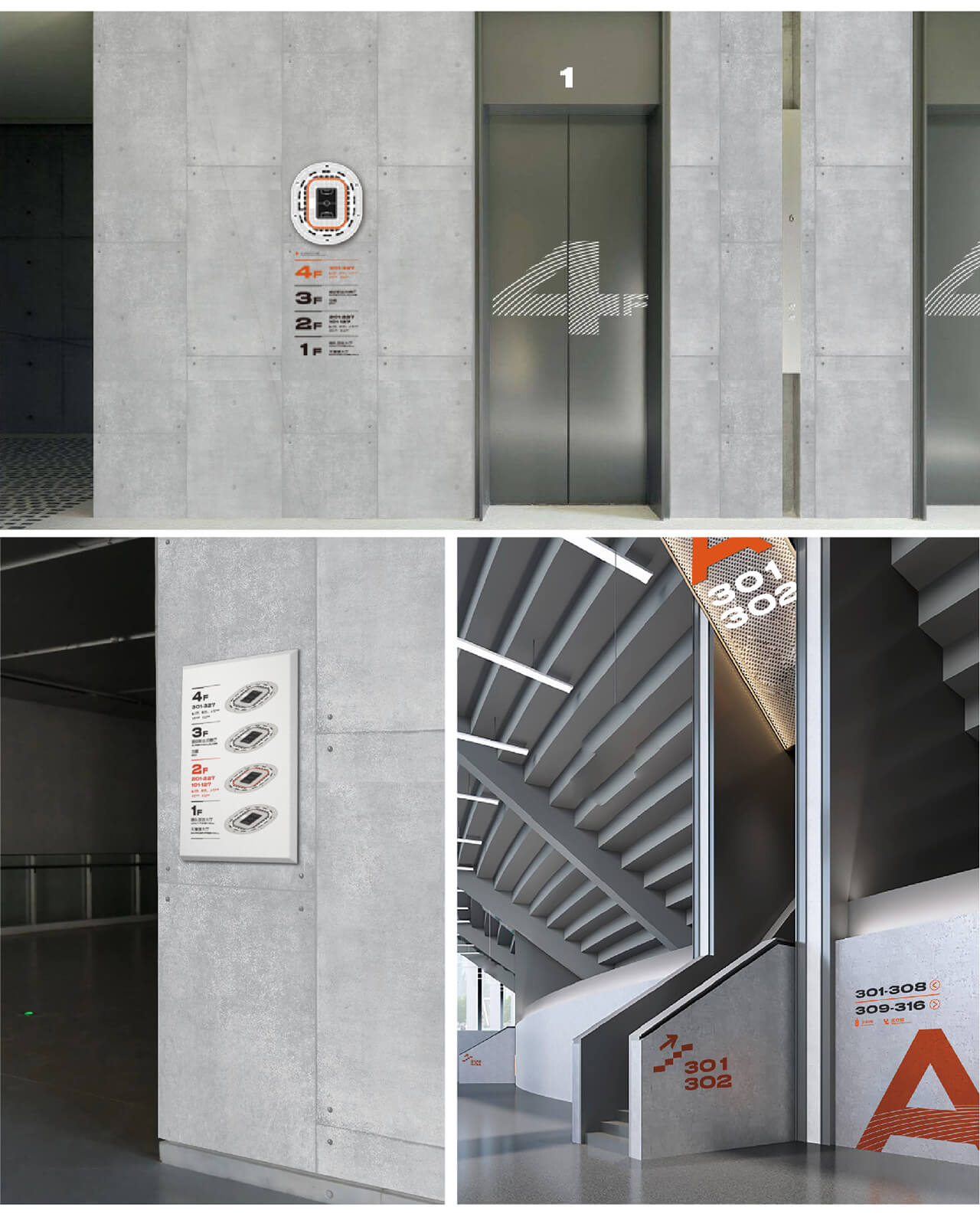
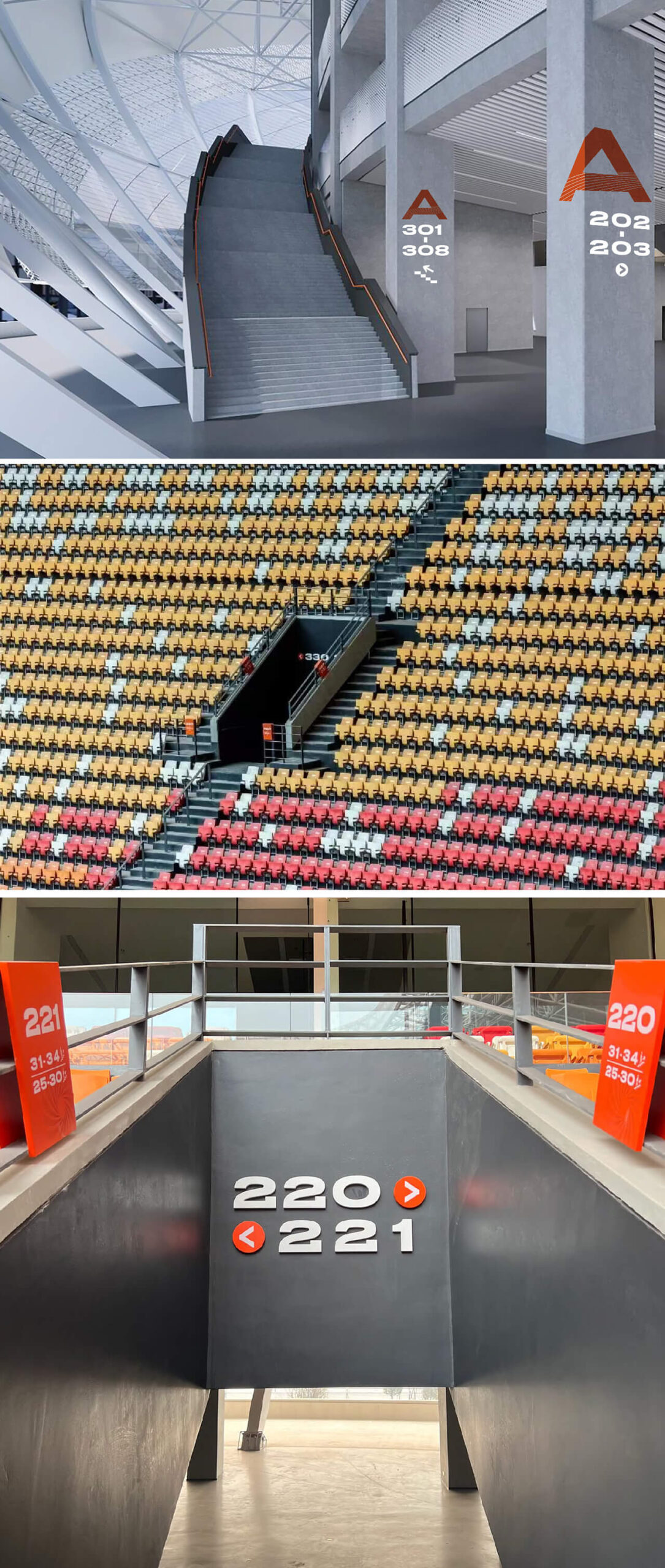
Chongqing Longxing Football Stadium
Chongqing Longxing Football Stadium 2023 WAYFINDING
-
Yong’an Urban Lake Forest Park
Yong’an Urban Lake Forest Park 2020-2021 BRANDING/CREATIVE PRODUCTS/WAYFINDING
-
bio-town chengdu
bio-town chengdu 2019-2024 BRANDING/WAYFINDING
-
Jingze Biological
Jingze Biological 2021 BRANDING
-
SCAINIM TECHNOLOGY
SCAINIM TECHNOLOGY 2021 BRANDING/WAYFINDING
-
SYI TSING ENERGY TECH
SYI TSING ENERGY TECH 2022 BRANDING/Environmental Design/WAYFINDING
-
ligne roset
ligne roset 2018-2024 BRANDING
-
mais
mais 2019 BRANDING/RETAIL STORE
-
TIANFU NO.7 HIGH SCHOOL
TIANFU NO.7 HIGH SCHOOL 2021 BRANDING/CREATIVE PRODUCTS/WAYFINDING
-
Chengdu Natural History Museum
Chengdu Natural History Museum 2022 WAYFINDING
-
wwf
wwf 2023 PROMOTIONAL MATERIAL
-
WEST CHINA STOMATOLOGICAL HOSPITAL
WEST CHINA STOMATOLOGICAL HOSPITAL 2020-2021 RE-BRANDING/WAYFINDING
Chengdu No.7 High School
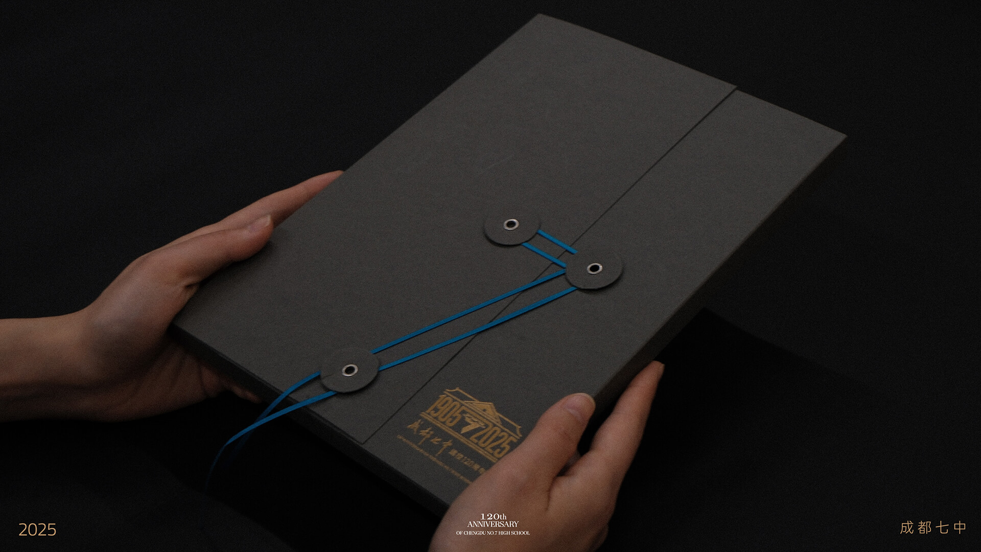
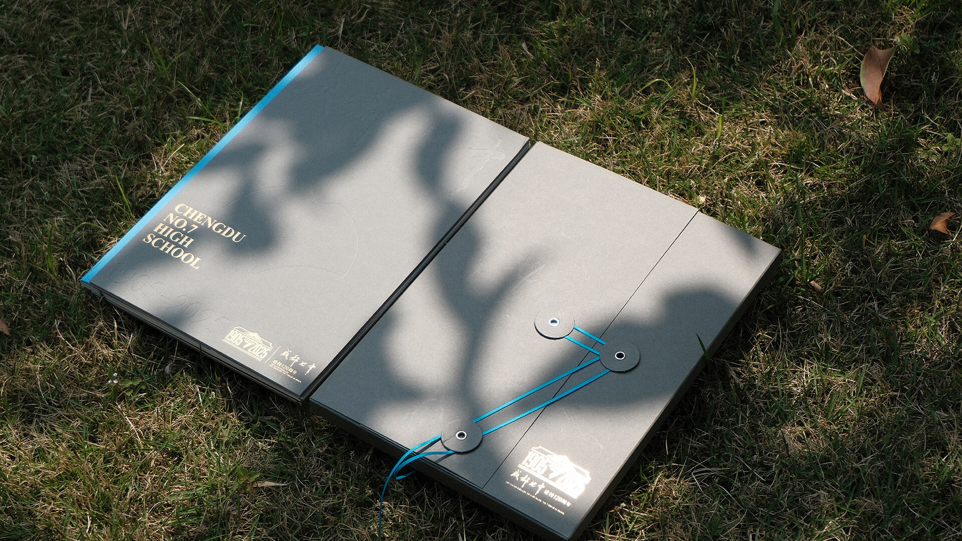
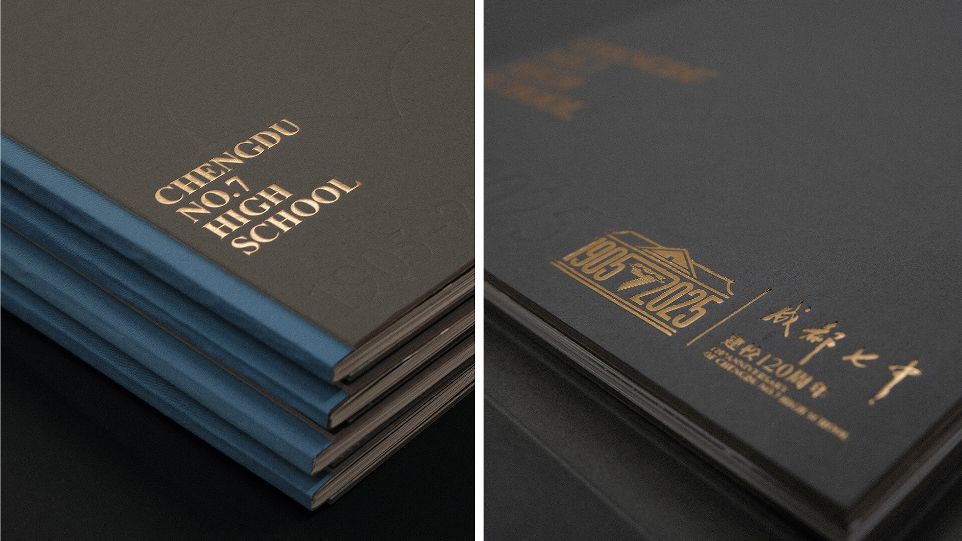
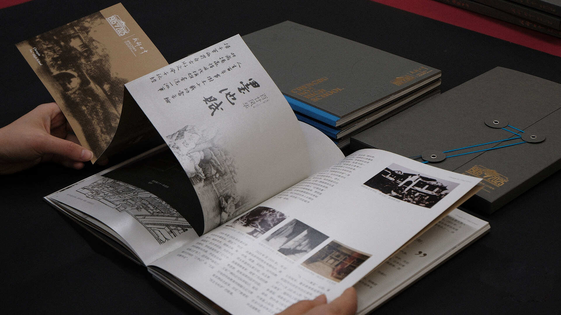
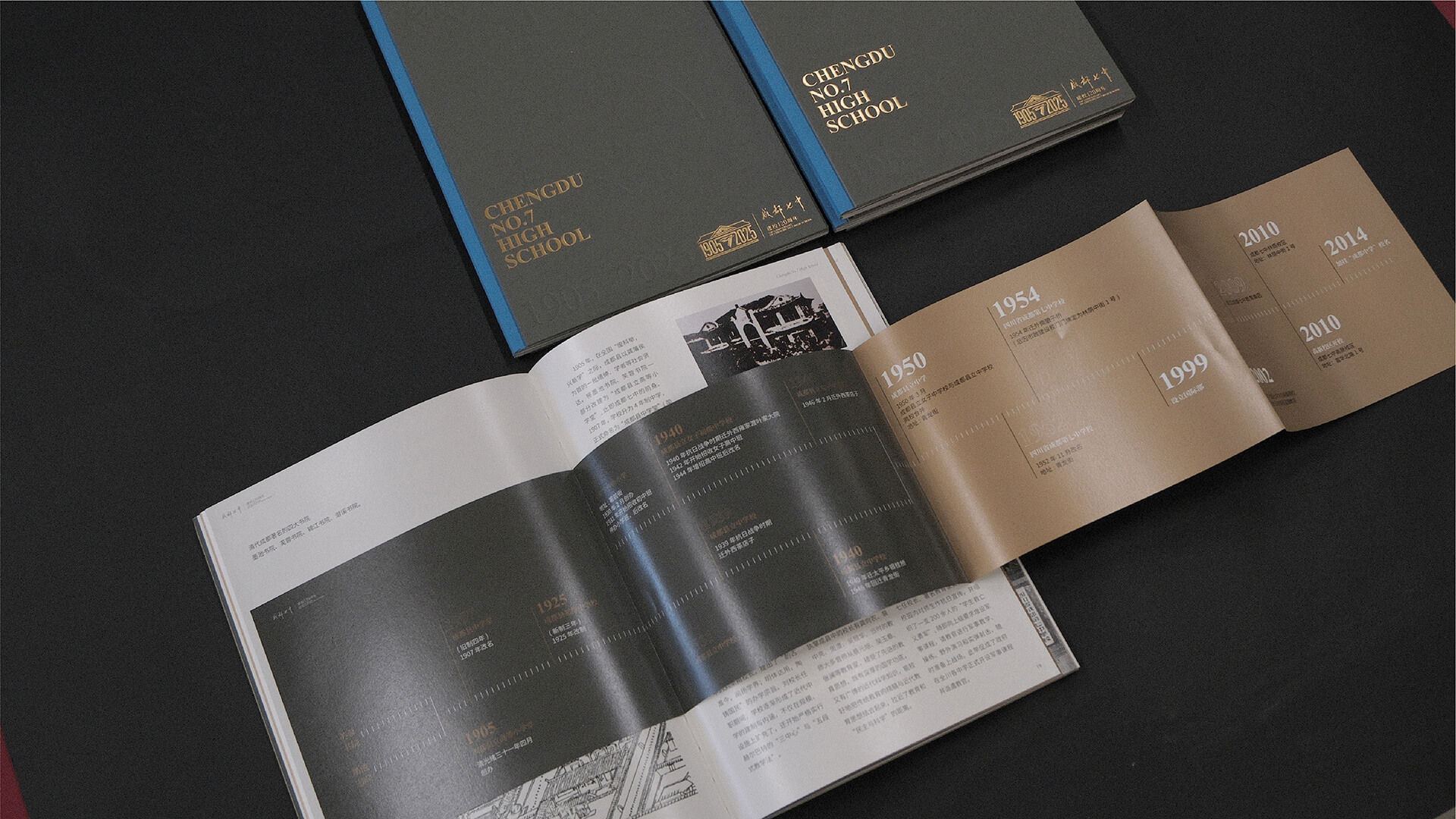
Chengdu No. 7 High School, a century-old school, carries the memories and emotions of countless alumni. To celebrate its 120th anniversary, we were commissioned by the school to serve as the visual designer for this cultural event, working to create a unique commemorative book.
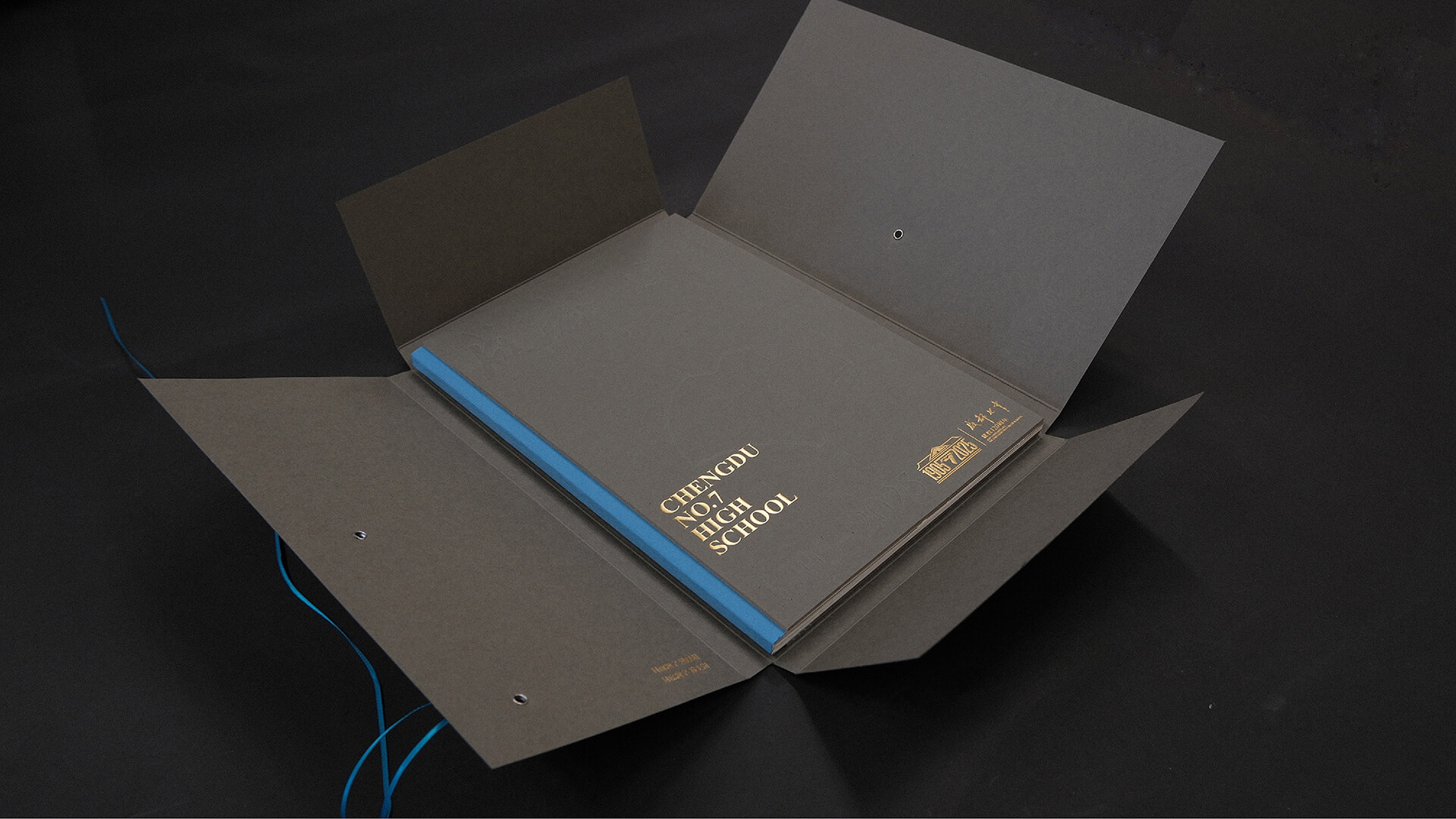
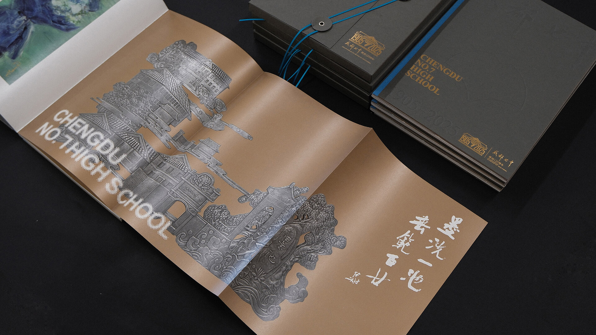
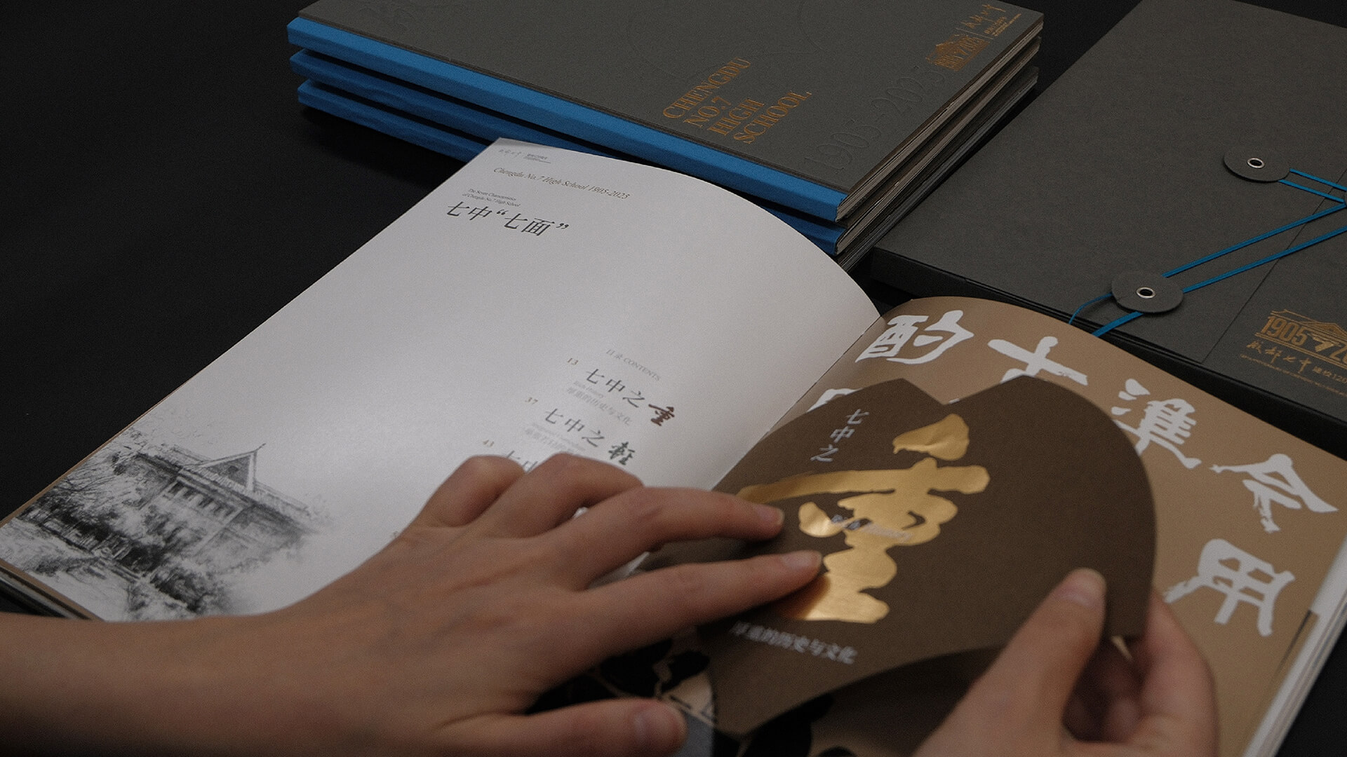
Tactile memory is 37 times more powerful than visual memory, so we designed an interactive experience that makes opening the gift a surprise experience you won’t forget.Instead of the traditional “box” format, we designed the envelope to be more like opening a file.The 7 characters wrapped in lines represent the 7 High Schools, and the fingertip wrapping around it opens a section of history and memory.
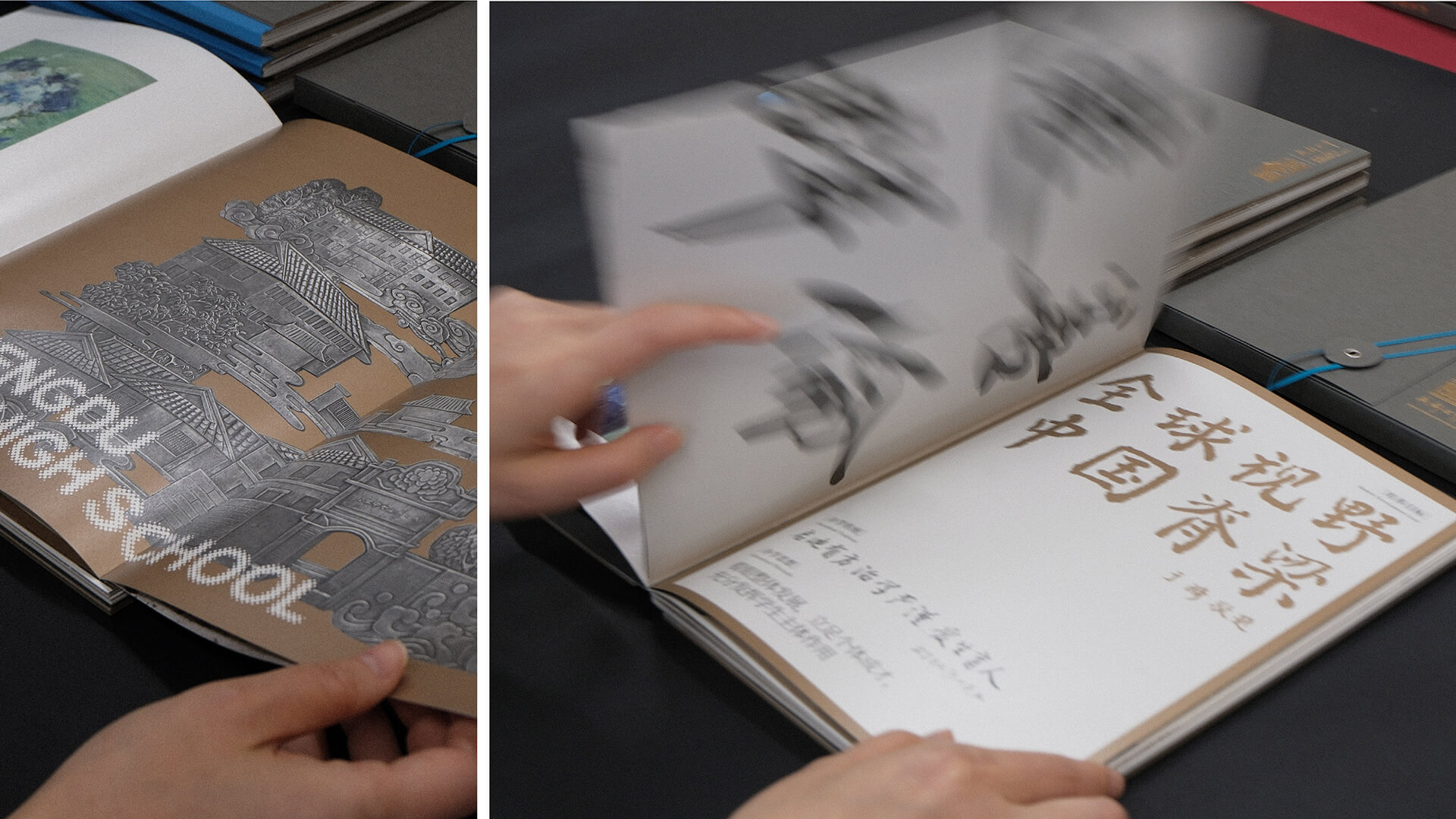
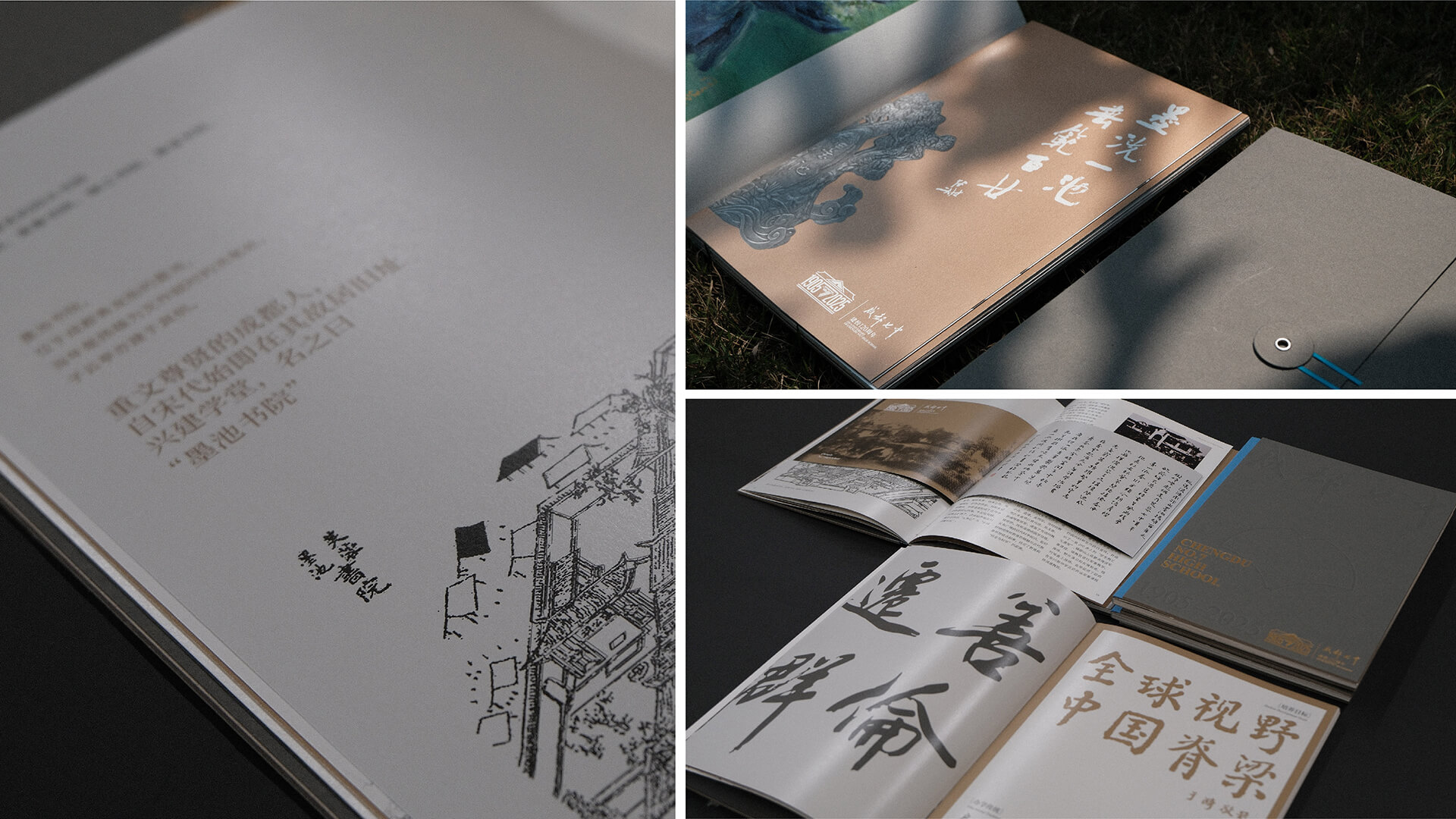
The content of the booklet encompasses the work of many of the Seven Sectors’ staff, and is designed to celebrate the history and future of the centuries-old school.History is transformed into narrative through the seven chapters of “The Seven Faces of Seven Secondary Schools”, each of which is differentiated by a different specialty paper, and the typography is designed and created according to the content.Different techniques and forms are used to interact with each other, connecting the richness of 120 years of content in a coherent and unified design.
Shanghai SynBio Innovation Center
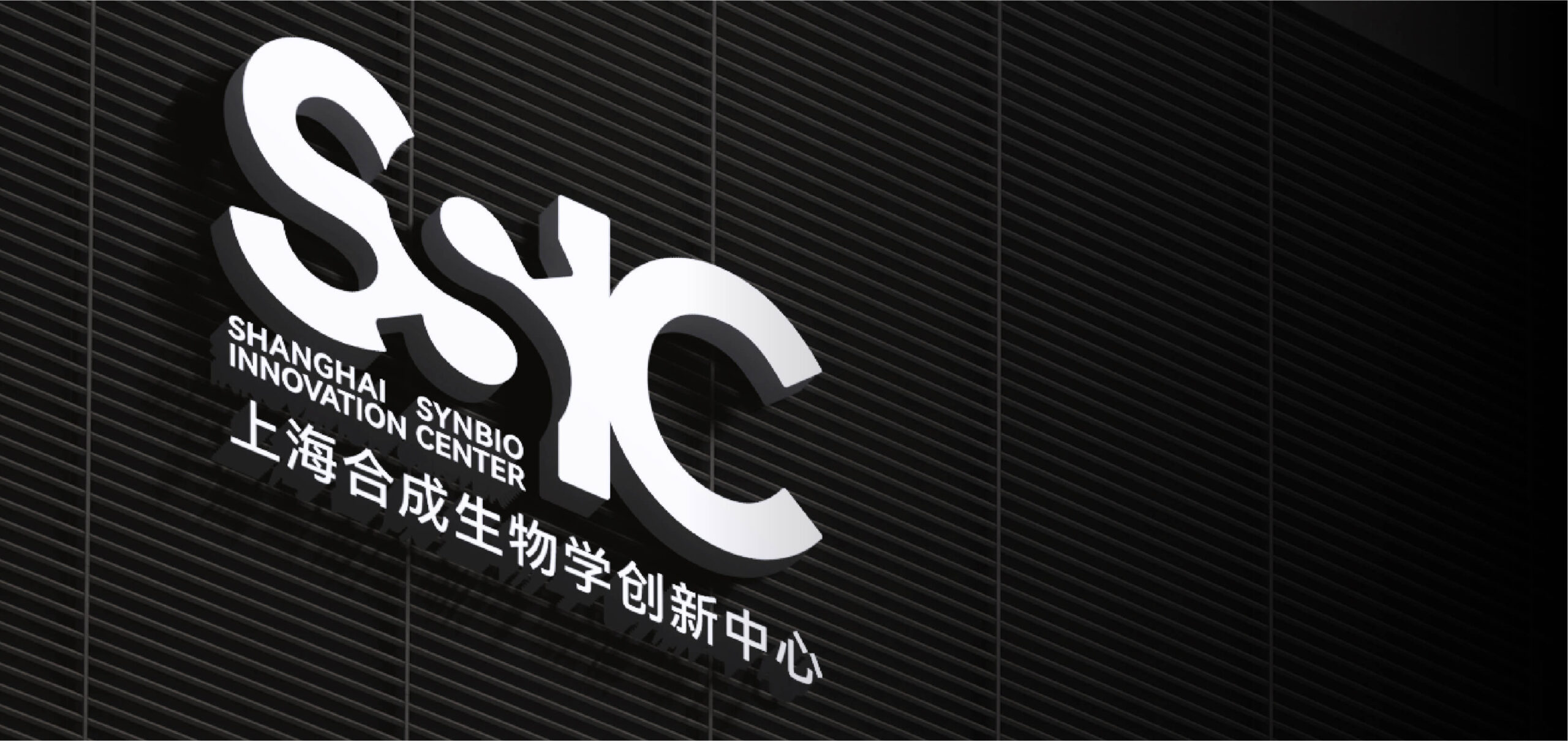
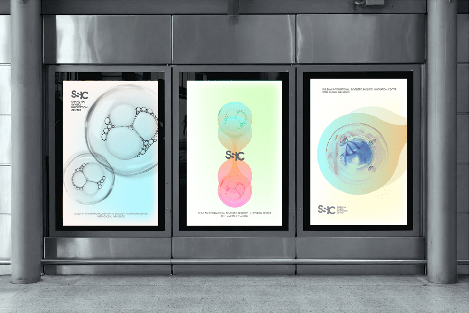
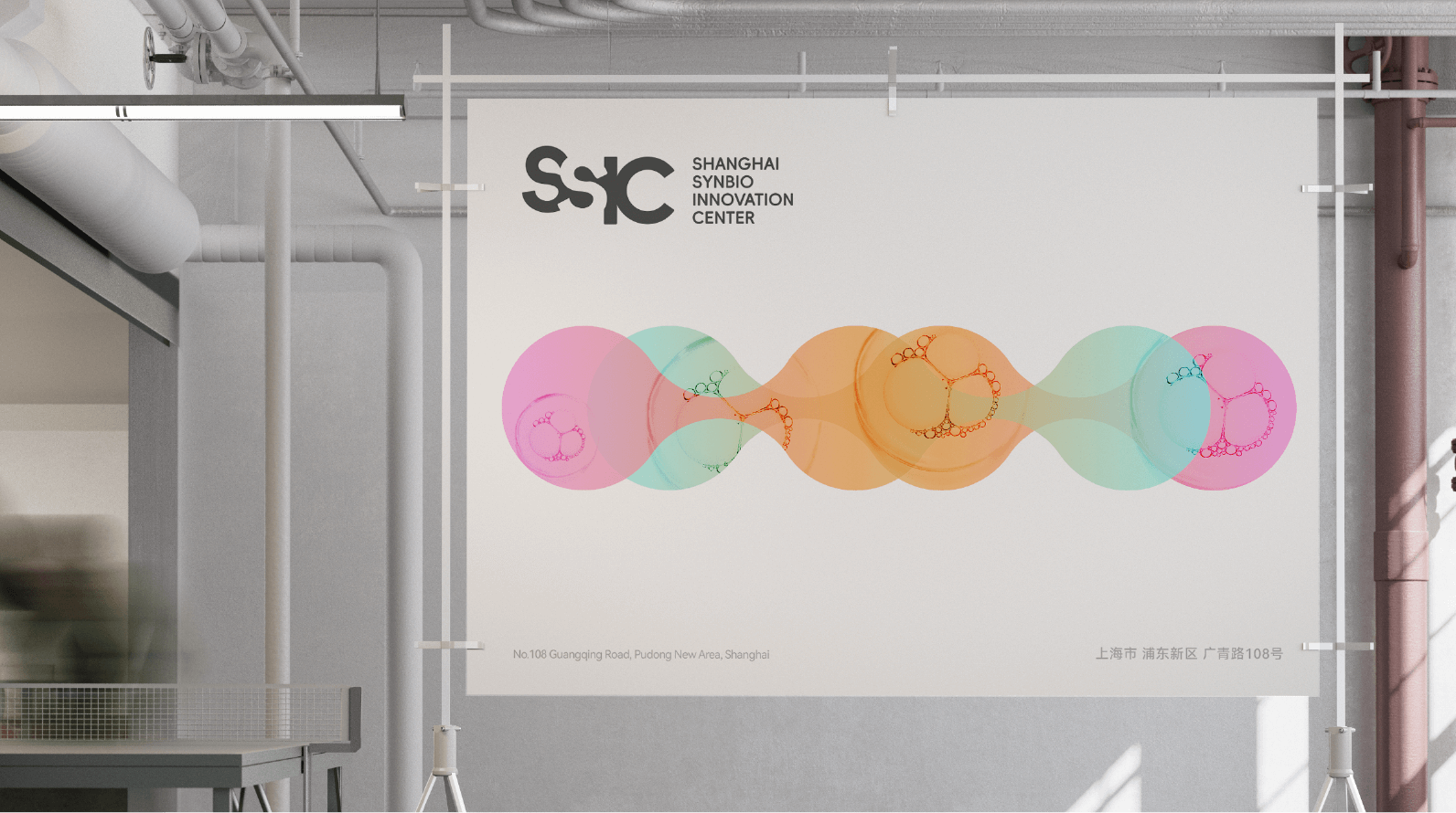
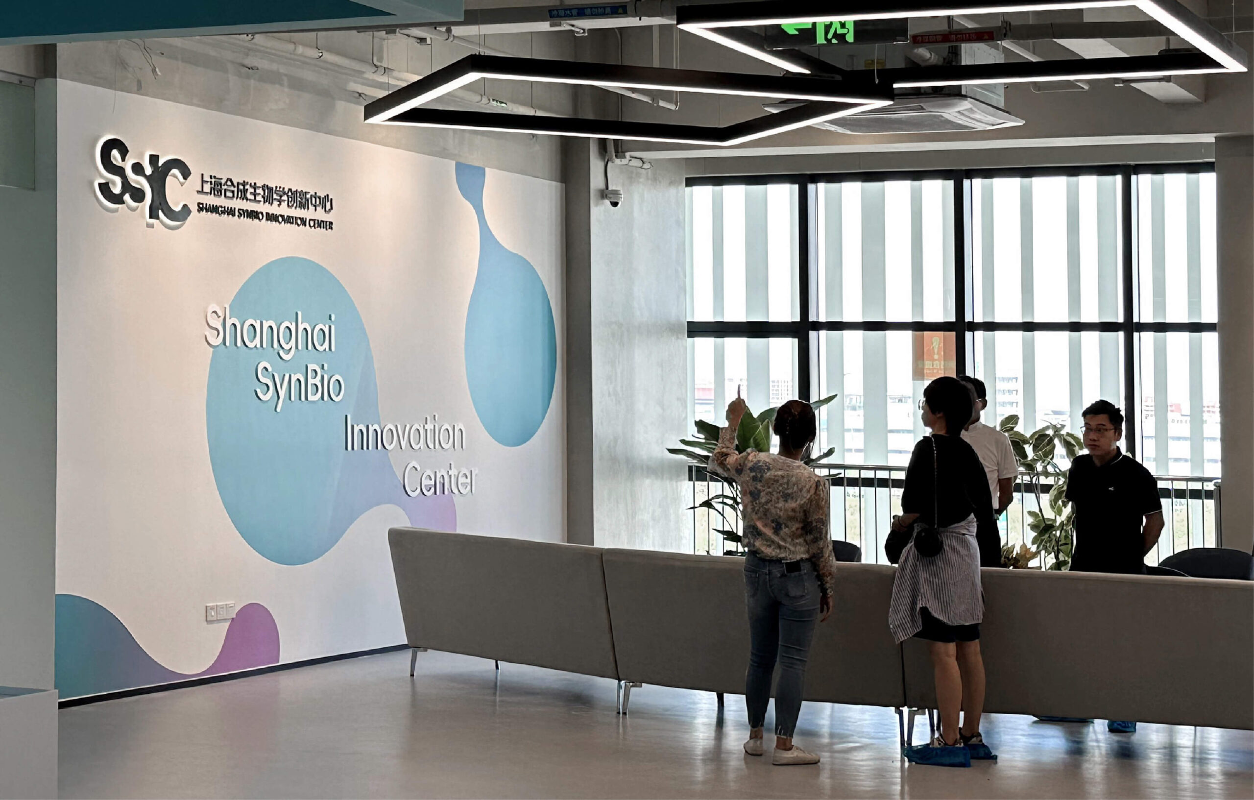
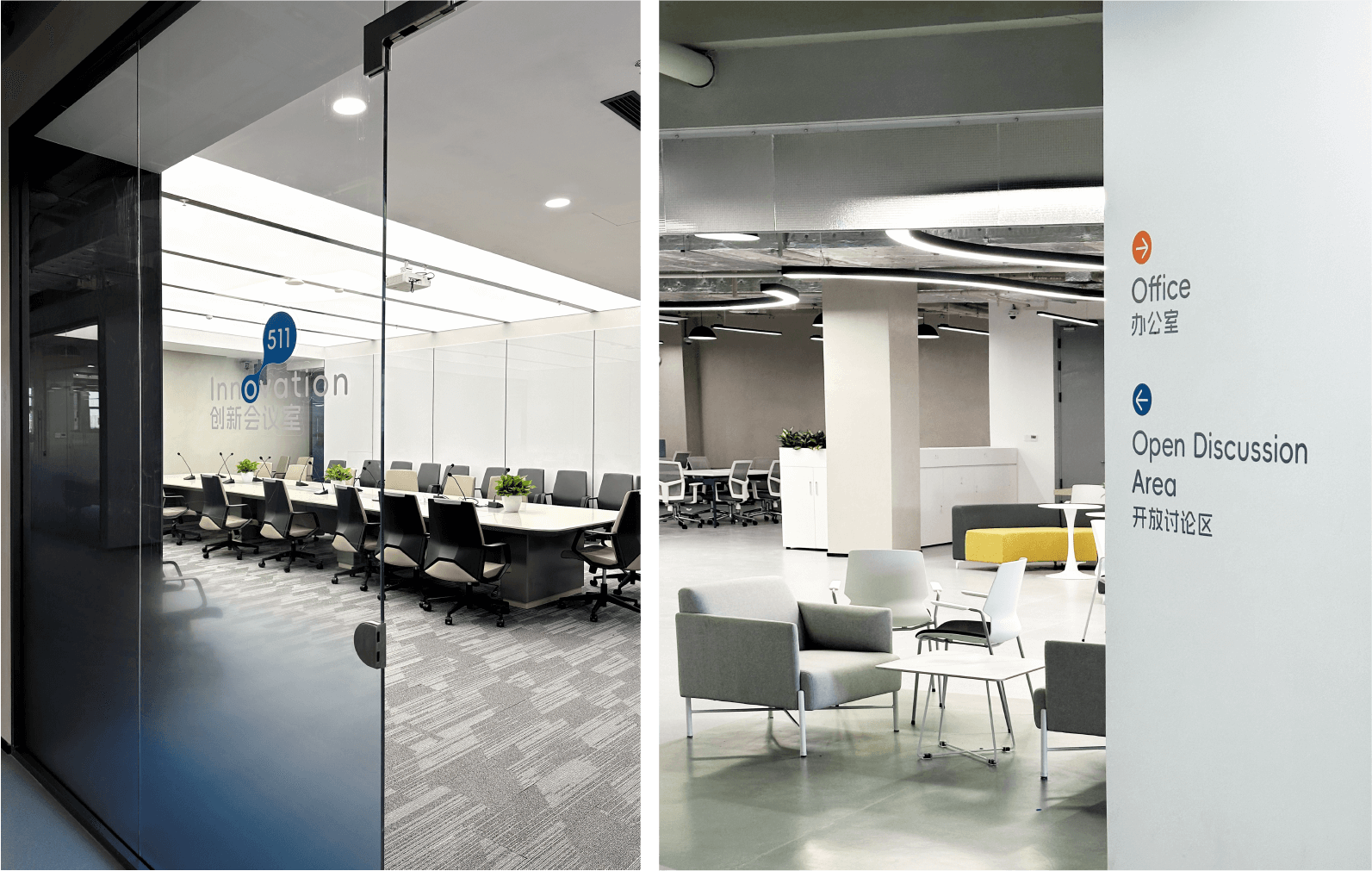
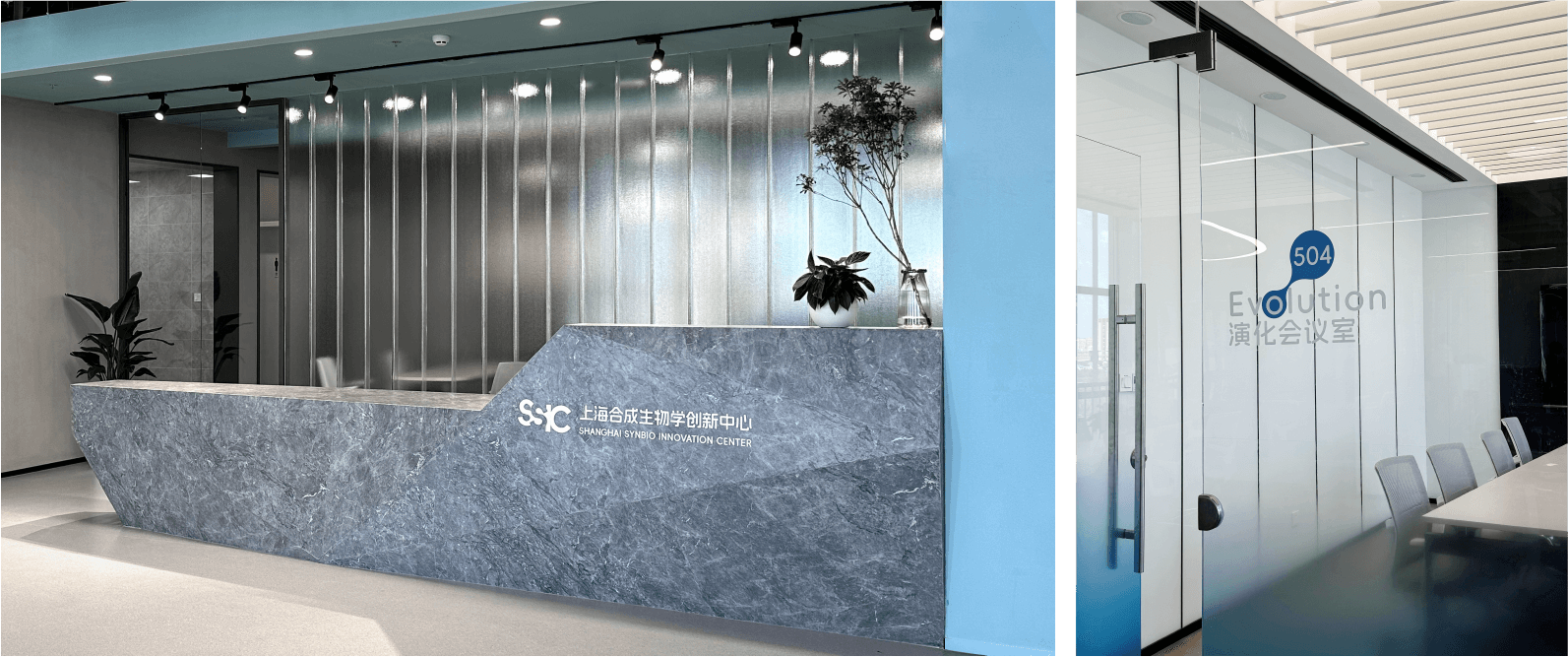
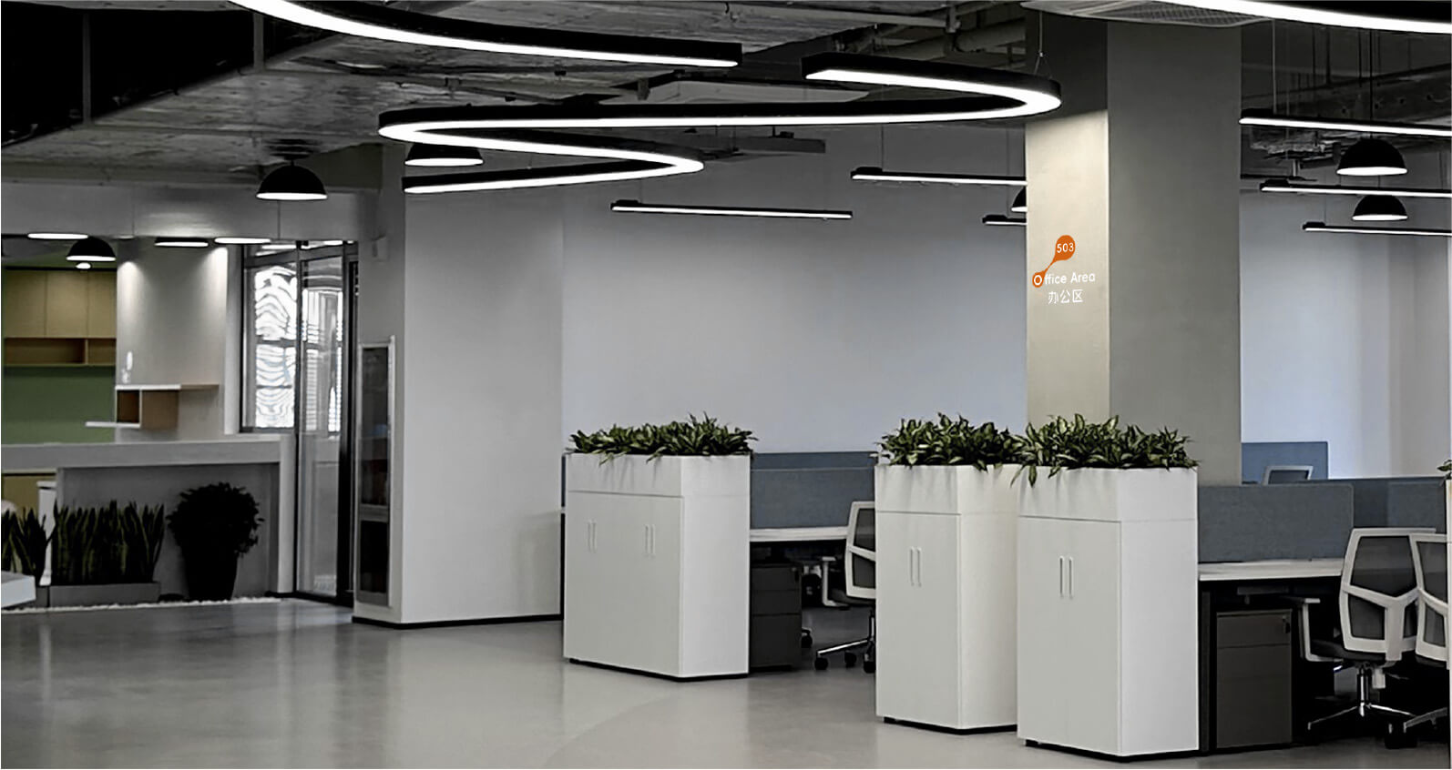
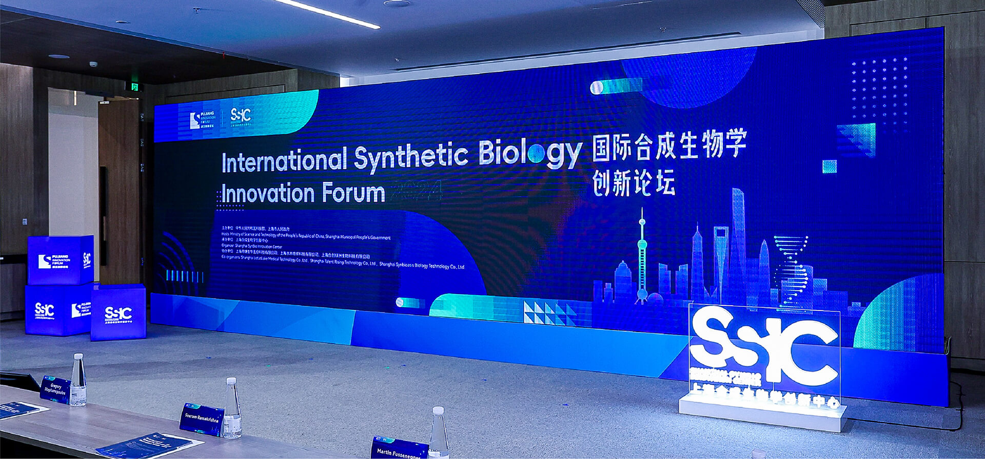
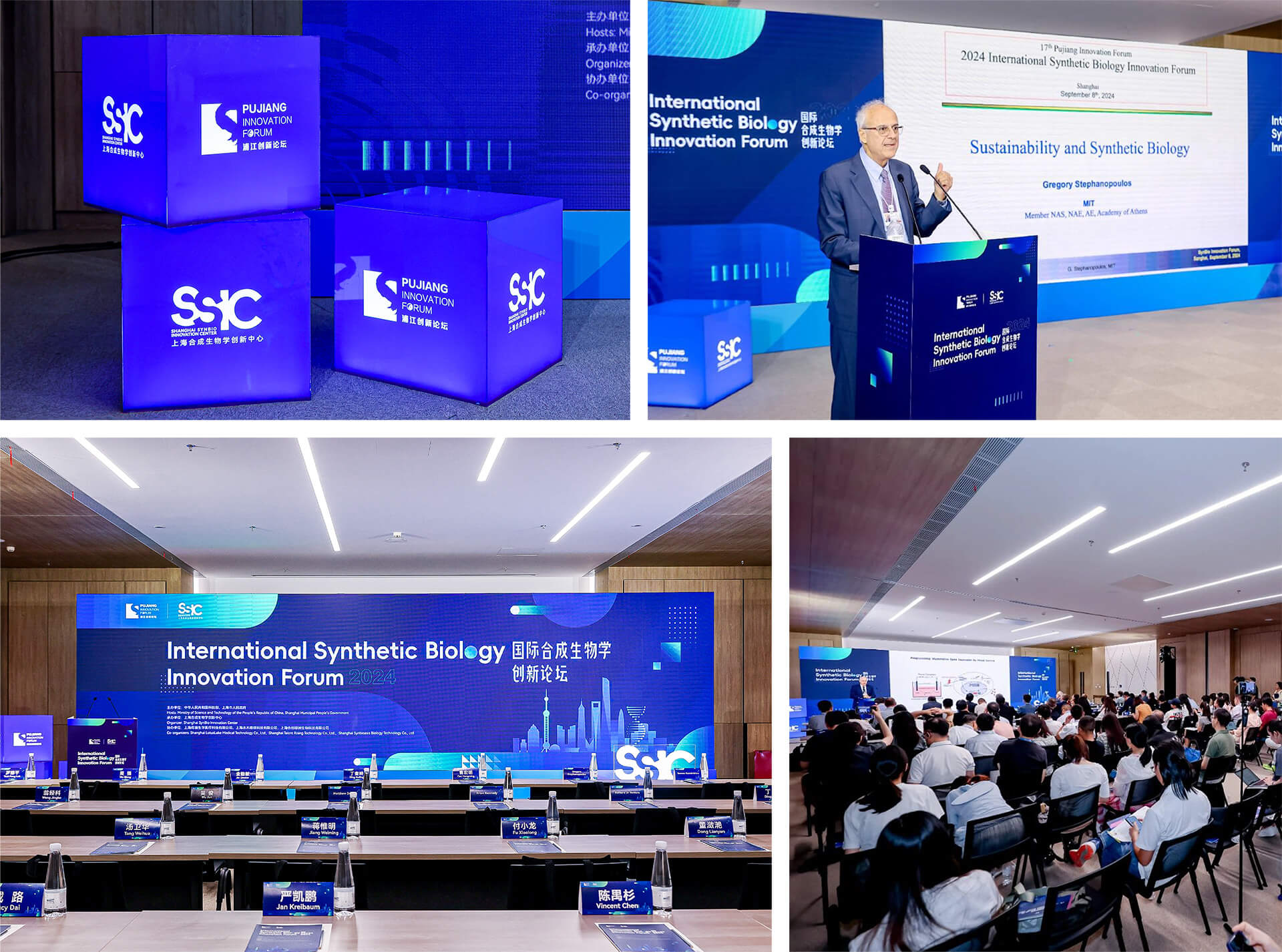
Synthetic biology, like a miracle of interdisciplinary integration, is akin to a modern-day alchemist skillfully weaving the threads of life into unprecedented patterns. It is not merely a cold touch of science but a passionate embrace of art and innovation.
The Shanghai Synthetic Biology Innovation Center was established in November 2023, jointly initiated by leading domestic technology industry service organizations and top synthetic biology technology innovation partners. The innovation center, operating on a non-profit basis, collaborates extensively with research institutions, non-profit organizations, and leading enterprises both domestically and internationally. It is dedicated to building a global talent network in the field of synthetic biology, engaging in technology cooperation, concept verification, and the transformation of scientific and technological achievements
Chengdu Art Museum
The Legacy and Sharing of Art
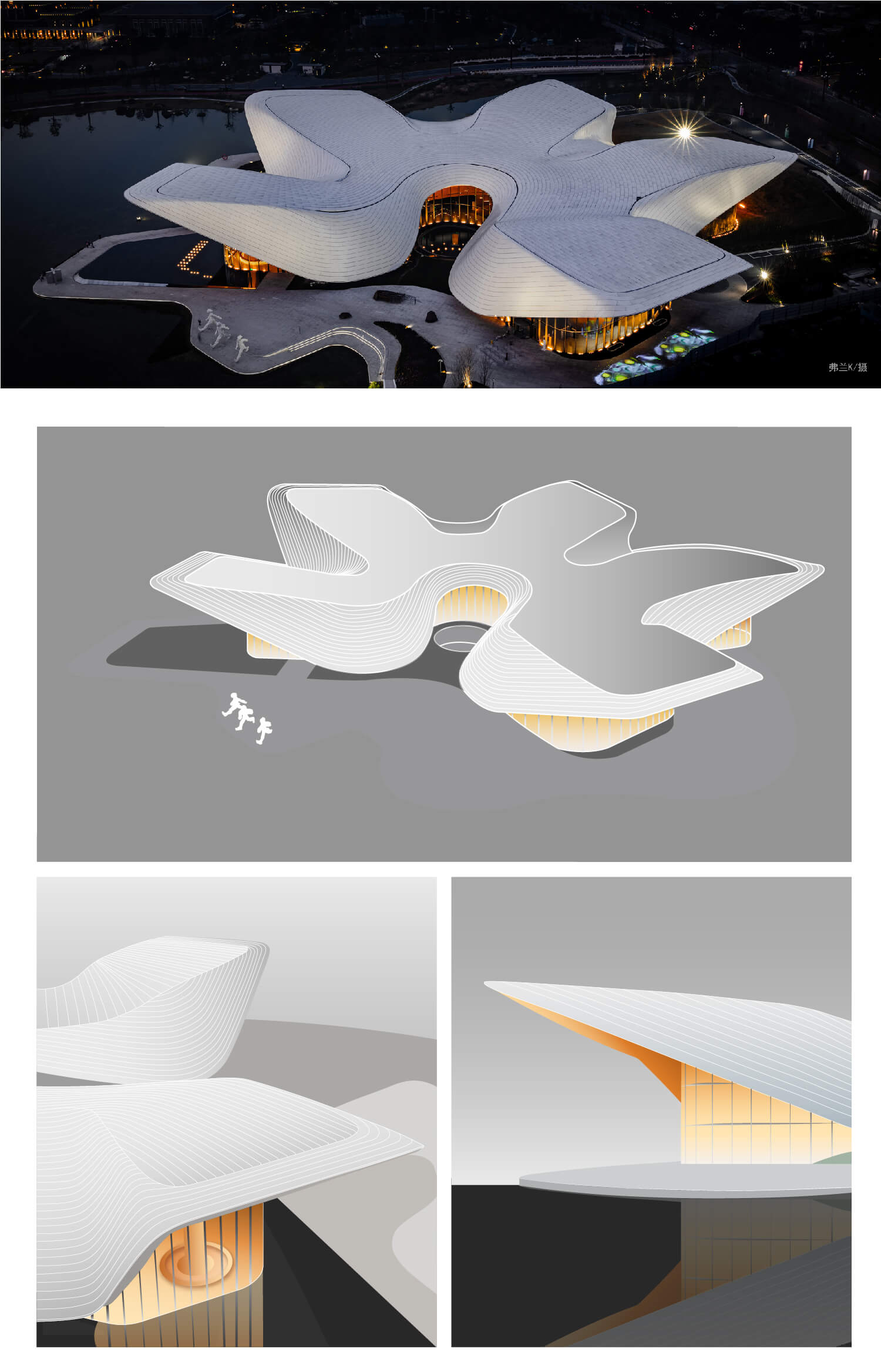
The Chengdu Academy of Painting (Chengdu Art Museum), the earliest modern public art academy established in Sichuan Province, is not only a sanctuary for artistic creation but also a symbol of the cultural heritage of Chengdu and Sichuan. It embodies rich historical, cultural, and artistic values, witnessing the evolution of Chinese art history post the Reform and Opening-up policy.
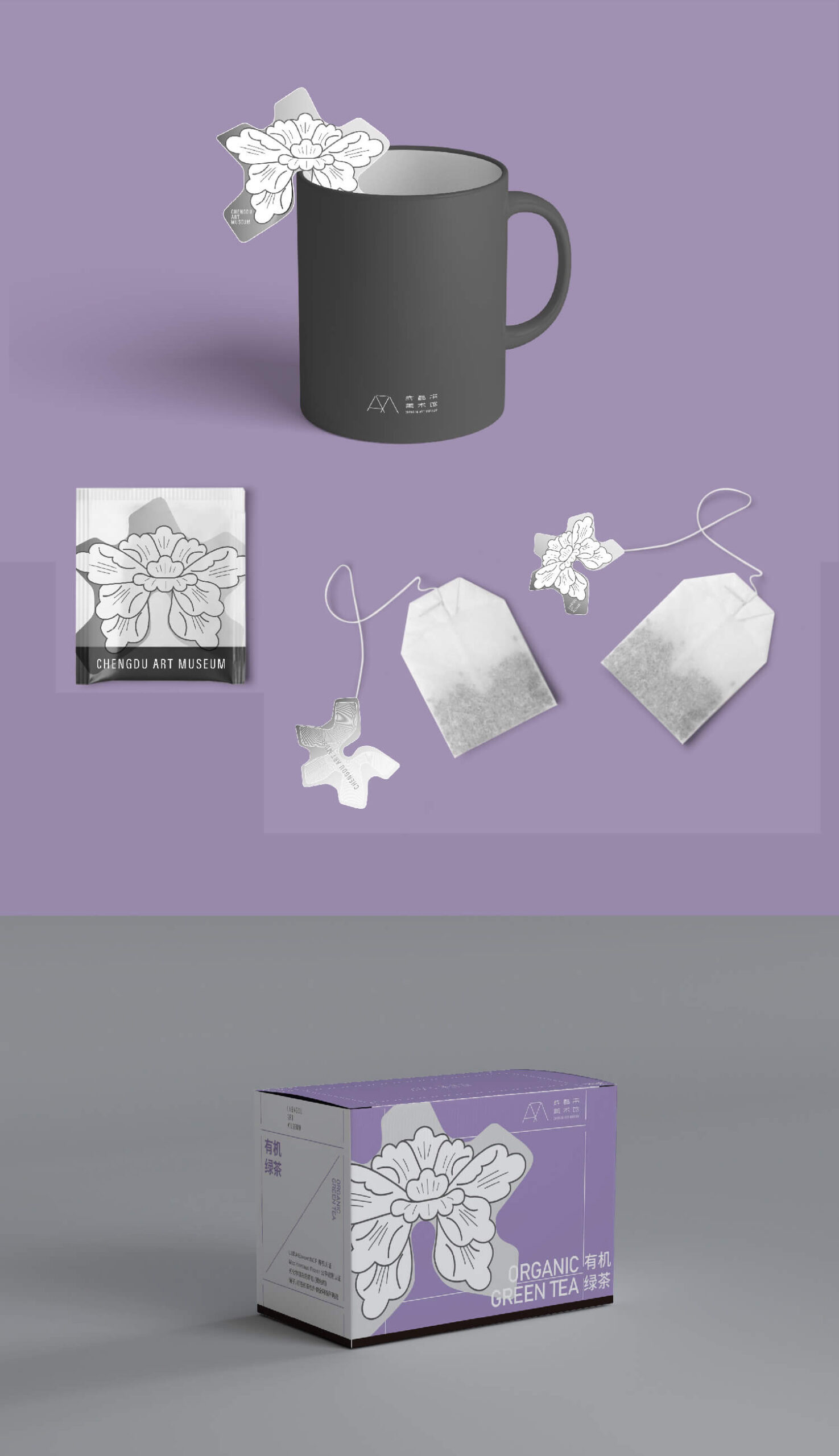
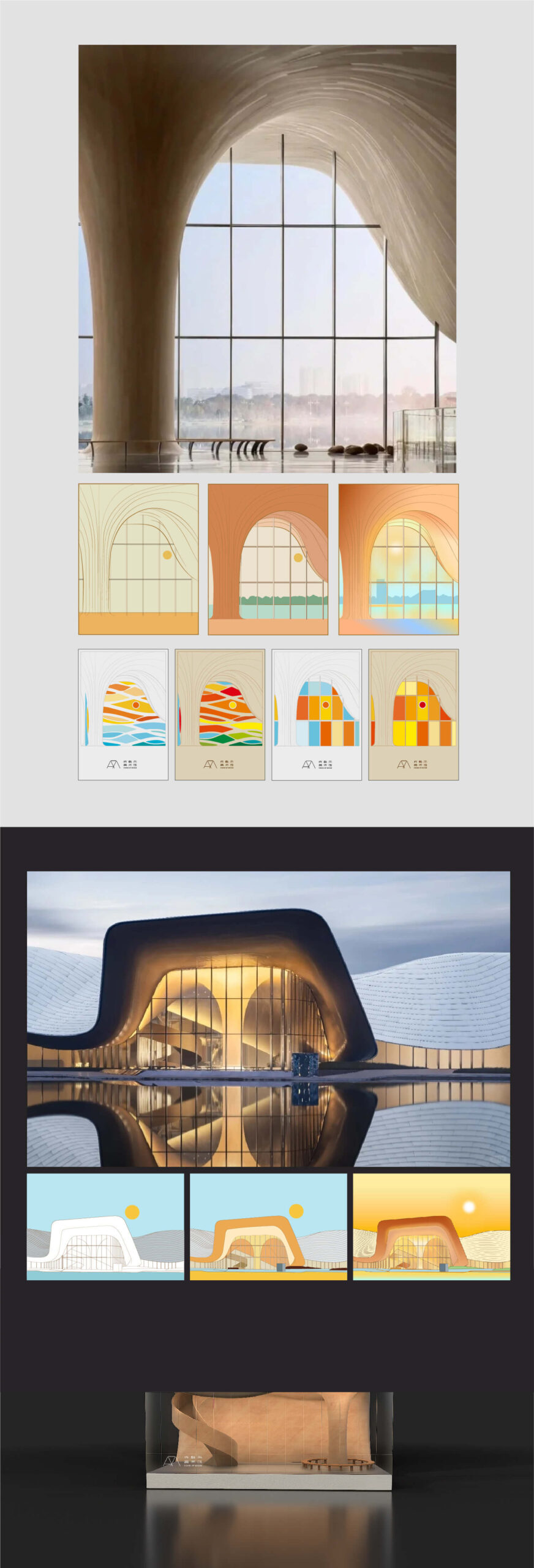
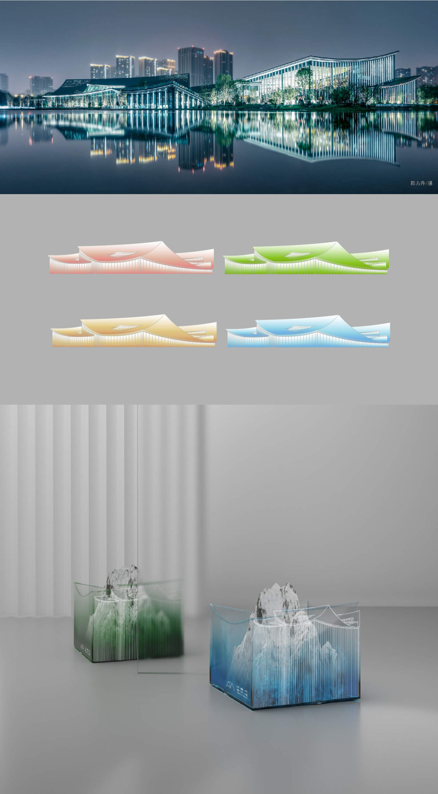
This project aims to integrate the resources of the Chengdu Academy of Painting (Chengdu Art Museum), including space, collections, and exhibitions, to enhance the design and development of cultural and creative products. After thorough discussions with the museum’s experts, we identified five key areas for in-depth exploration and design development:
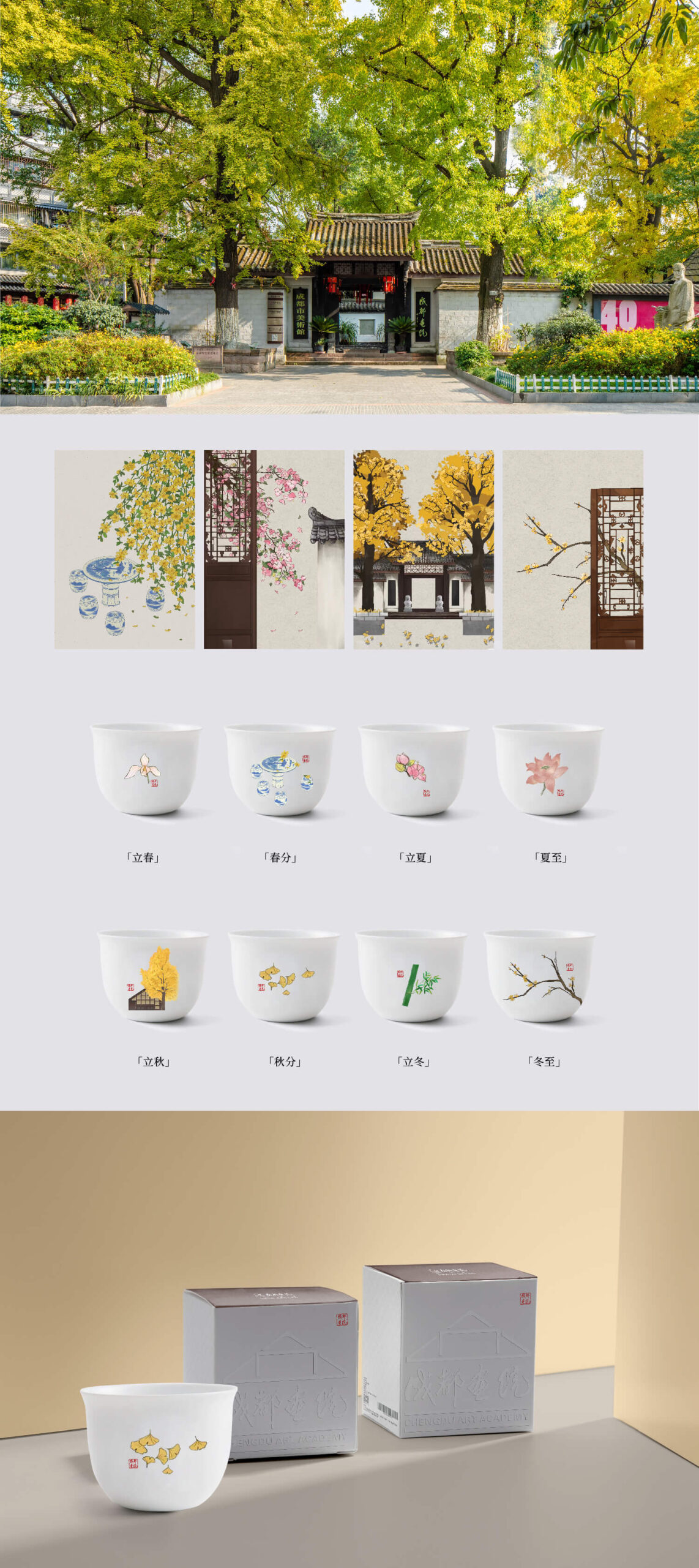
1.Architectural Scene Library of the Chengdu Academy of Painting
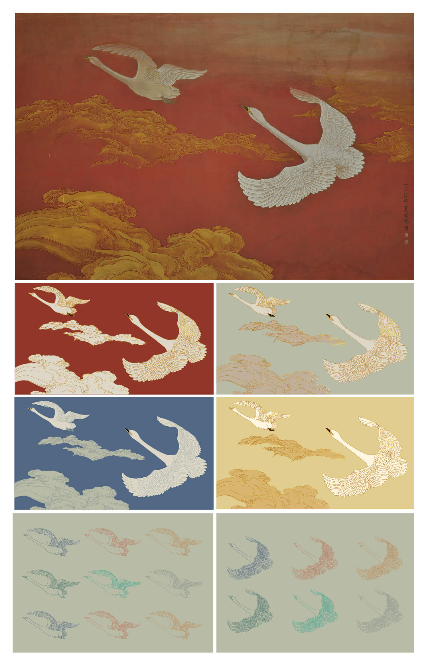
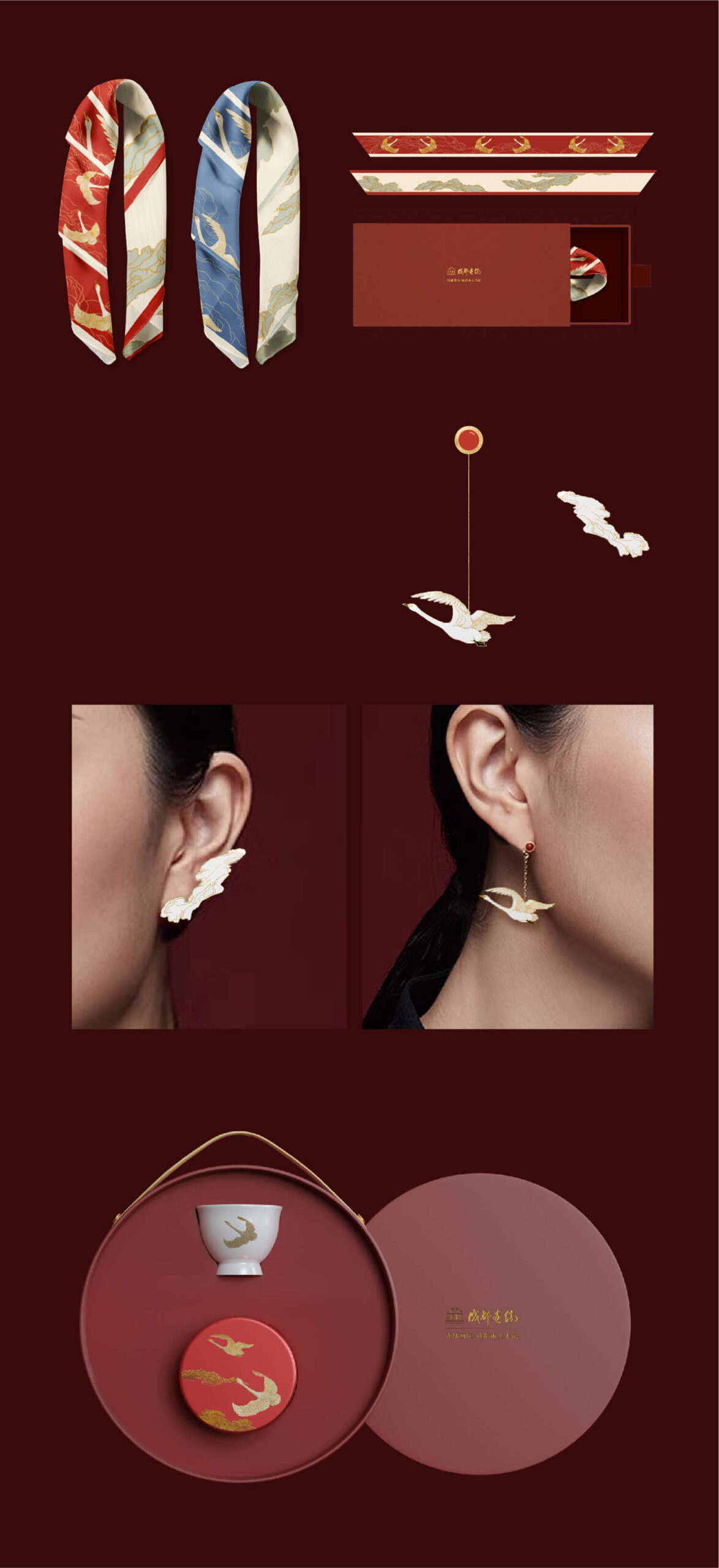
2.Re-creation Library of the Academy’s Treasure “Auspicious Cranes and Auspicious Clouds”
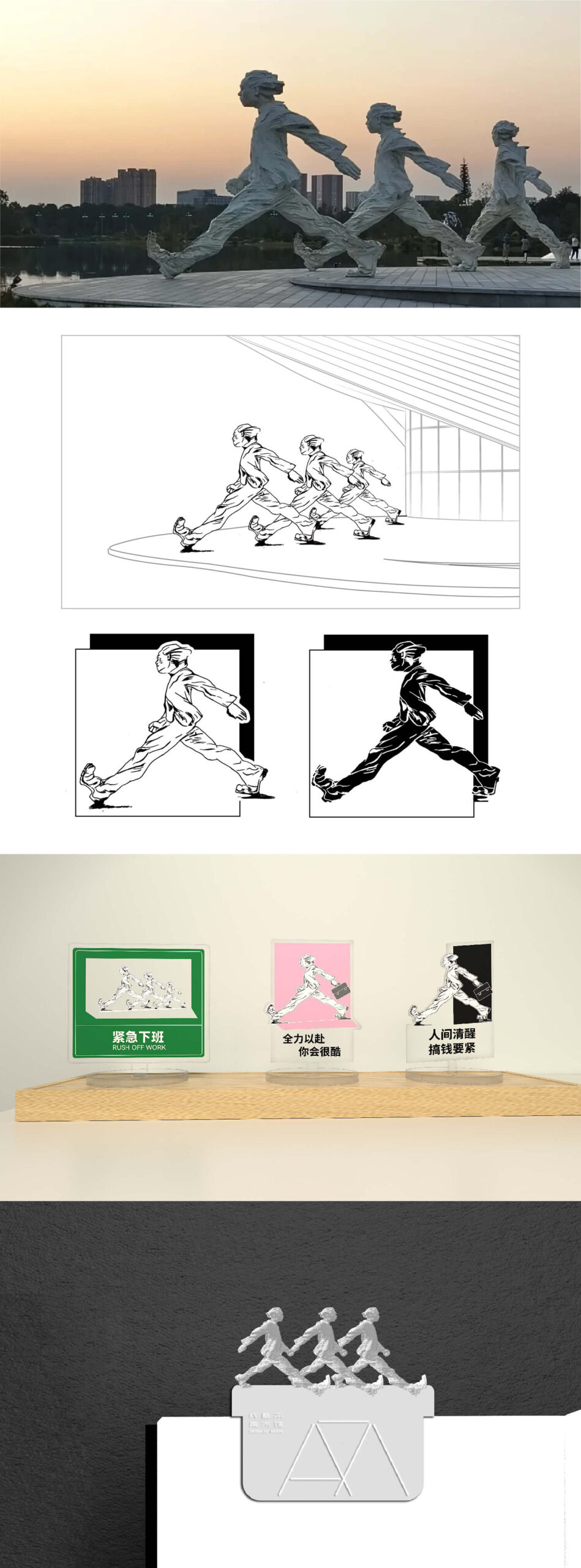
3.Realistic Sketch Library of the Sculpture “Walking Man”
4.Architectural Library of Art Museum and Contemporary Art Museum
5.Sunset Scene Library of Art Museum and Chengdu Contemporary Art Museum
The core of our creation lies in capturing the historical charm and cultural depth of the academy’s architecture and artworks while infusing them with a modern aesthetic interpretation. We have planned five series of libraries and extended products corresponding to these five creative directions.
Through market research and a comprehensive study of production techniques, we have developed a range of products favoured by the younger generation, ensuring a seamless integration of art and commerce. This approach not only brings economic benefits but also enhances the social impact of the museum, fostering a deeper connection between art and the community.
Tianfu Design Industrial Park
Thinking Out of the Box
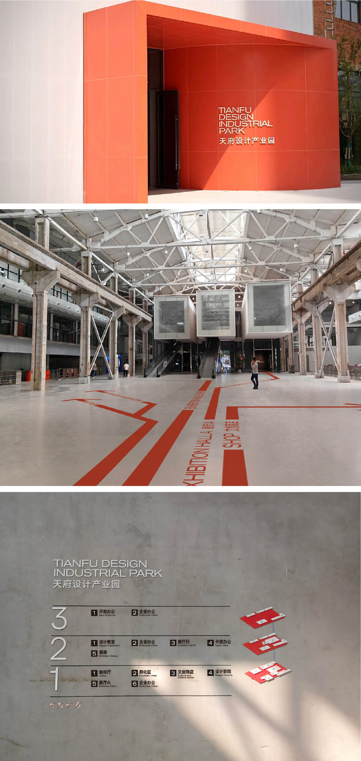
In the 1960s, construction teams from various regions settled in Balizhuang and Erxian Bridge, transforming the then-desolate suburbs into bustling industrial hubs. Over time, these industrial zones became a cherished memory for the older generations of Chengdu and historical relics of the city’s past. Fortunately, the old factories were not abandoned by time. In 2022, in collaboration with an architectural design team, we breathed new life into these massive relics.
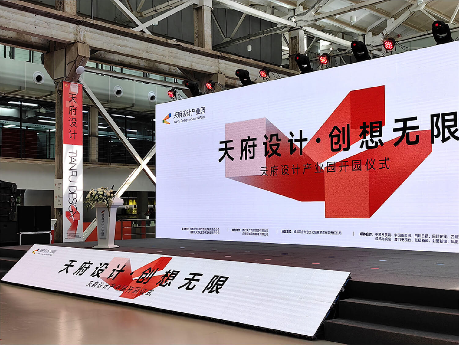
The Tianfu Design Industrial Park is an innovative hub dedicated to the field of industrial design. The square, an artificial shape rarely found in nature but ubiquitous in modern industrial civilization, serves as the foundation for many technical structures. We chose the square as the fundamental visual element for the park. The evolving cube symbolizes the transition between entering and exiting, the observer and the observed, and the real and virtual realms.
In our design expression, we aimed for a logo that conveys a continuous motion, reflecting the dynamic interchange and transformation between two blocks.
Environmental Graphics – Conveyor Belts and Industrial Aesthetics
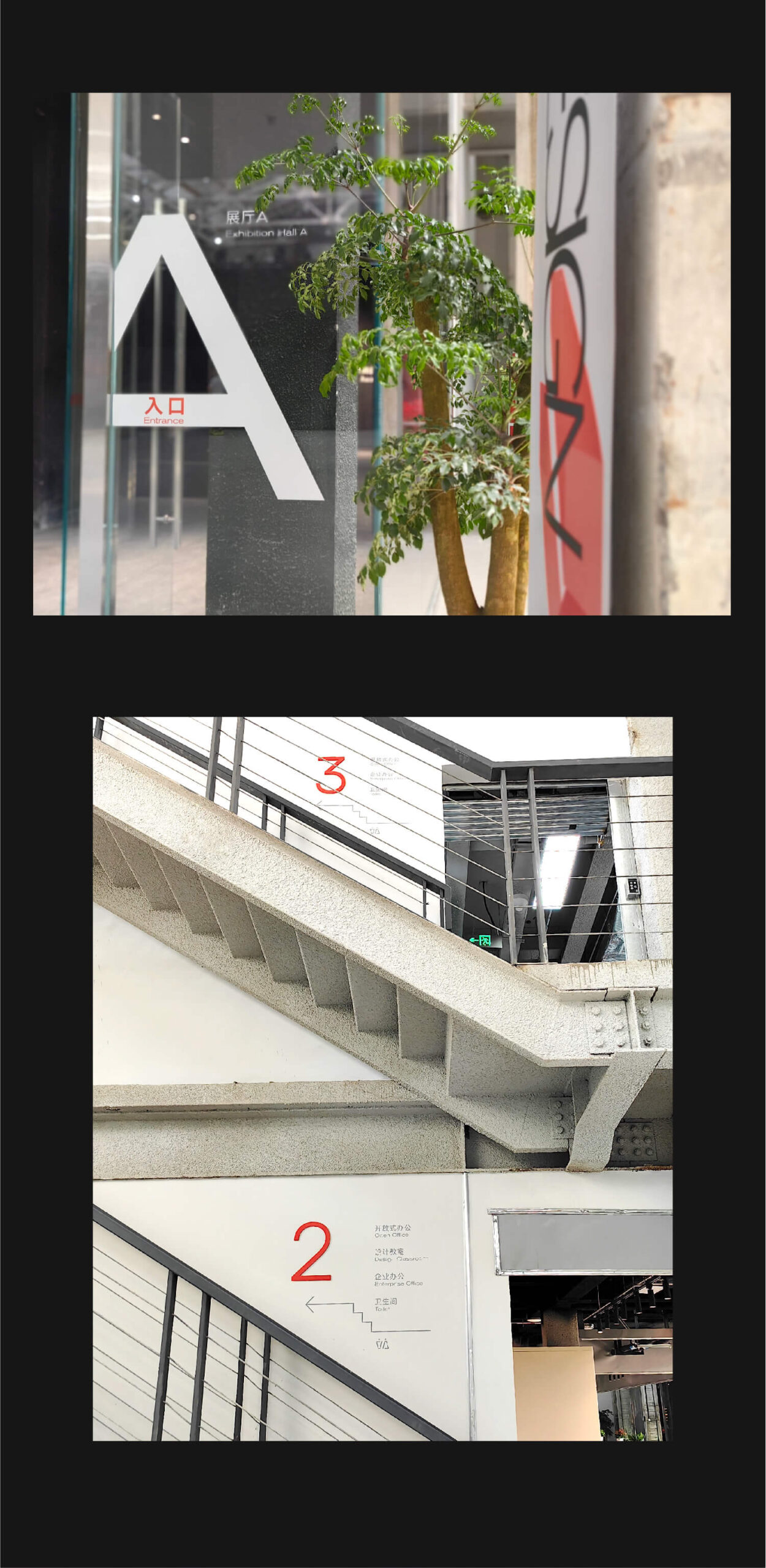
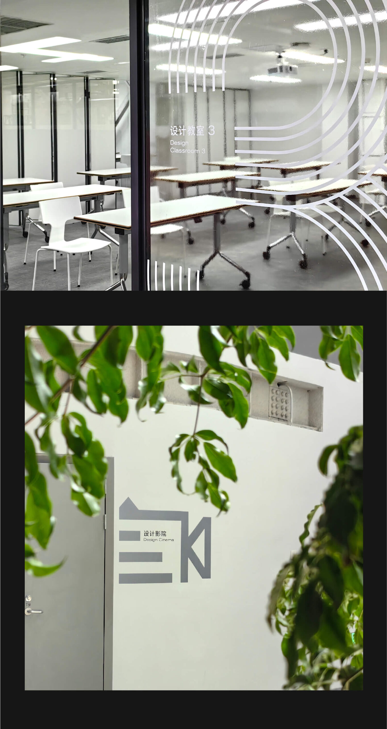
The conveyor belt, a common medium for transporting items in industrial activities, inspired the interior displays and spatial design, linking the vast industrial space with a strong mechanical aesthetic. For environmental graphics and signage, we used robust icons to denote various functions, while lines symbolizing conveyor belts guided the flow throughout the interior. These line elements permeate the entire park, connecting different types of information.
Our signage system is intentionally restrained to balance functionality with the space’s sensory experience, creating a harmonious relationship with the architectural texture. Most of the directional information is screen-printed on walls, blending seamlessly with the indoor environment’s intrinsic texture.
CHENGDU MUSEUM
Chengdu speaks to the world
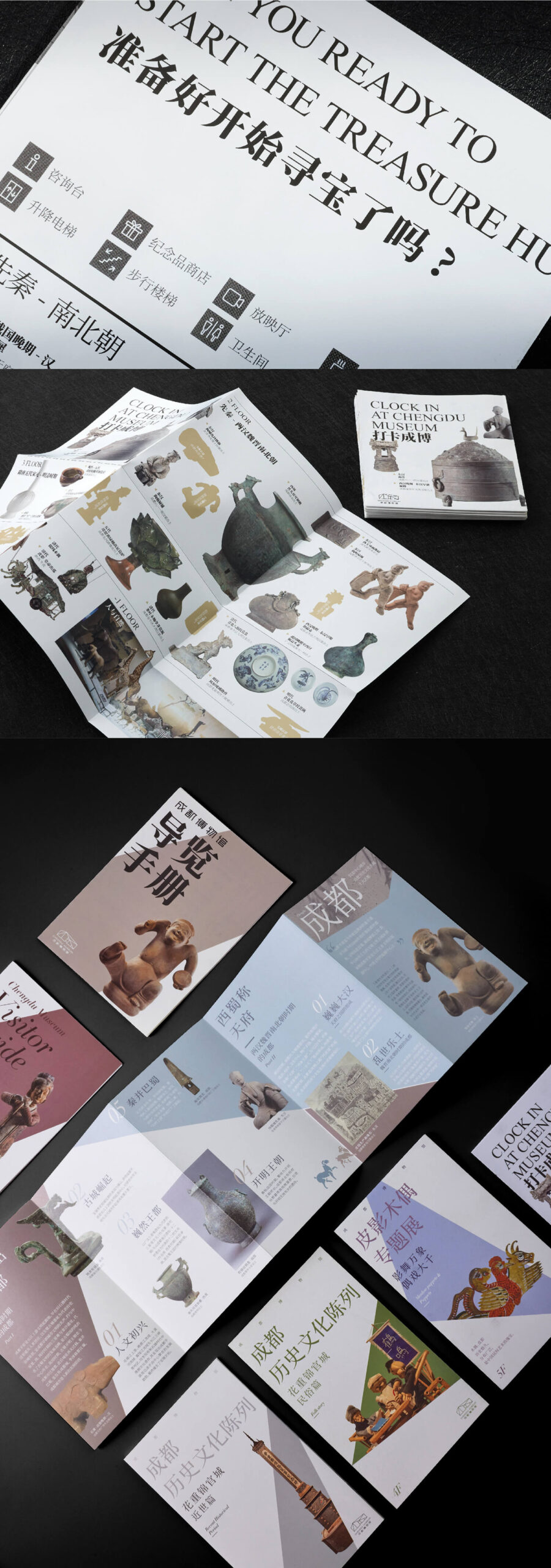
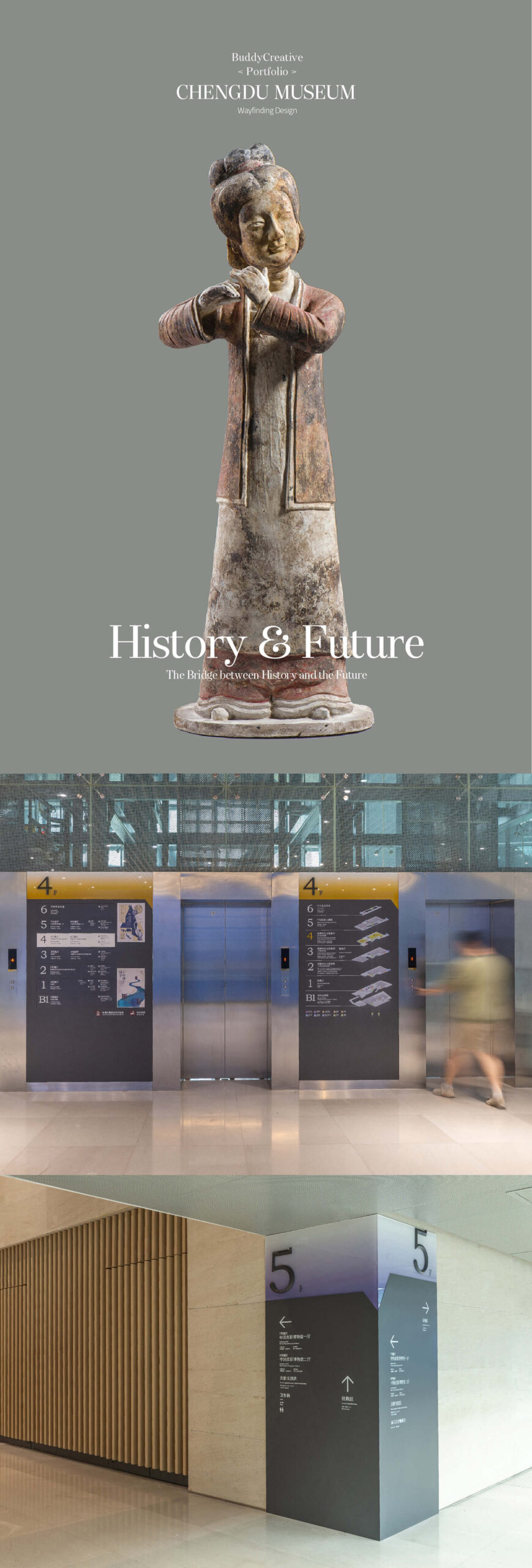
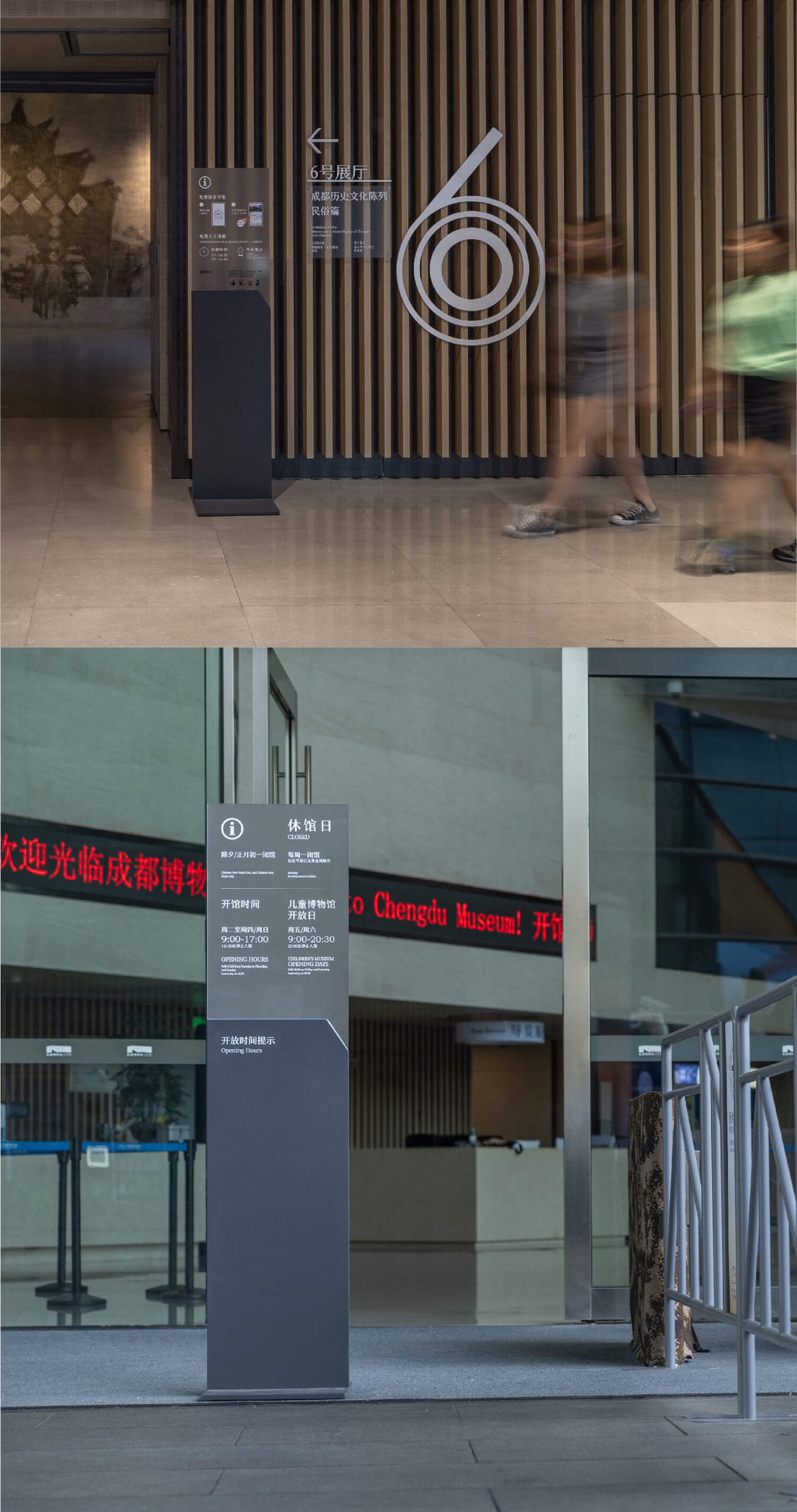
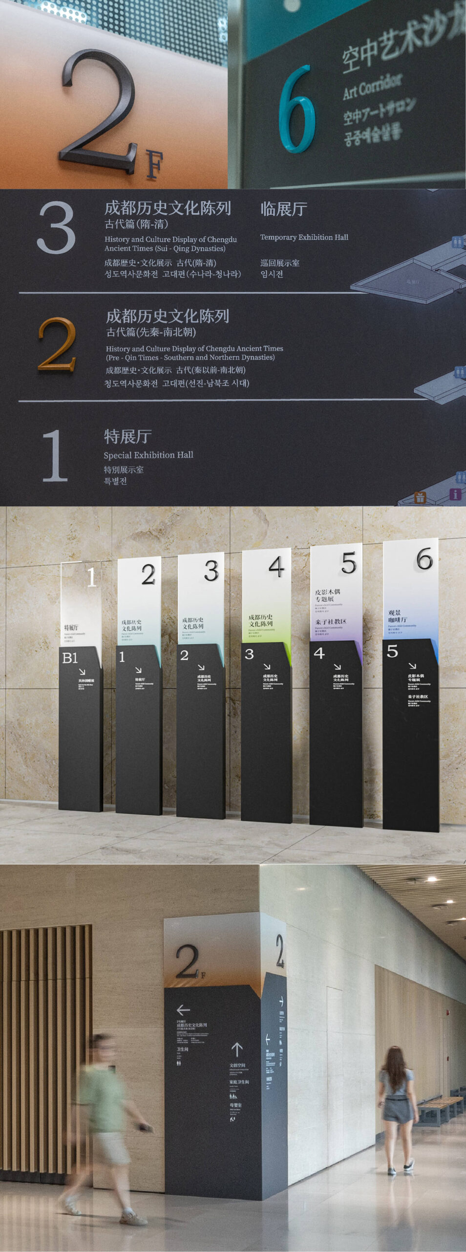
In this design, we integrated the concept of dialog boxes into the creative materials of the museum. Inside the building, through color divisions, the overall guidance for the visit path on each floor is provided. At the same time, we integrated and classified information to better present information to the audience.
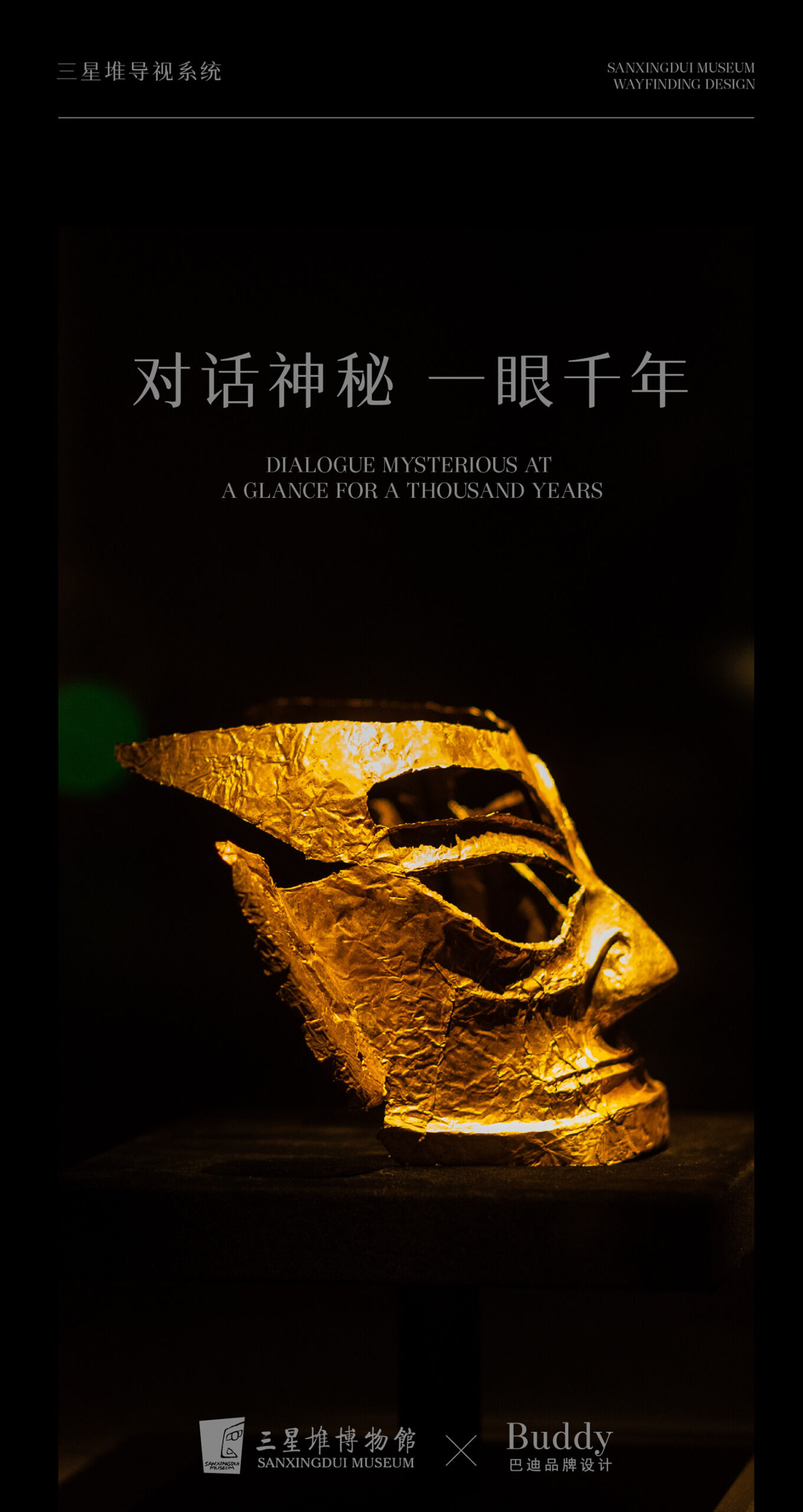
SANXINGDUI MUSEUM
Feel the mystery of ancient times
Walking into the new Sanxingdui Museum, we encountered the ancient Shu civilization. This time, modern design is used to dialogue with lost wisdom.
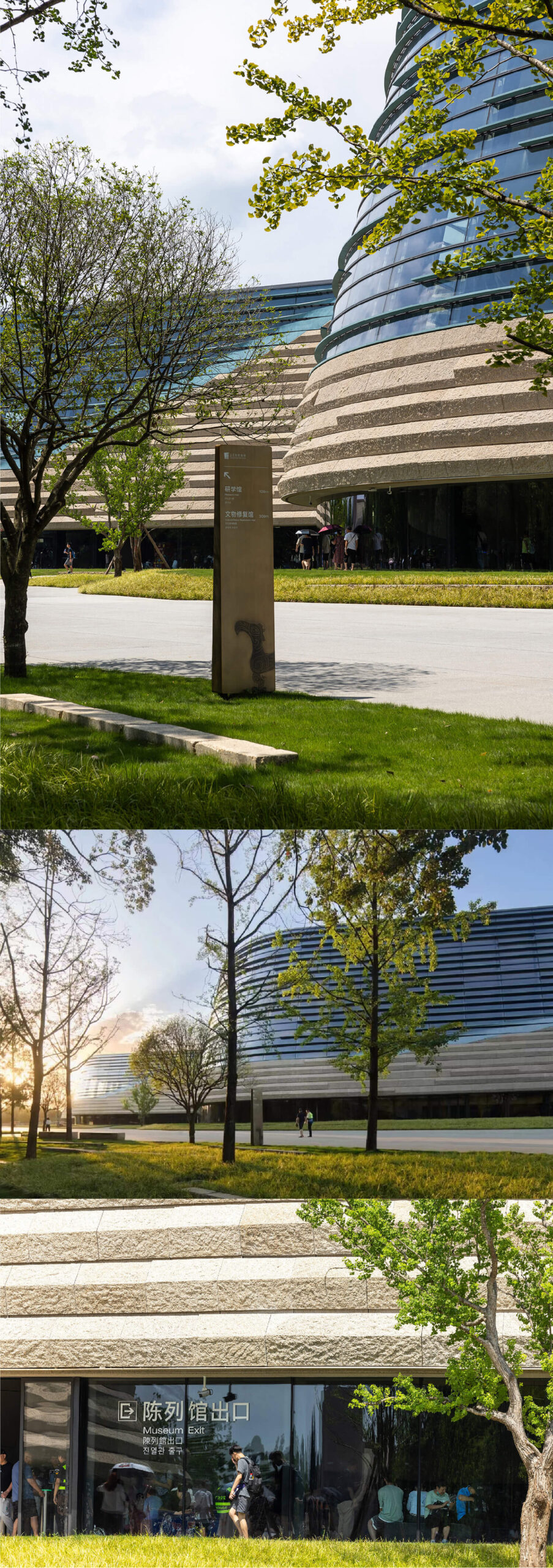
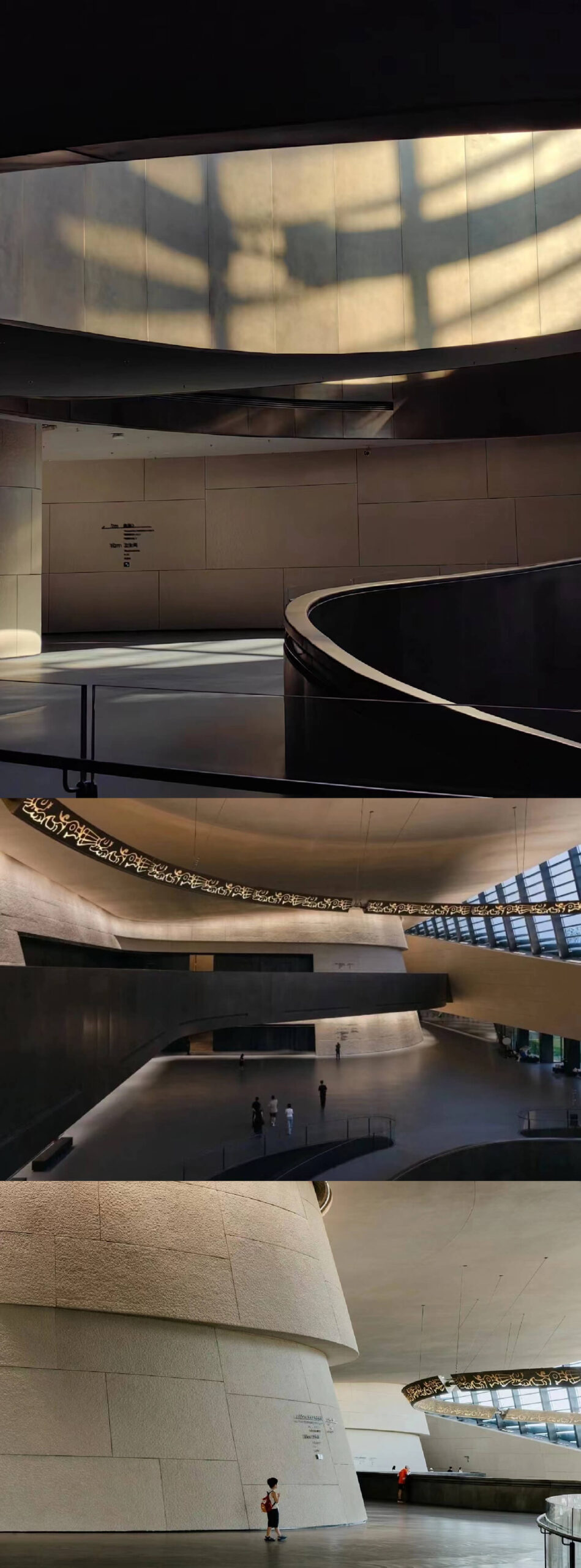
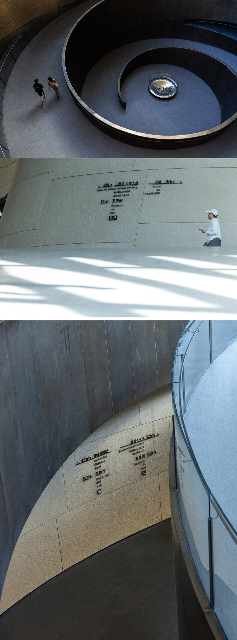
We hope that this time the wayfinding system can be “hidden” in the building, leaving the excitement to these mysterious cultural relics. At many points, we use transparent tempered glass to “float” information and make the space more transparent and cleaner.
The transparency of the glass, the delicateness of the screen printing , and the warmth of the copper plate make the signage come alive.
It took us half a year from the journey mapping to the final completion. Our positioning is accurate to every brick. We use simple and clear graphic language to allow visitors to navigate clearly in the museum.
Chongqing Longxing Football Stadium
The Pinnacle of Chongqing’s Football Spirit
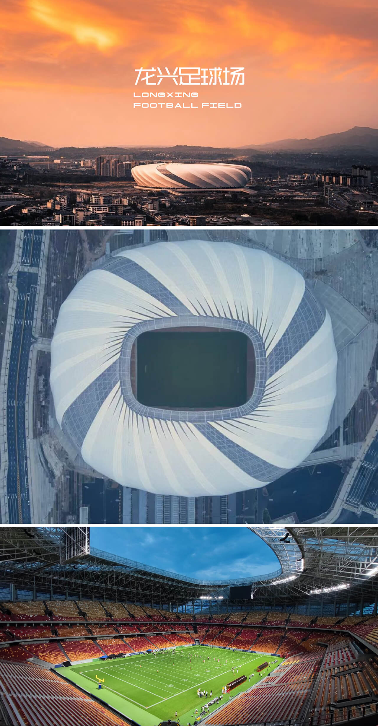
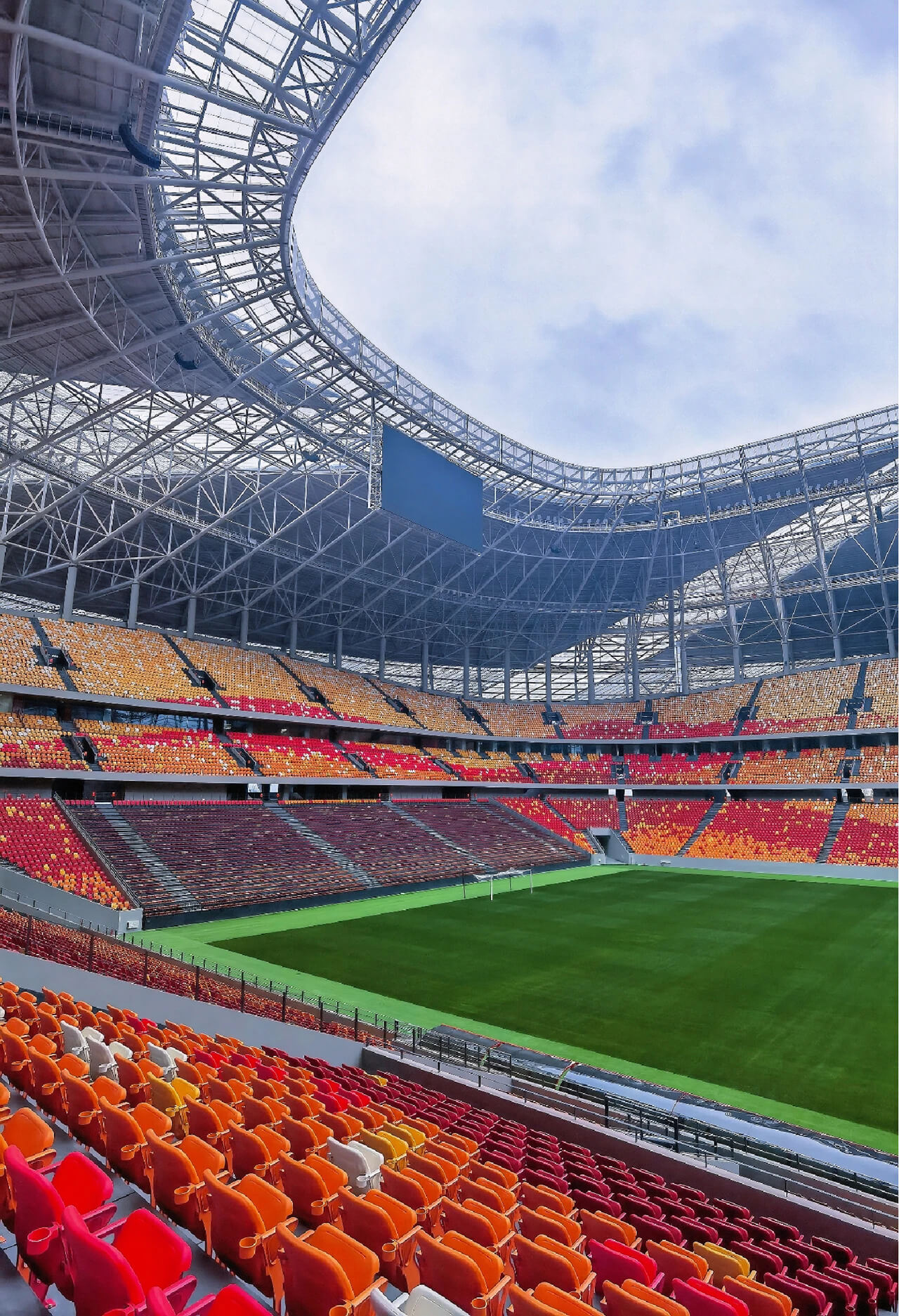
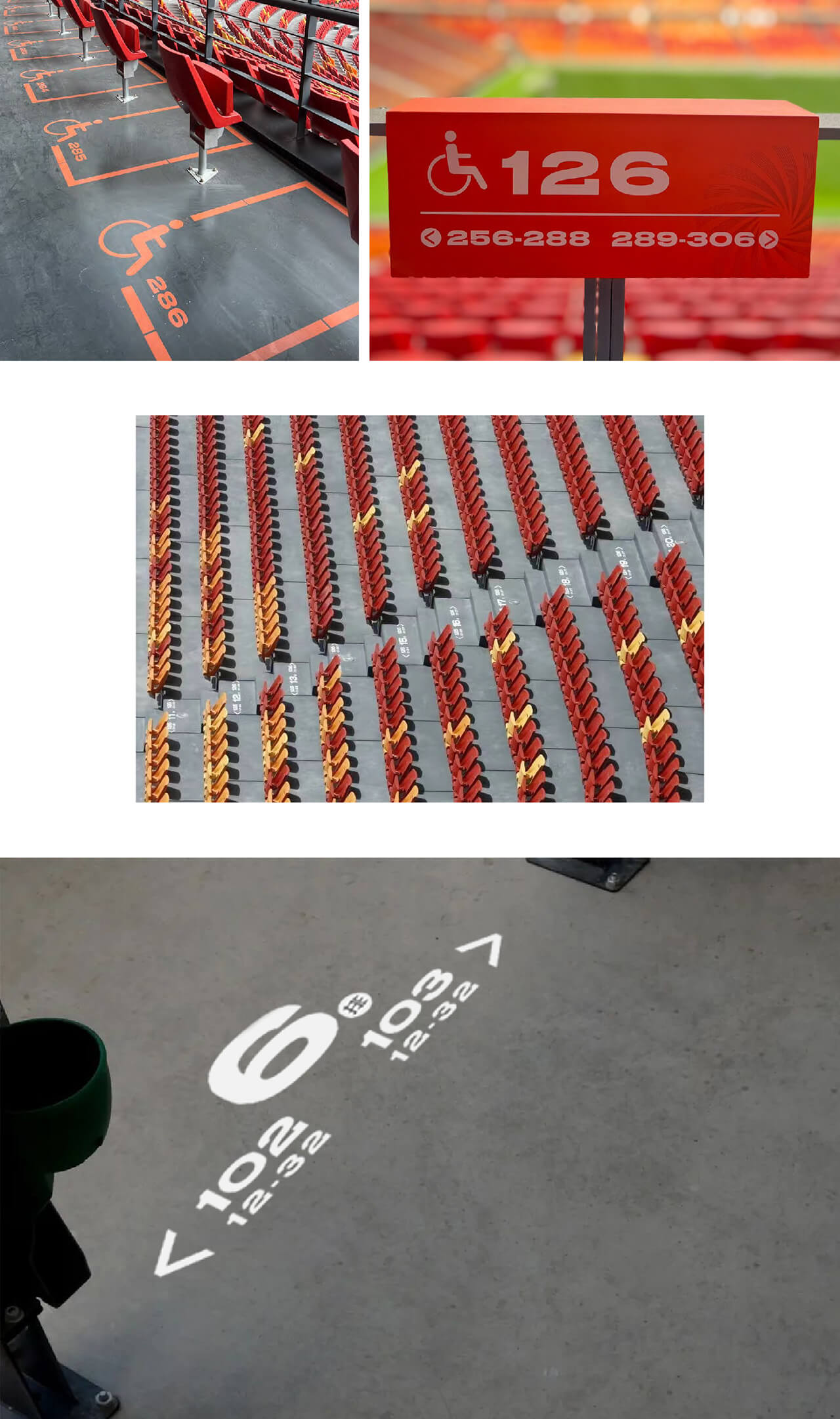
Nestled in Yubei District of Chongqing, the Longxing Football Stadium is not only one of the venues for the 2023 Asian Cup but also the largest professional football stadium under construction in China. Standing at the highest point of the stadium, the sight of the red and yellow stands evokes the image of a boiling hotpot, with the red representing the spicy broth and the yellow symbolizing the bubbling butter.
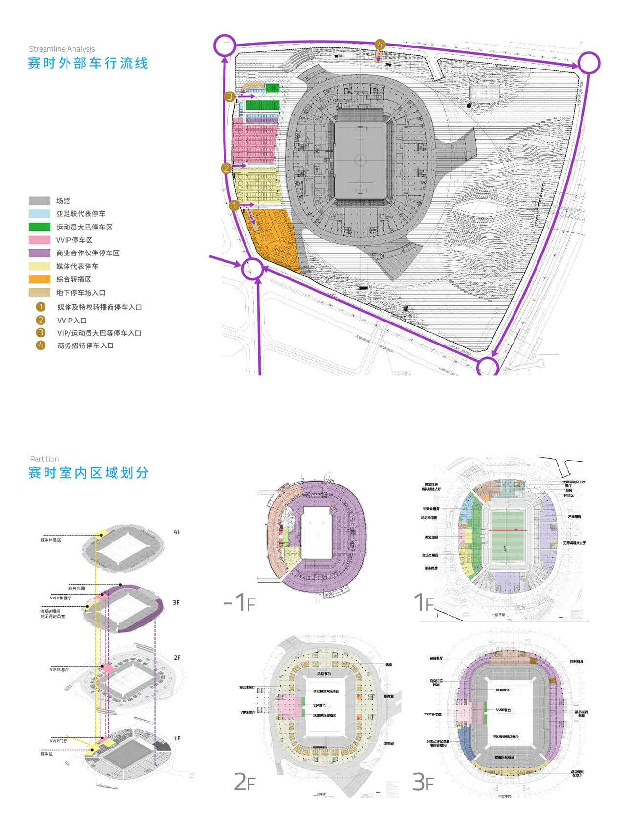
As a new urban landmark, the Longxing Football Stadium required a clear and coherent visual order to meet the informational needs of visitors while aiding in area management and safety. Moreover, it needed a distinctive visual identity to enhance the brand’s atmosphere and provide an immediate, immersive experience. Establishing a well-structured, aesthetically pleasing creative signage system was therefore crucial to the stadium’s facility management.
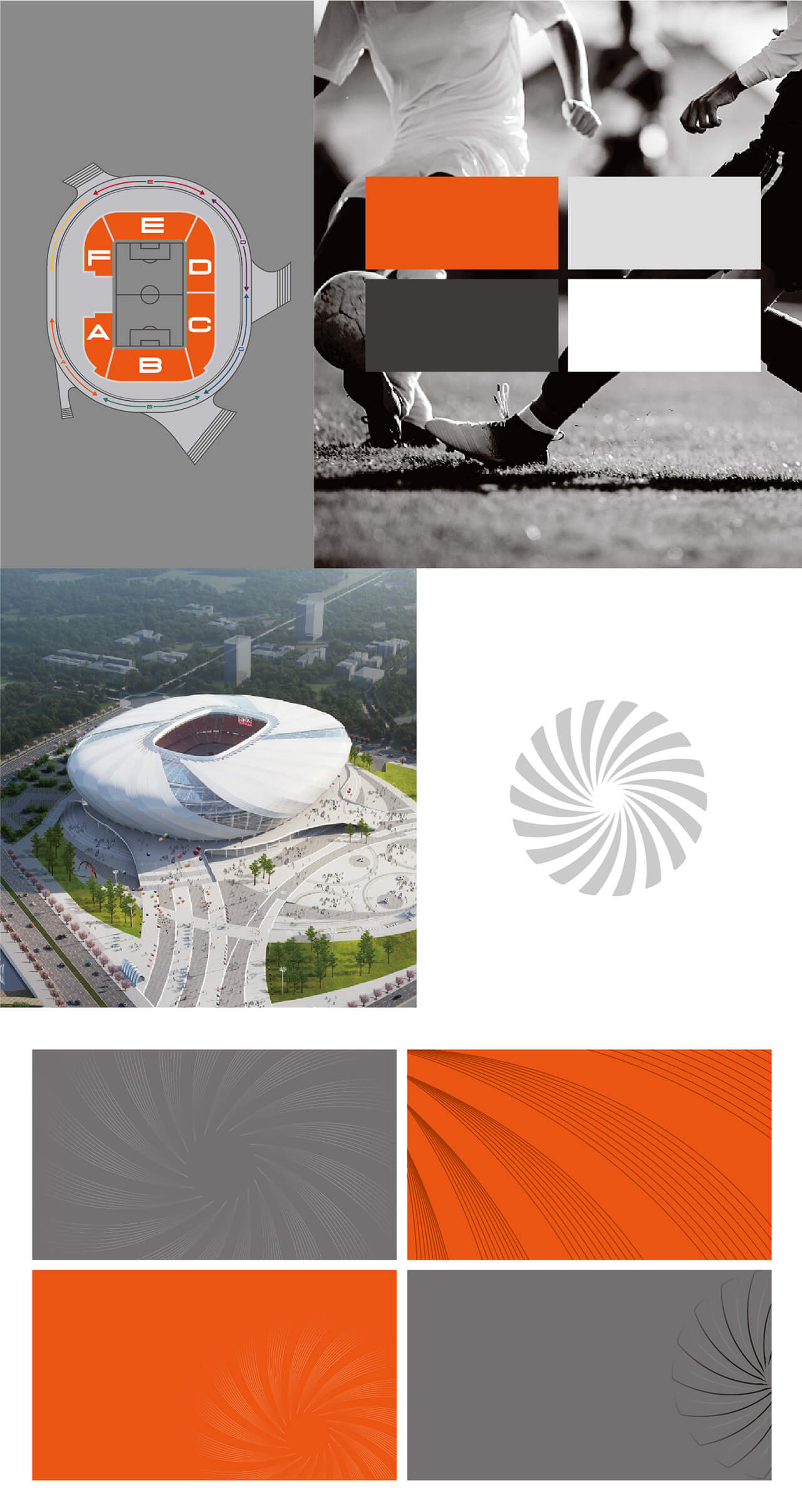
Drawing inspiration from Chongqing’s mountainous city culture, the signage colours reflect the city’s passion and straightforwardness. The bold use of orange-red backgrounds with white text creates a striking visual impact, making information easily accessible. The use of bold fonts combined with concise information layout enhances the clarity of communication.
Both Chinese and English signage feature dynamic, bold fonts, complemented by custom-designed, robust icons that embody the resilient spirit of sports. This creative approach ensures that visitors not only receive information effectively but also feel the unique energy and spirit of Chongqing and its football culture.
Yong’an Urban Lake Forest Park
Hello Nature
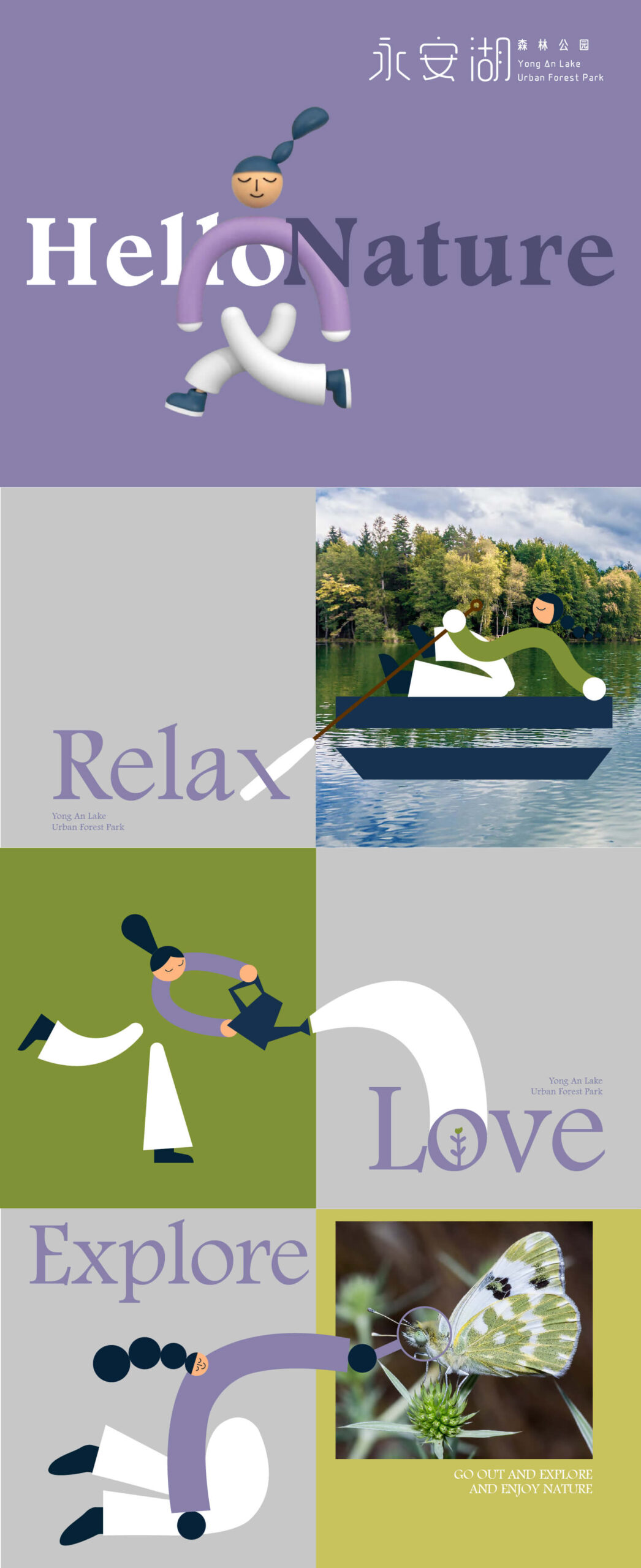
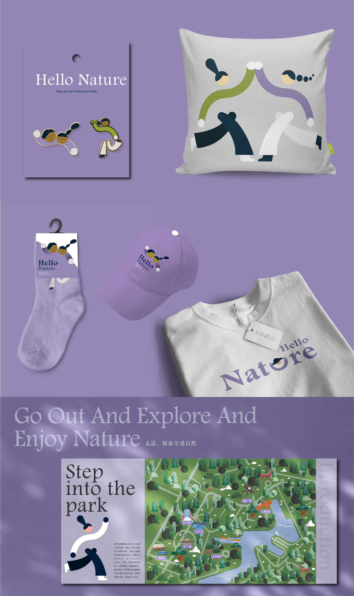
In this concept, we directly use the image of a human as the branding elements of this park, instead of the common natural elements, such as the plants or mountains and waters.
We want to emphasize not only the beauty of nature, but also the people in nature and the rich life experience that nature can bring to us.
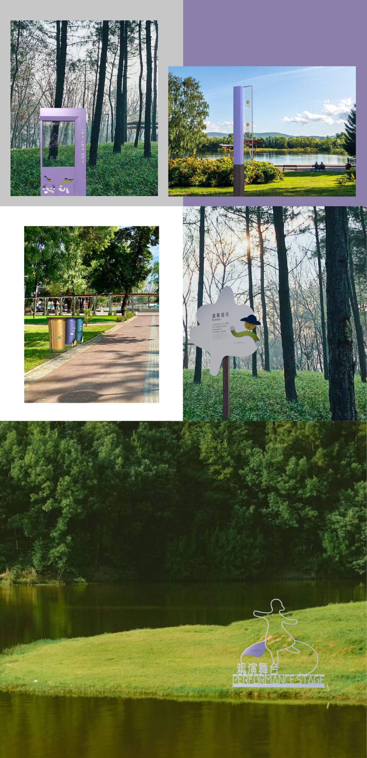
By visualizing the Chinese character “An” in the name of Yong’an Lake as a self-sufficient person in nature and highlighting the feet of the big steps, cheerful hair and squinting eyes. We create a group of characters depicting various activities in the park. We hope that these graphics can bring people closer to nature, awaken people’s interest for nature, guide people to relax in this park, encourage people to take steps and say Hi to nature, then step into and explore and enjoying this place.
bio-town chengdu
The home of global biological people
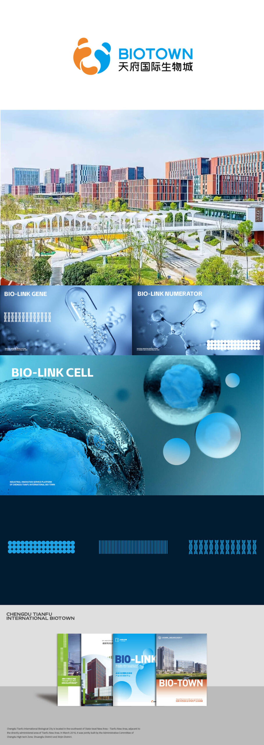
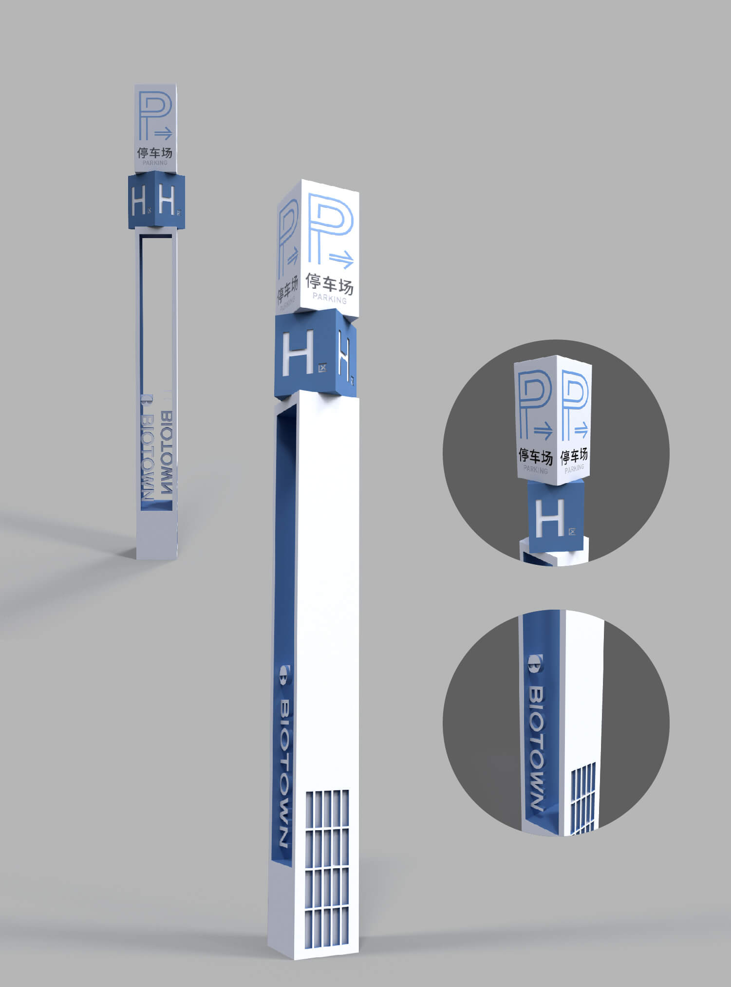
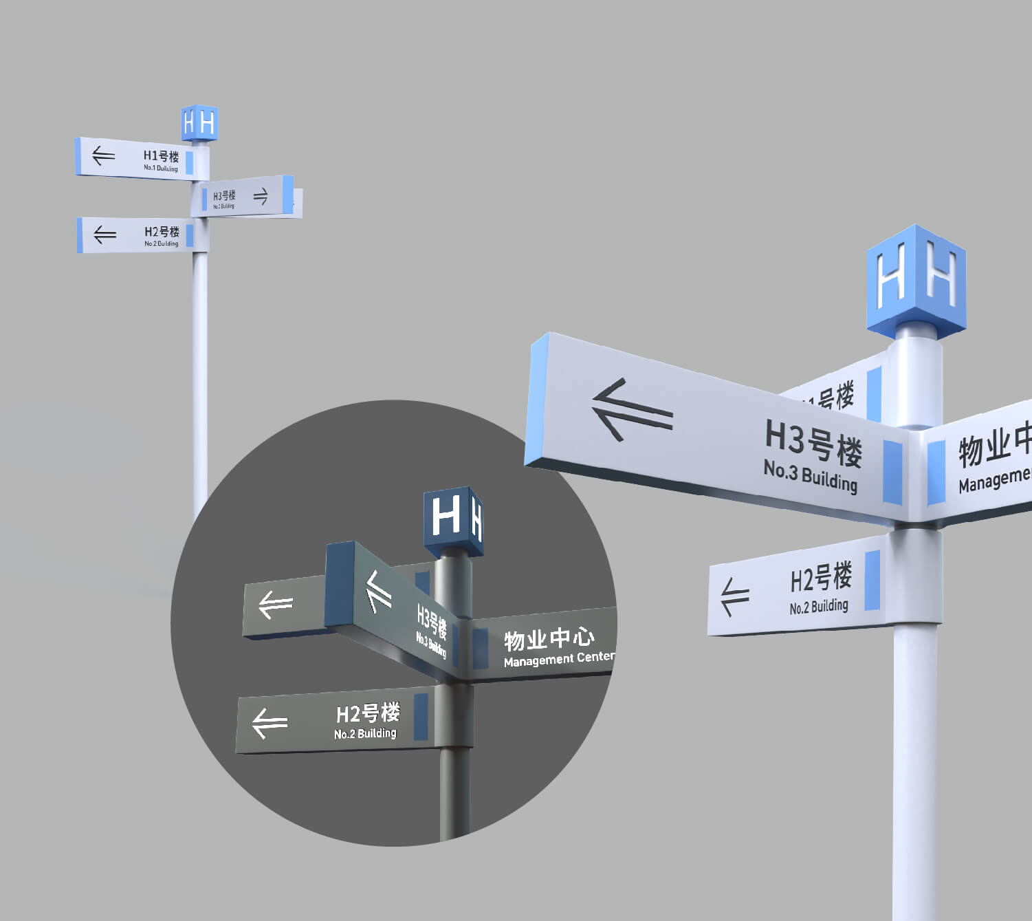
Bio-town, Chengdu’s most cutting-edge biological R&D cluster. The construction period of this town is 30 years, which covers R&D centers, factories, residential communities, schools and shopping mall, providing complete living facilities for scientists.
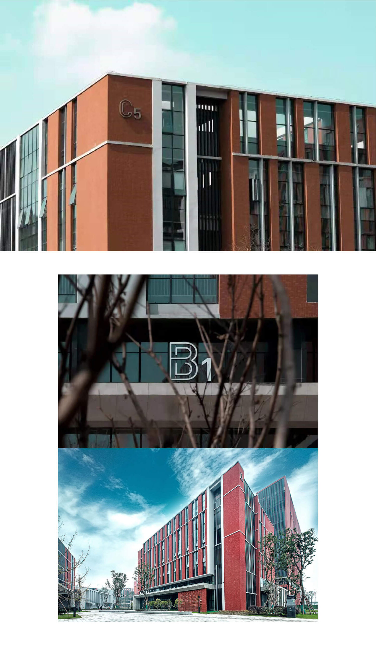
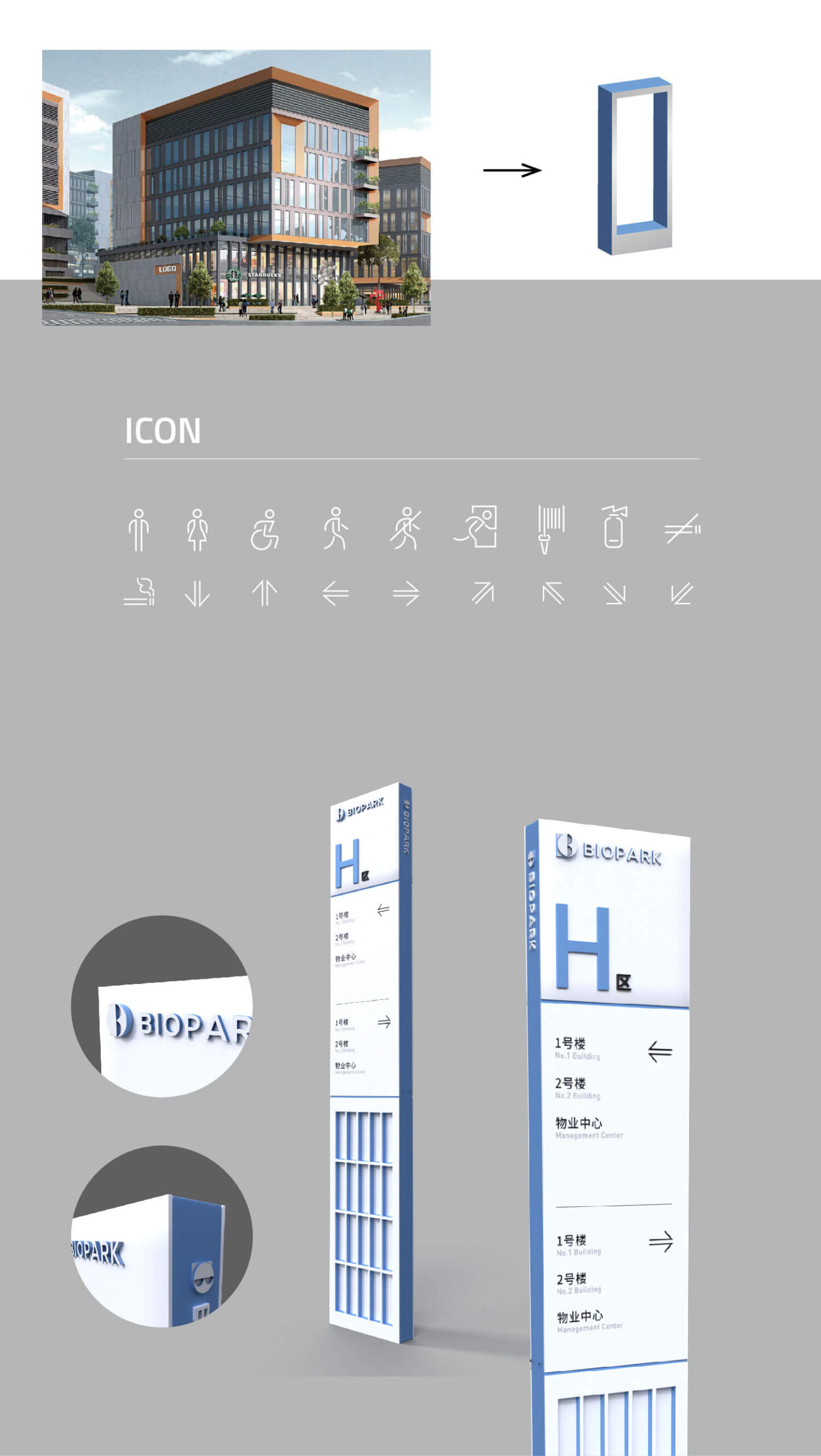
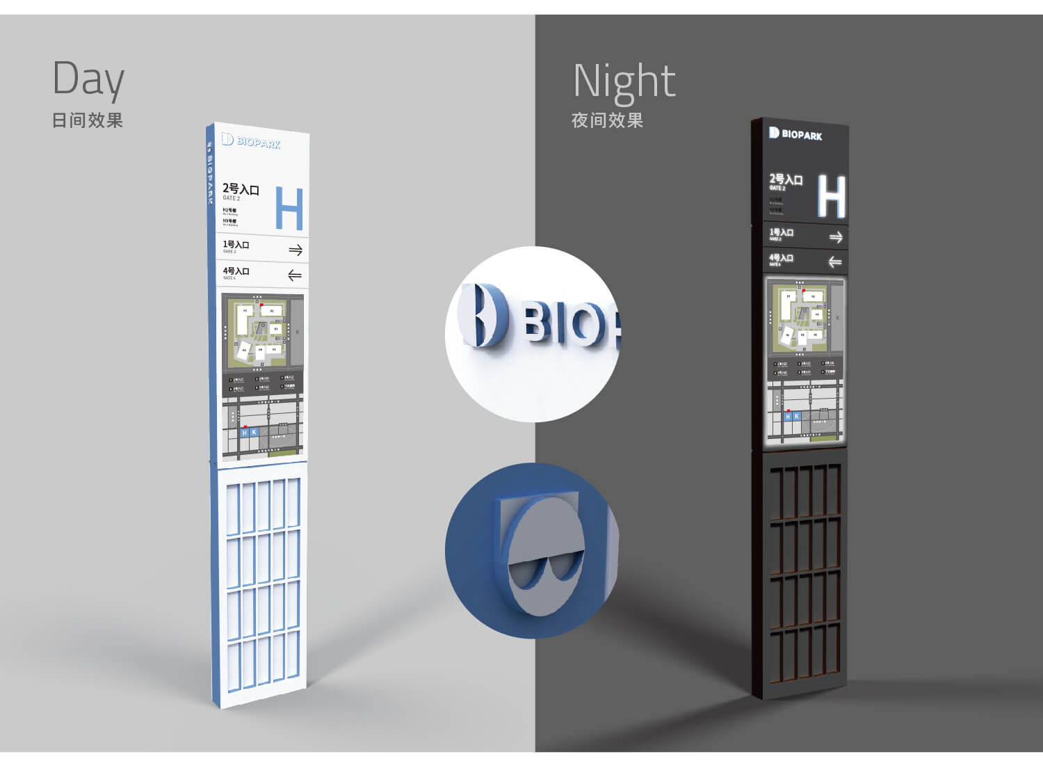
Over the past 8 years, we have provided this town with a full range of design from branding identity to environment design.
We extracted cells, genes and other elements from a biological perspective and integrated them into the design to form our own visual style.
Jingze Biological
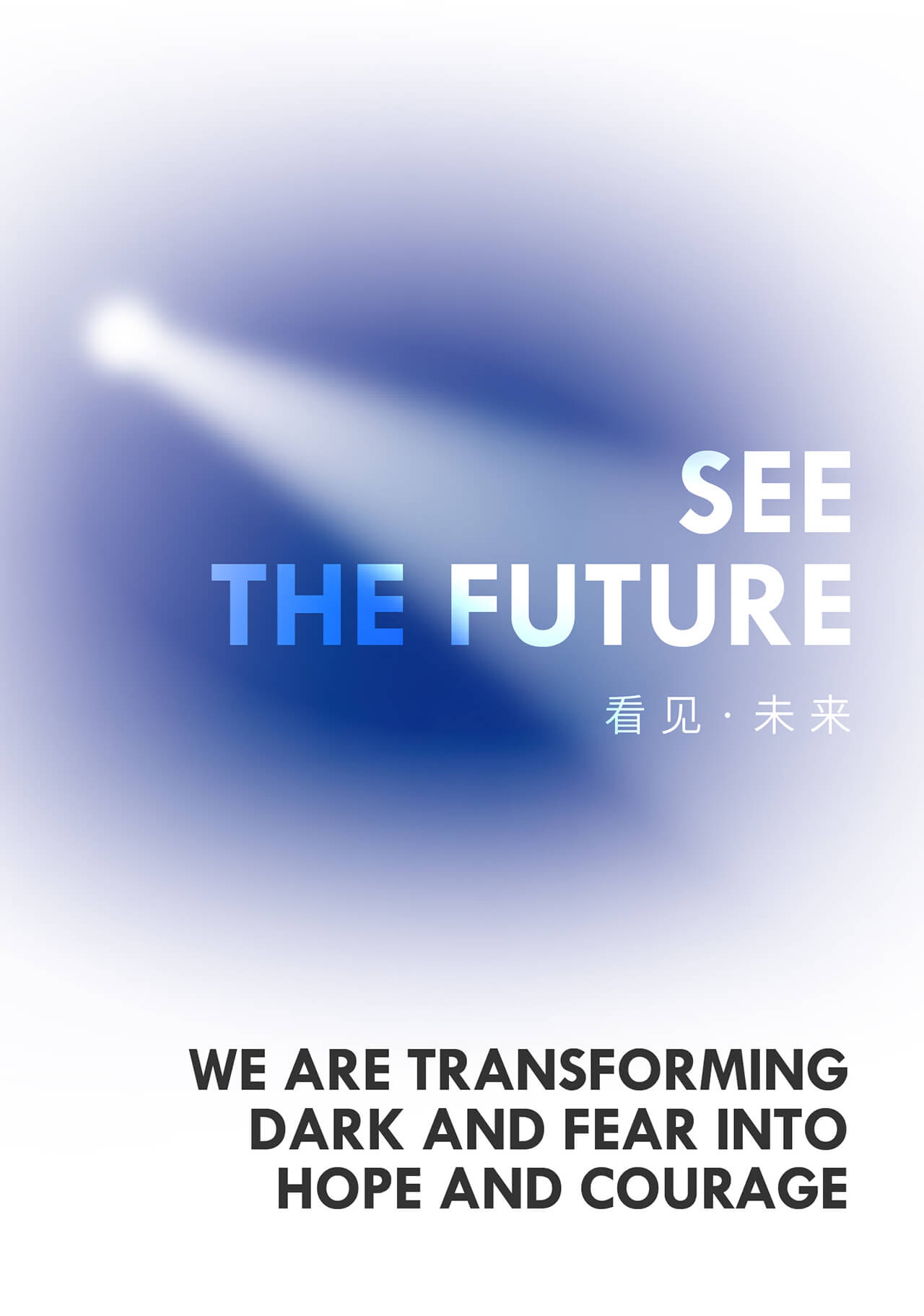
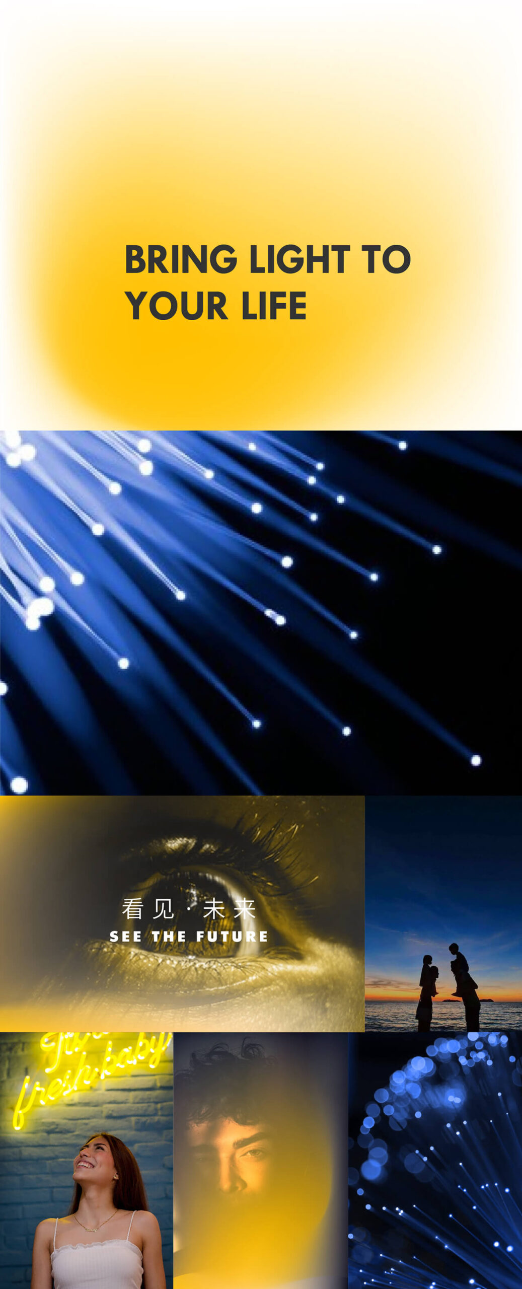
See The Future
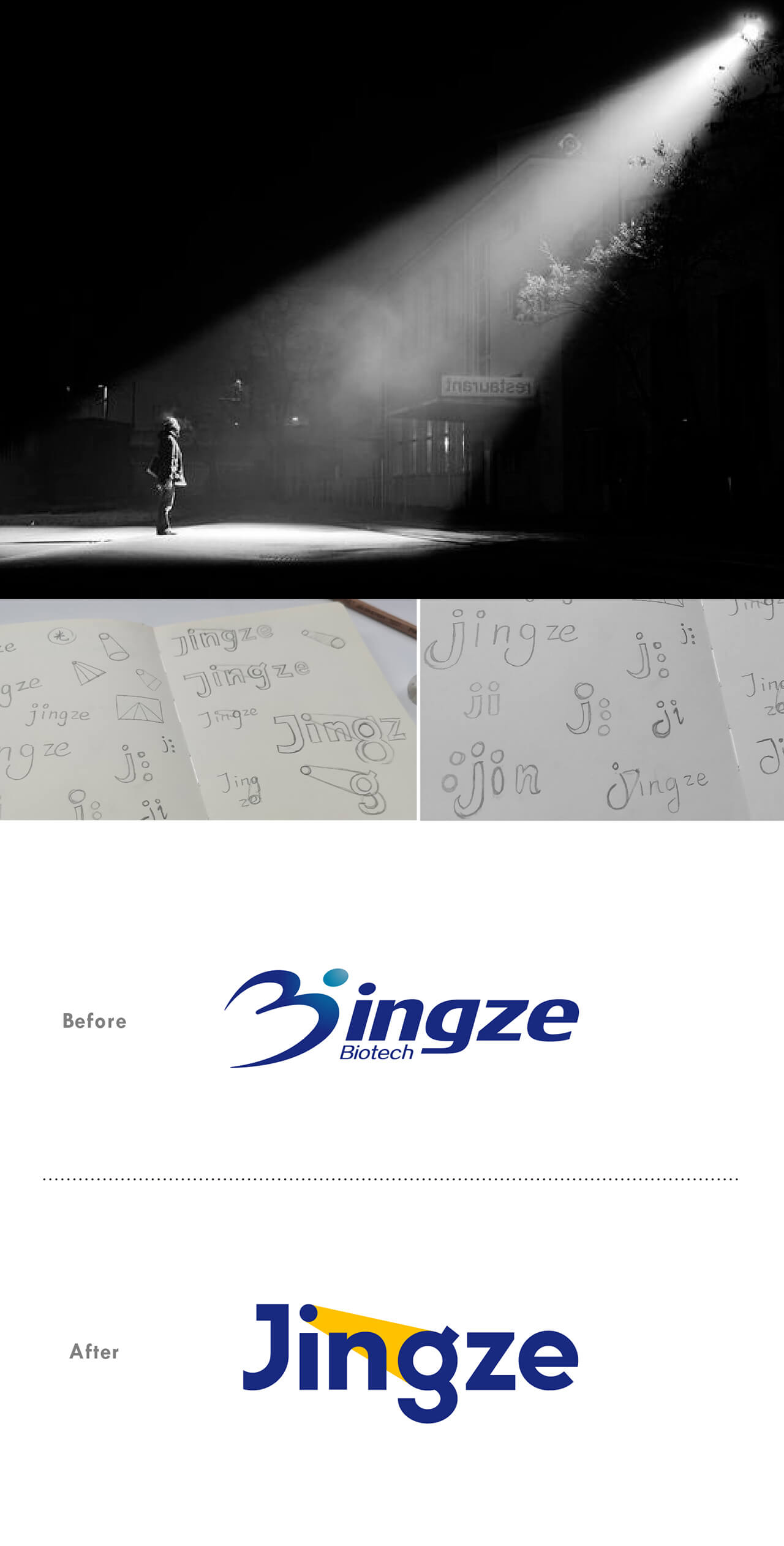
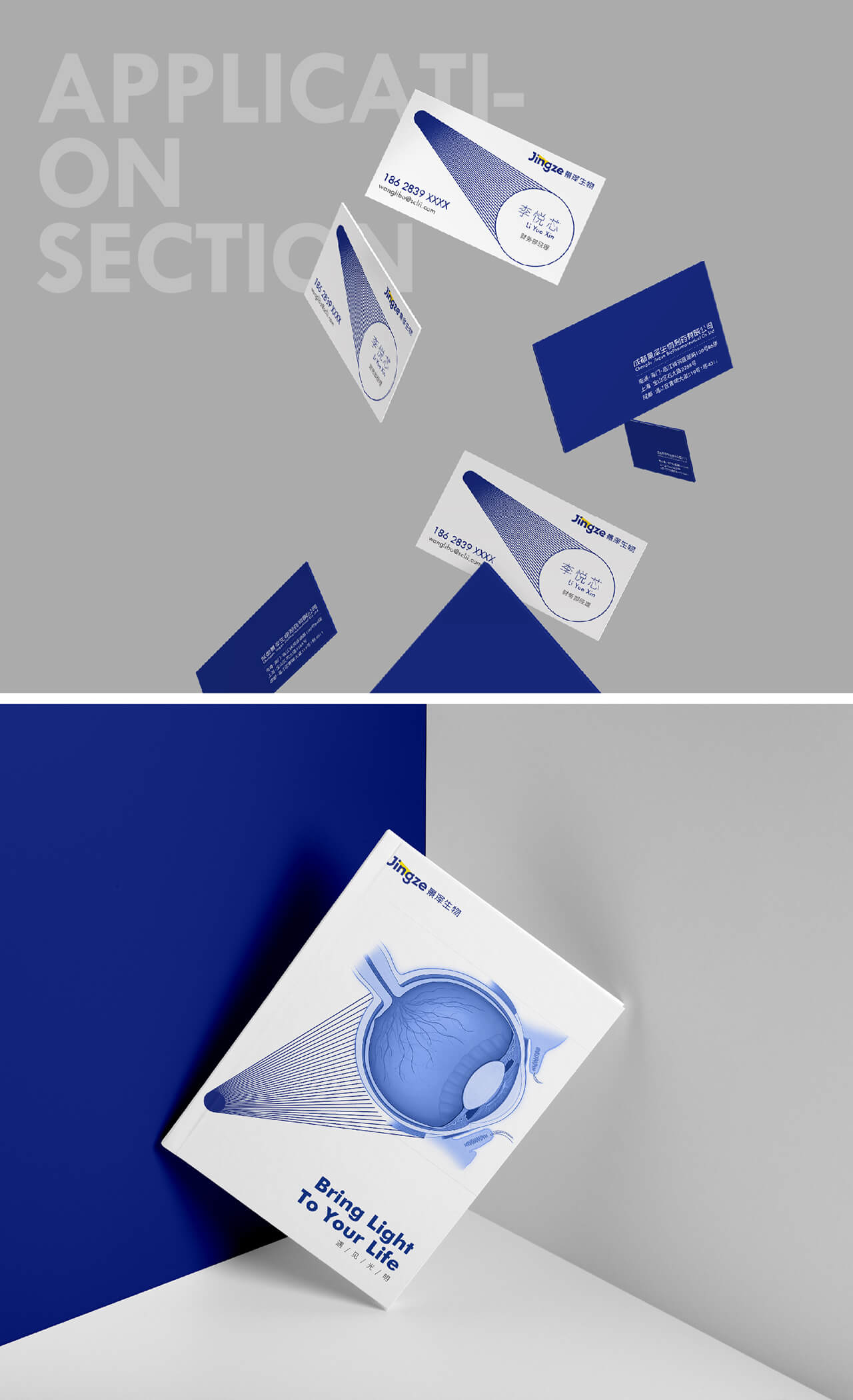
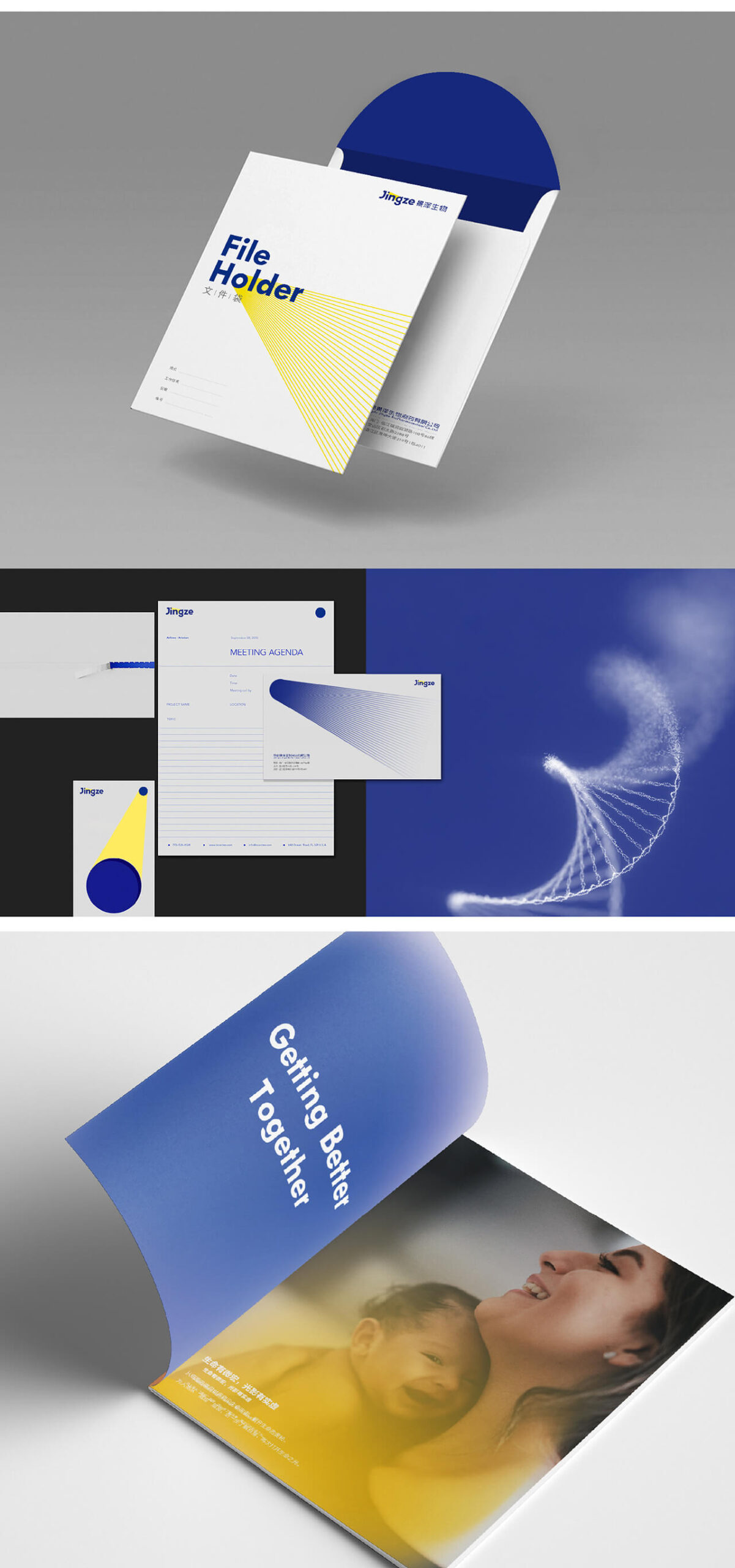
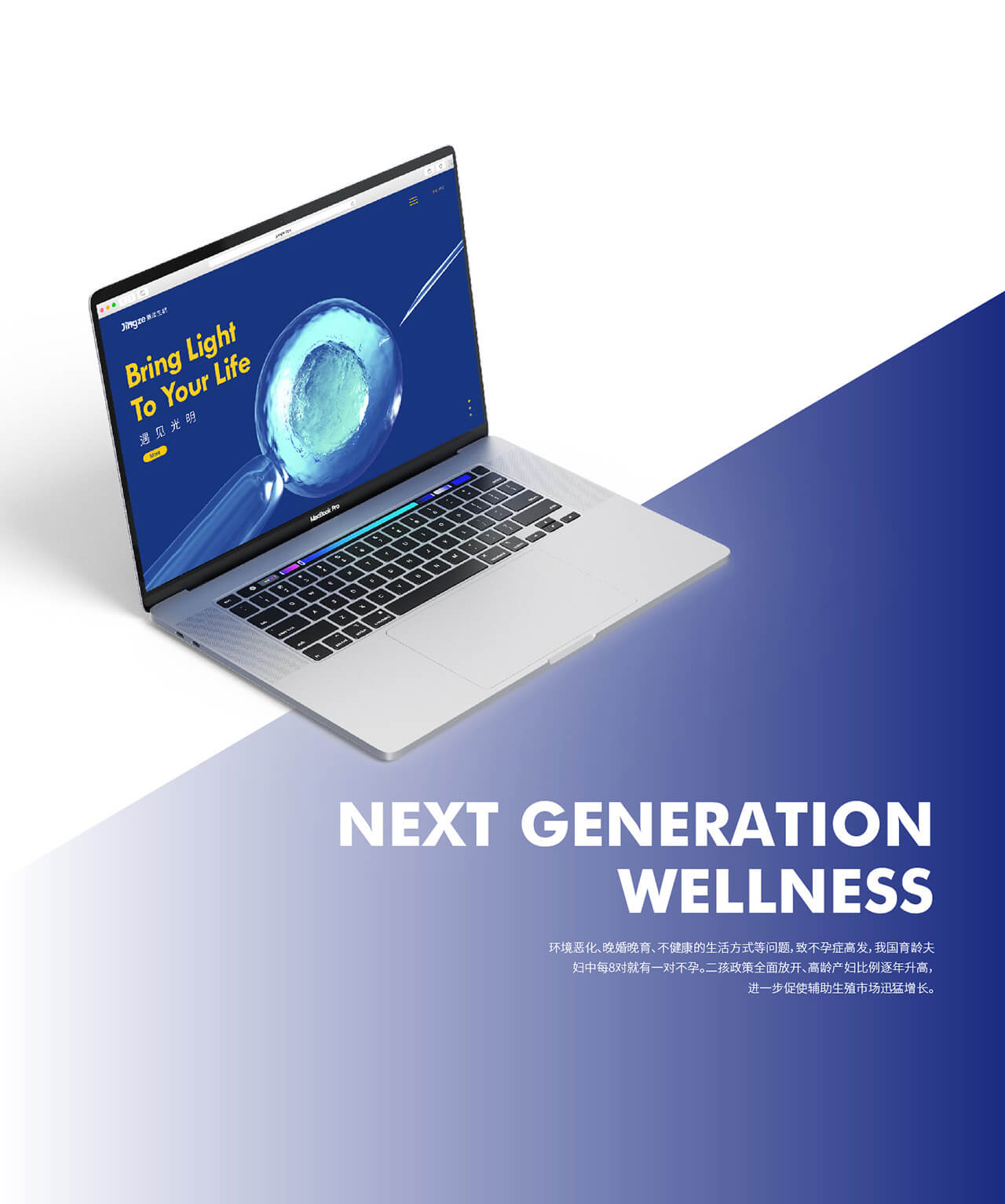
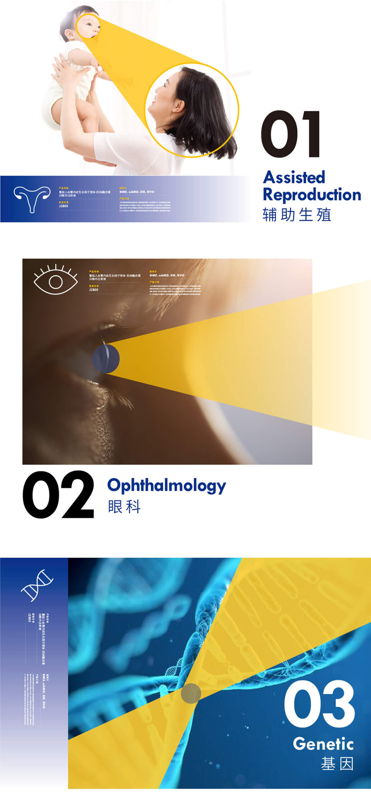
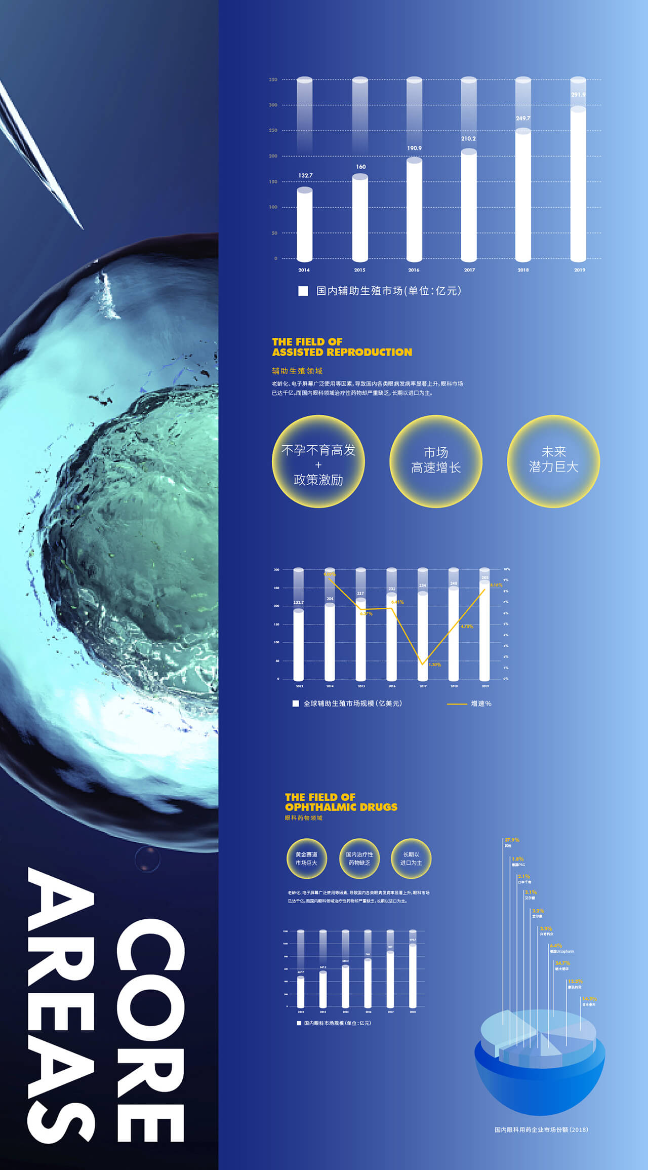
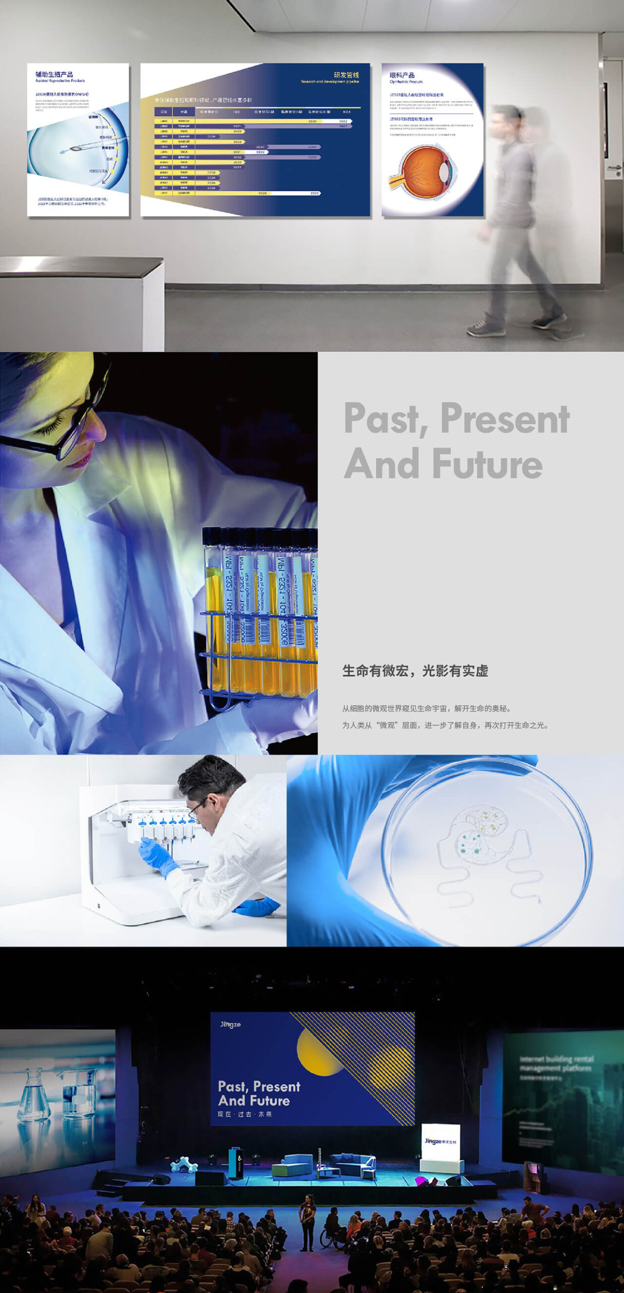
Jingze Biological was born in Shanghai in 2014. Jingze focuses on the felds of ophthalmology, assisted reproduc-tion, and tumor treatment, and is determined to become the frst brand in the feld of ophthalmology in China. At the same time, it leads the assisted reproductive industry.
“WE ARE TRANSFORMING DARK AND FEAR INTO HOPE AND COURAGE”
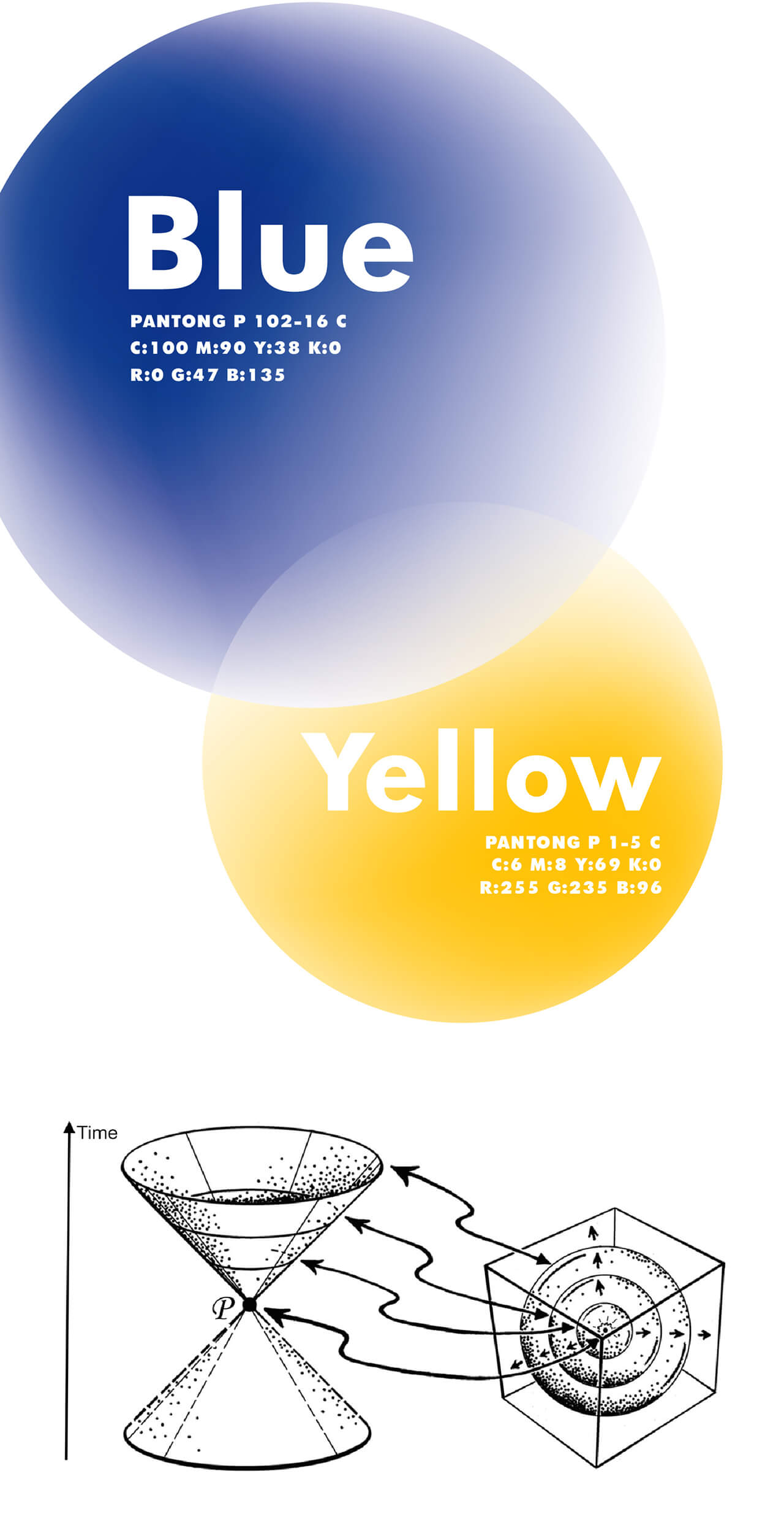
We think that Jingze are like the light cones of time in the theory of relativity. As the intersection of two time and space, Jingze connect the past, present and future.Blind patients who have been treated can start their lives anew.So ophthalmology is a subject that focuses on “now”, because the eyes are always watching the present. Jingze Biology also includes the feld of reproduction, this is a topic about the future. Although human can see the present but life is limited. Only by extending life can we expand into more unknowns.
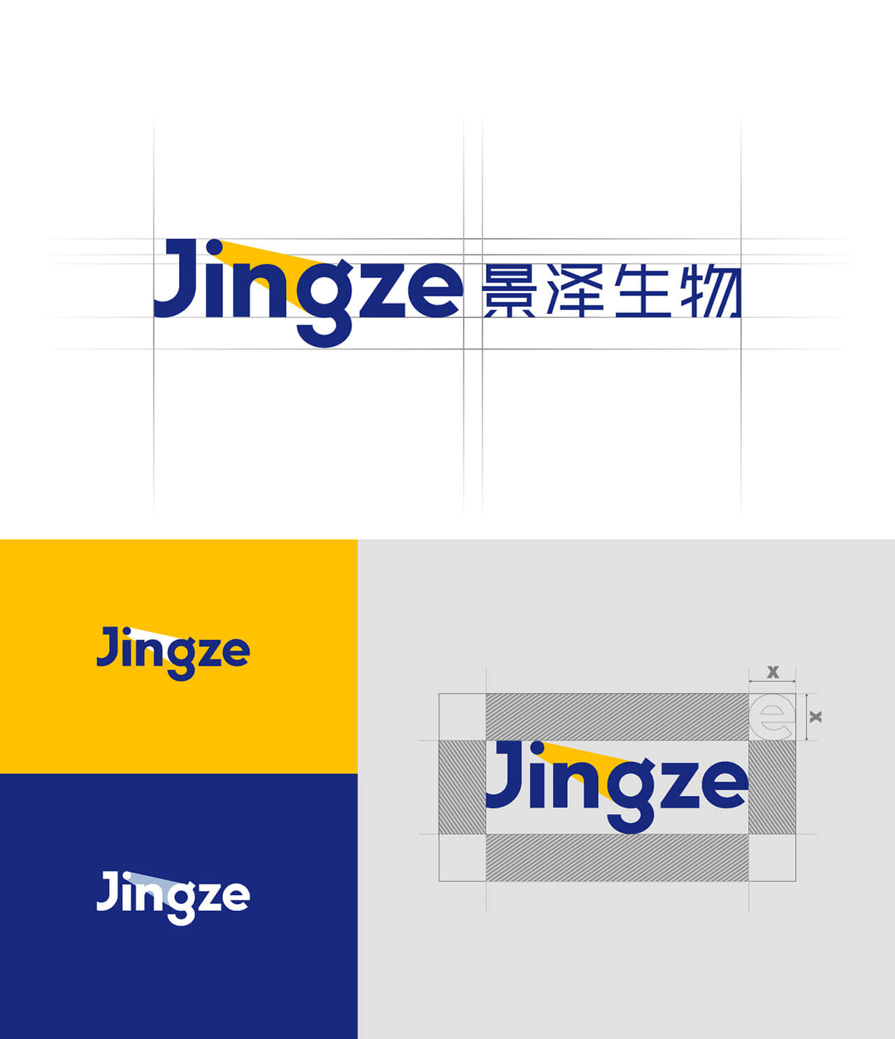
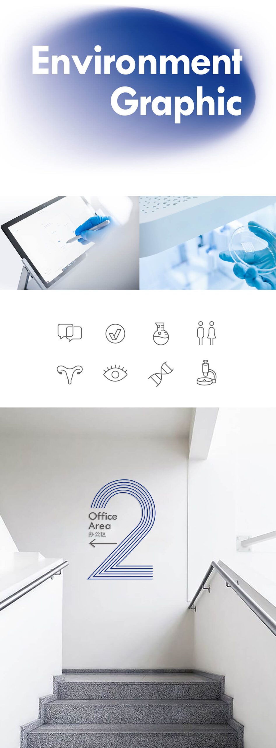
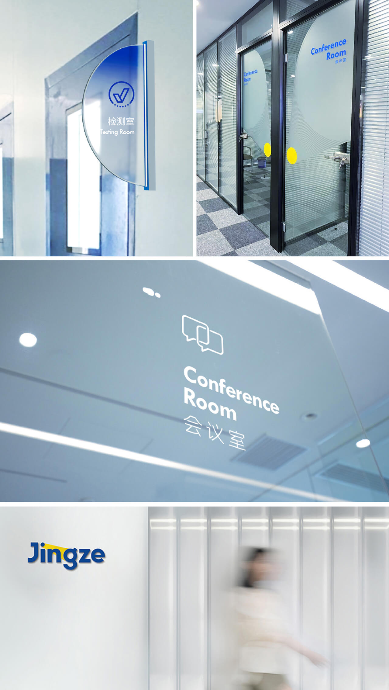
“Explore”, “Future”, “Continuation”, and “Link” are the key words of this concept. We start from the typographic and use two circles as the basic element to express the rela-tionship between the two times.At the same time, the overlap and change of the two circles allow the graphics to simultaneously represent of the company’s attention-oph- thalmology and reproduction.
With a new brand story, logo, and visual identity Jingze’s third round of fnancing exceeded 400 million in 2021. At the same time Jingze Bio’s innovative ophthalmic drugs have also entered clinical development to beneft more patients.
SCAINIM TECHNOLOGY
THE LIMIT AND THE INFINITY
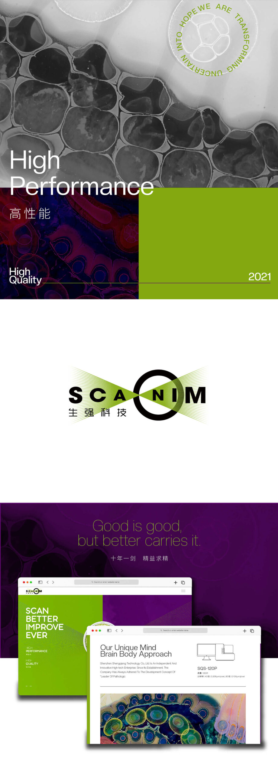
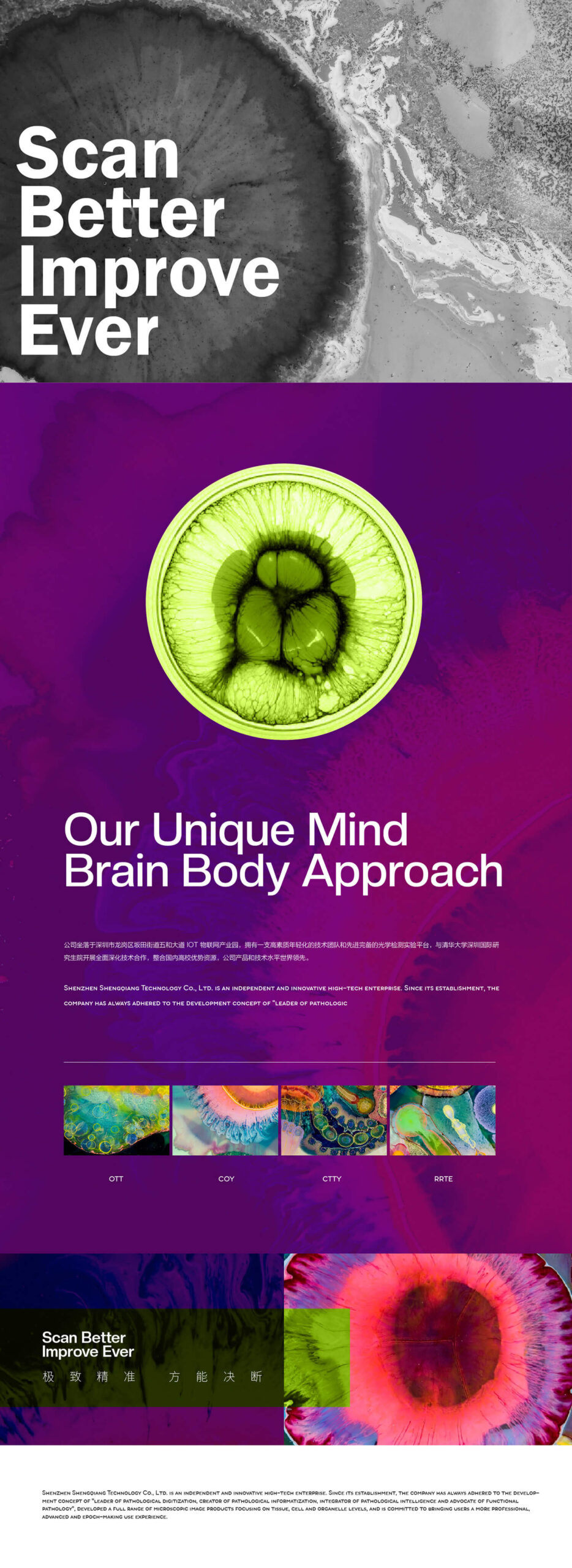
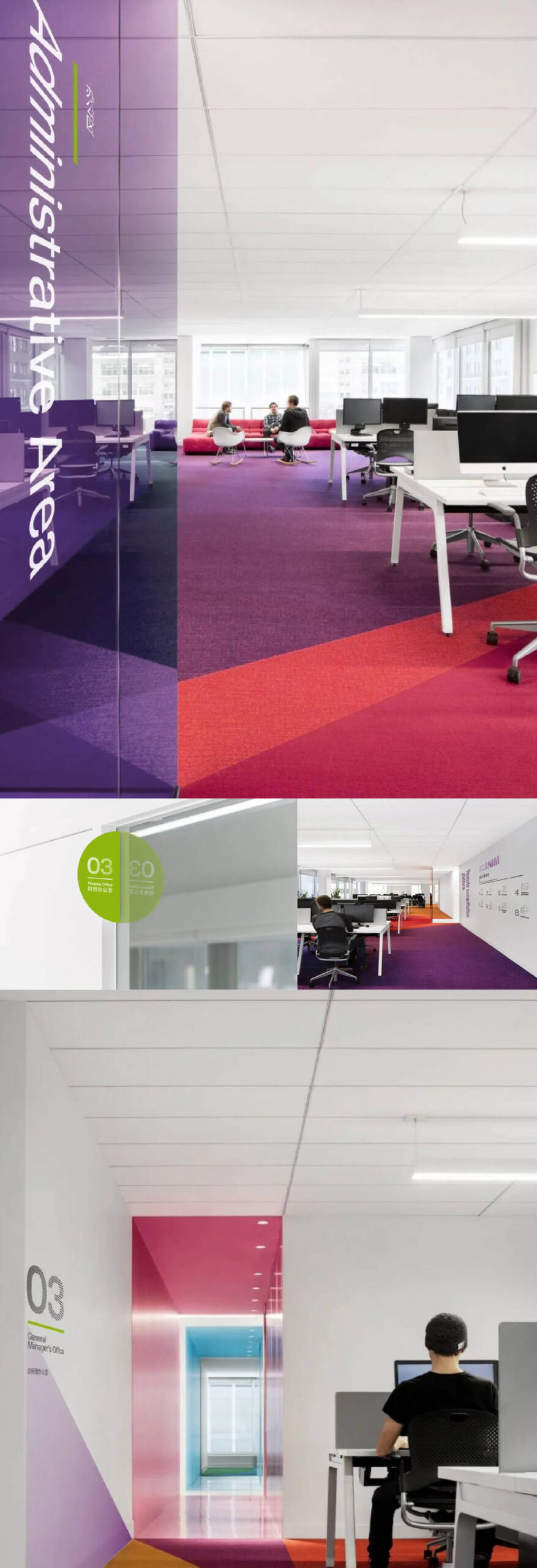
During the creation process, we were deeply shocked by the cell photos taken by SCAINIM’s optical microscope, the small histocytes on the slides used for pathological research look so magnificent and beautiful after being stained and magnified.
In logo design, we studied the imaging principle of the optical microscope, the flagship product of Shengqiang, from which we extracted the circles representing the lens and broken lines representing the light, logo graphics show the magic moment when light meets the lens, and the instruments capture the light source through the lens and focus on a point to enlarge the English brand name of Shengqiang, the beam of light further highlights the core technology of Shengqiang – scanning.
SYI TSING ENERGY TECH
Technology makes the earth greener
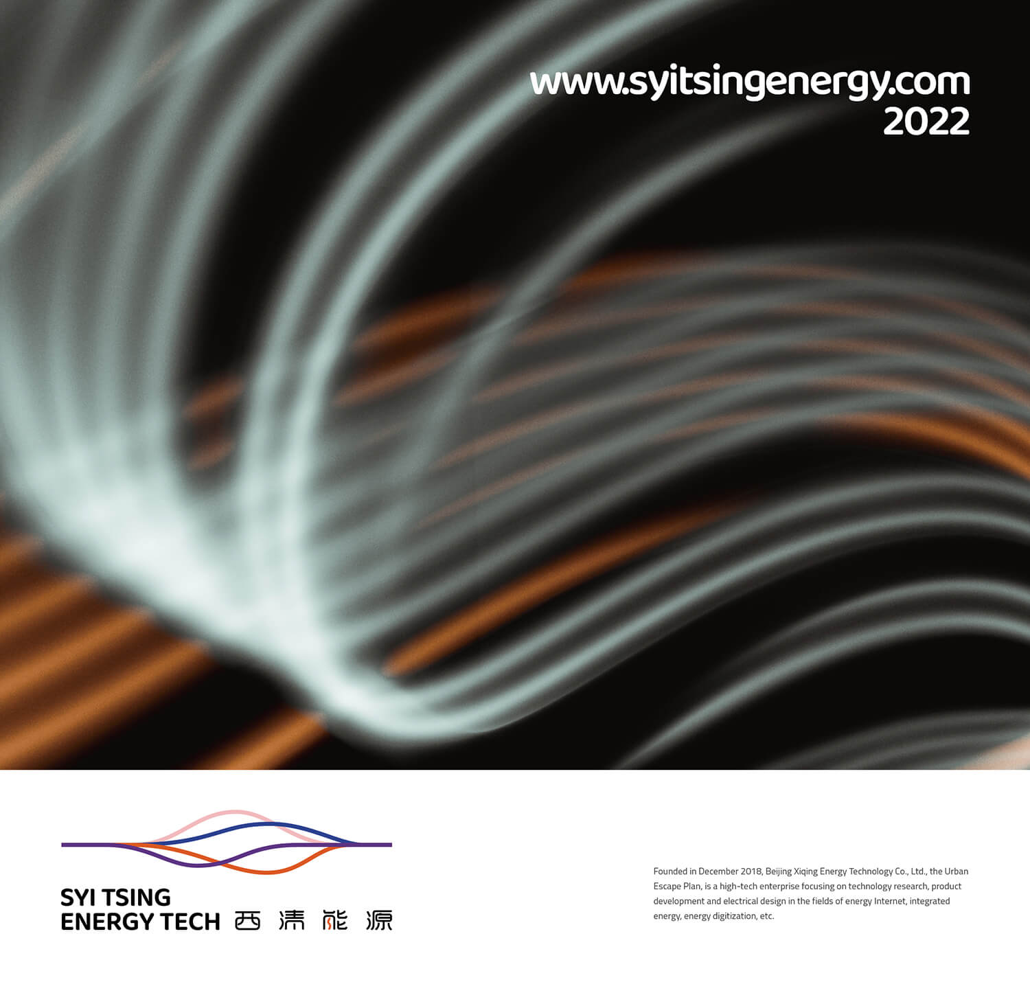
SYI TSING Energy uses artificial intelligence to provide digital solutions for energy.
We have spent the past year injecting new insights into the brand.
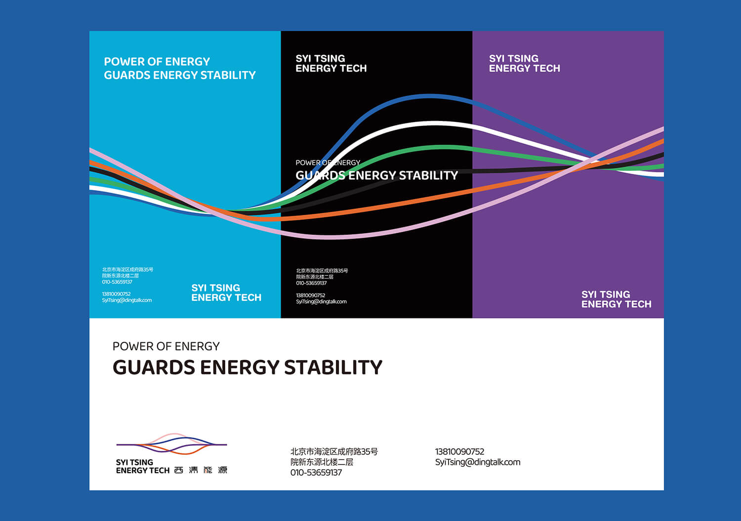
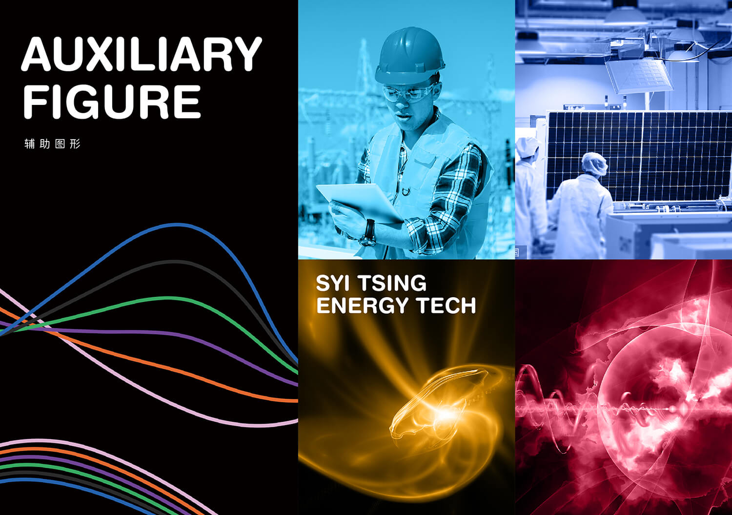
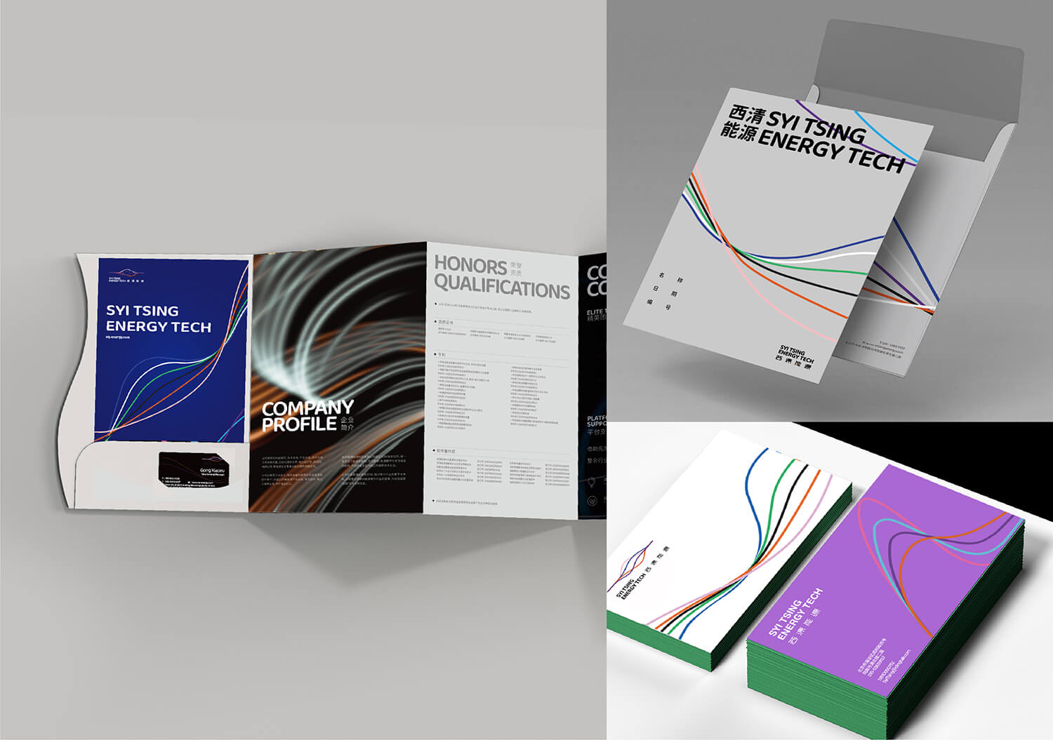
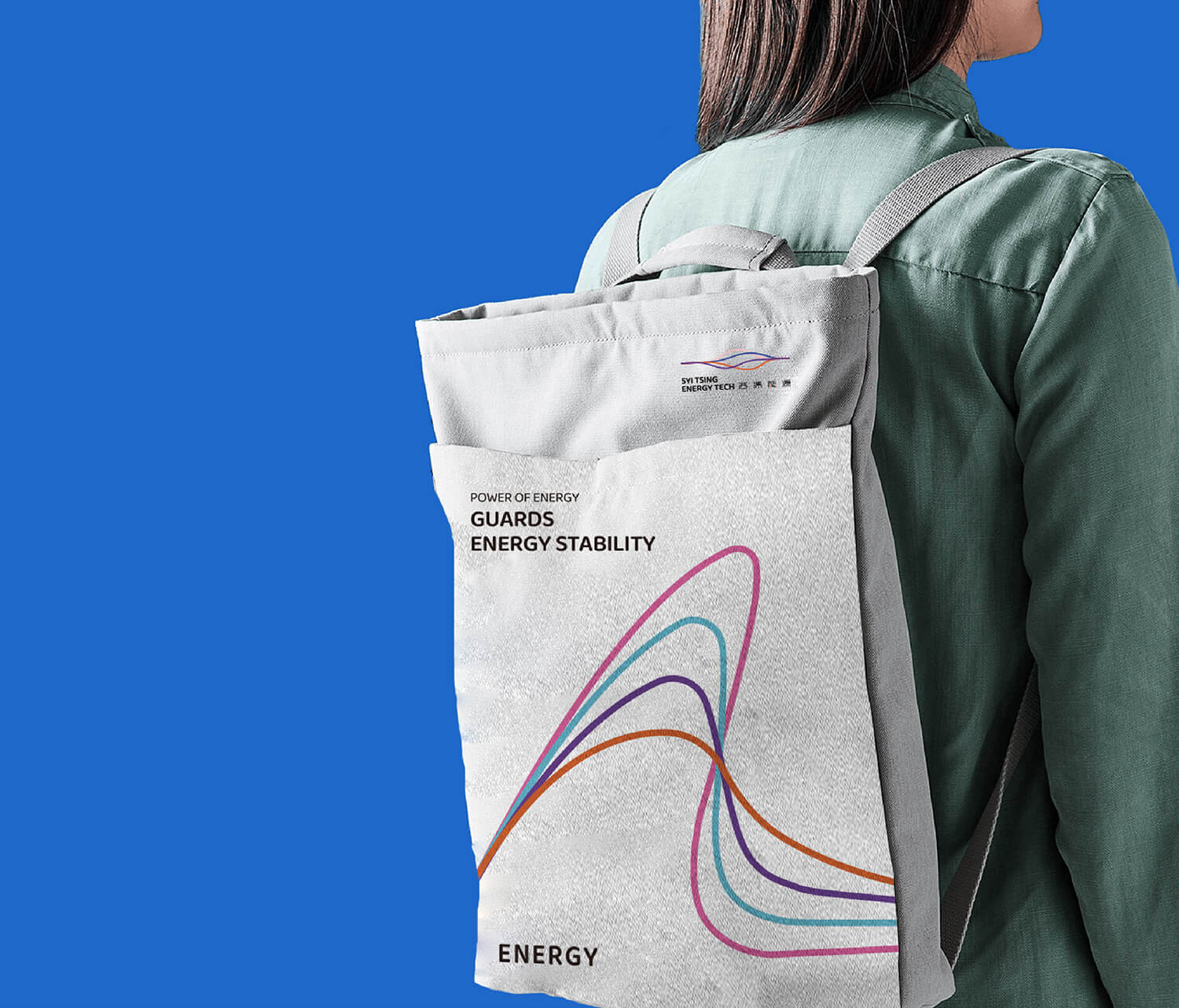
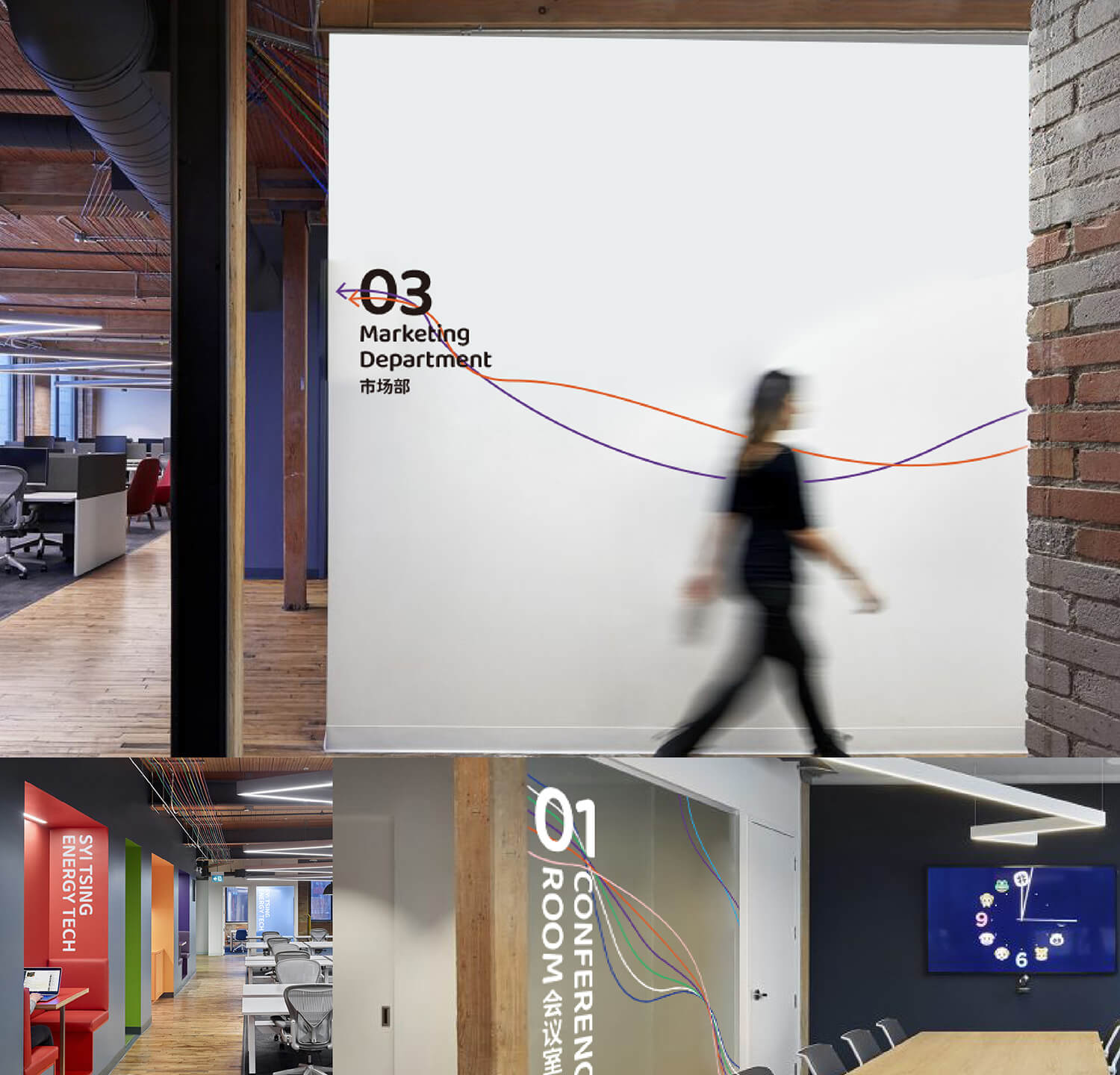
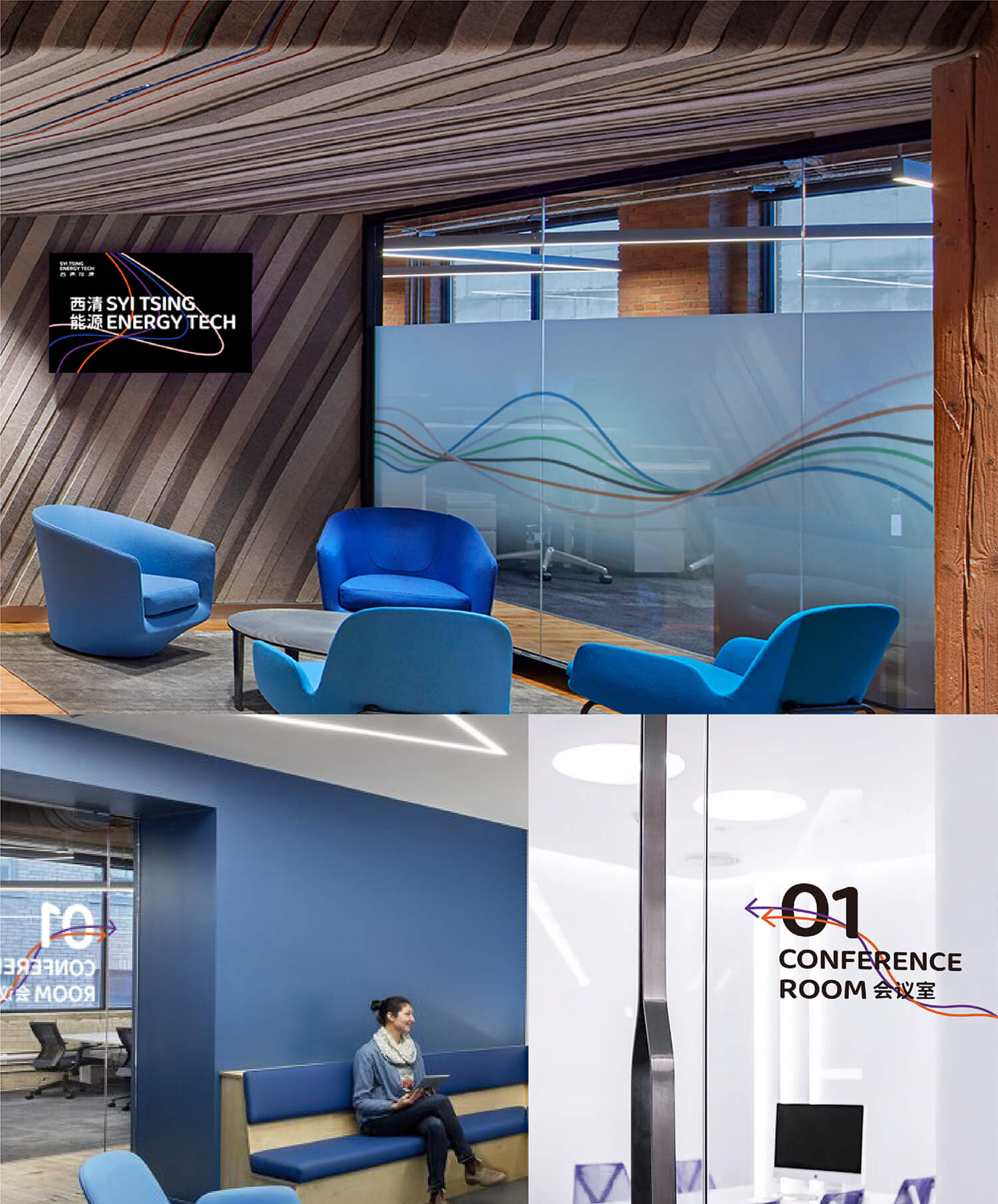
The interlacing lines represent energy waves.We use four different colors to represent each energy. Flowing lines can become interesting and creative in animation and future communication.
We did not use the design methods of traditional technology companies, injecting more humanistic and artistic expression into Xiqing Energy, and stood out in the visual expression of similar companies.
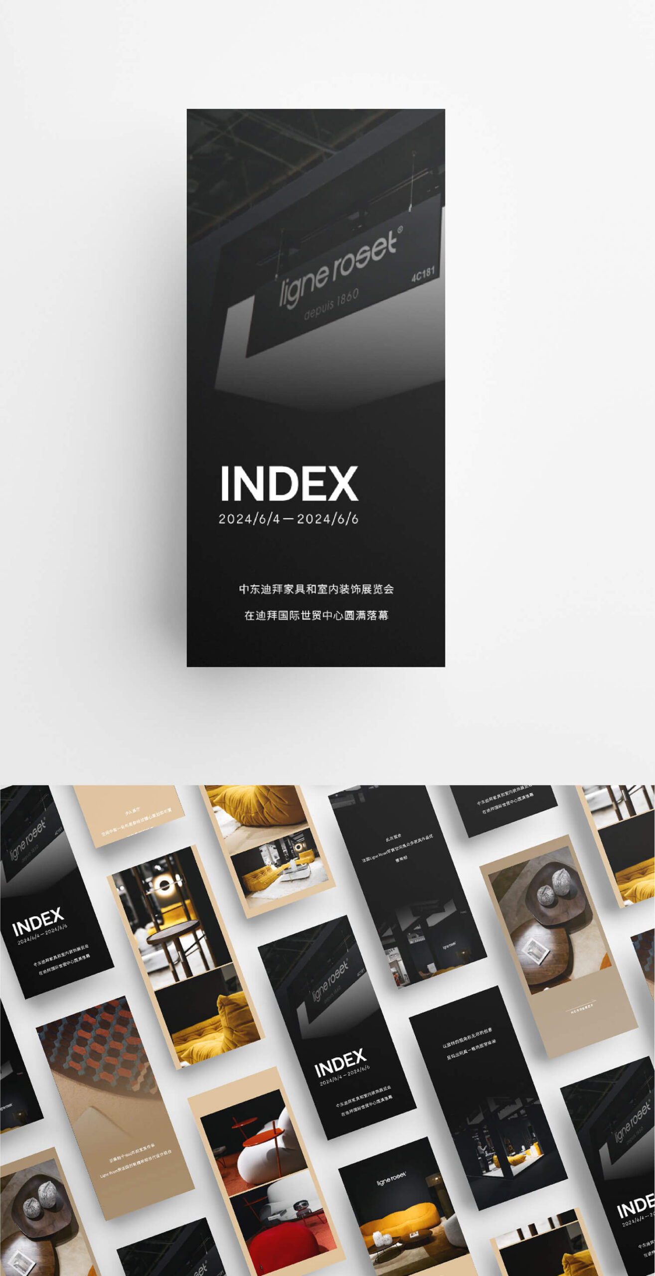
ligne roset
A home furnishing brand with a history of 130 years
Ligne Roset is synonymous with modern luxury and invites consumers to enjoy a contemporary and avant-garde lifestyle.
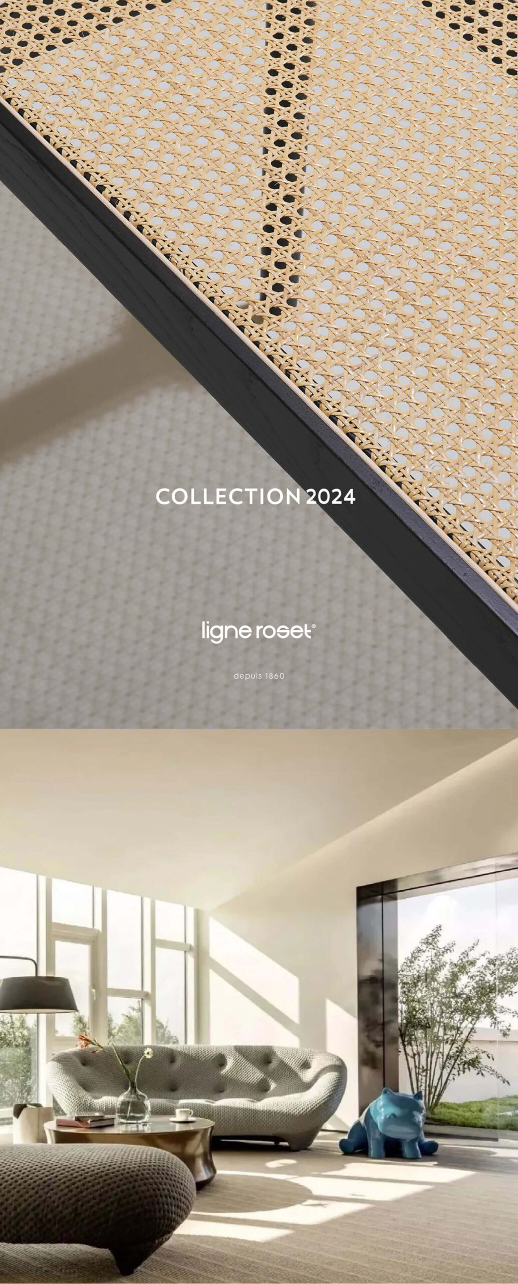
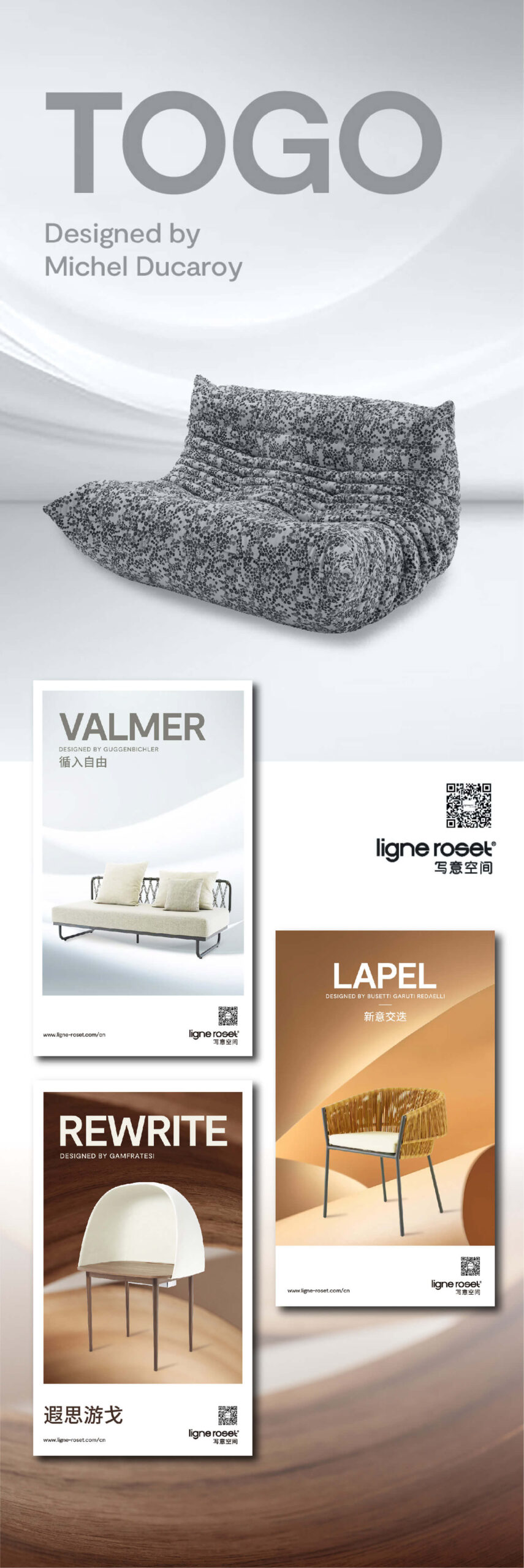
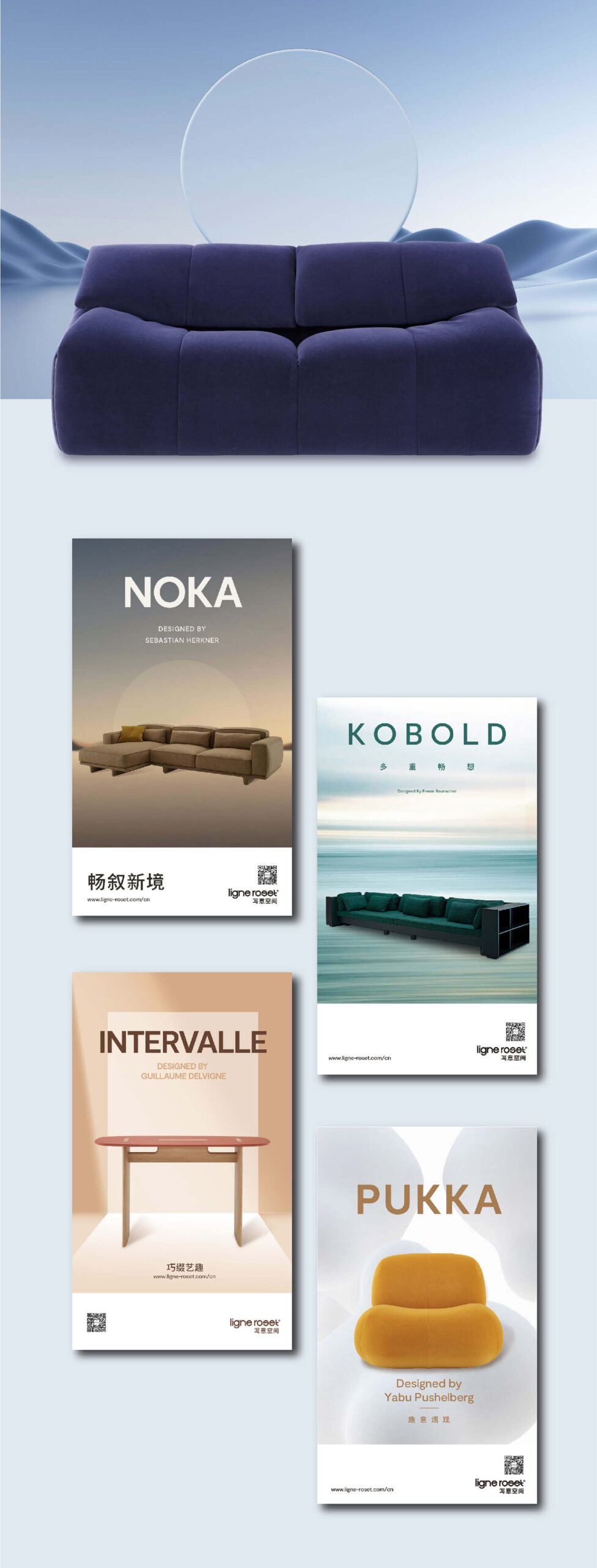
We have provided promotional design services for this brand in China for three consecutive years. In each promotion, we combine the characteristics of each product with the corresponding nodes, and use minimalist design techniques to convey the brand’s culture.
In terms of color, we all use low-saturation colors to maximize the style of the furniture itself. At the same time, minimalist expressions are used in layout to highlight the high-end tone of the brand.
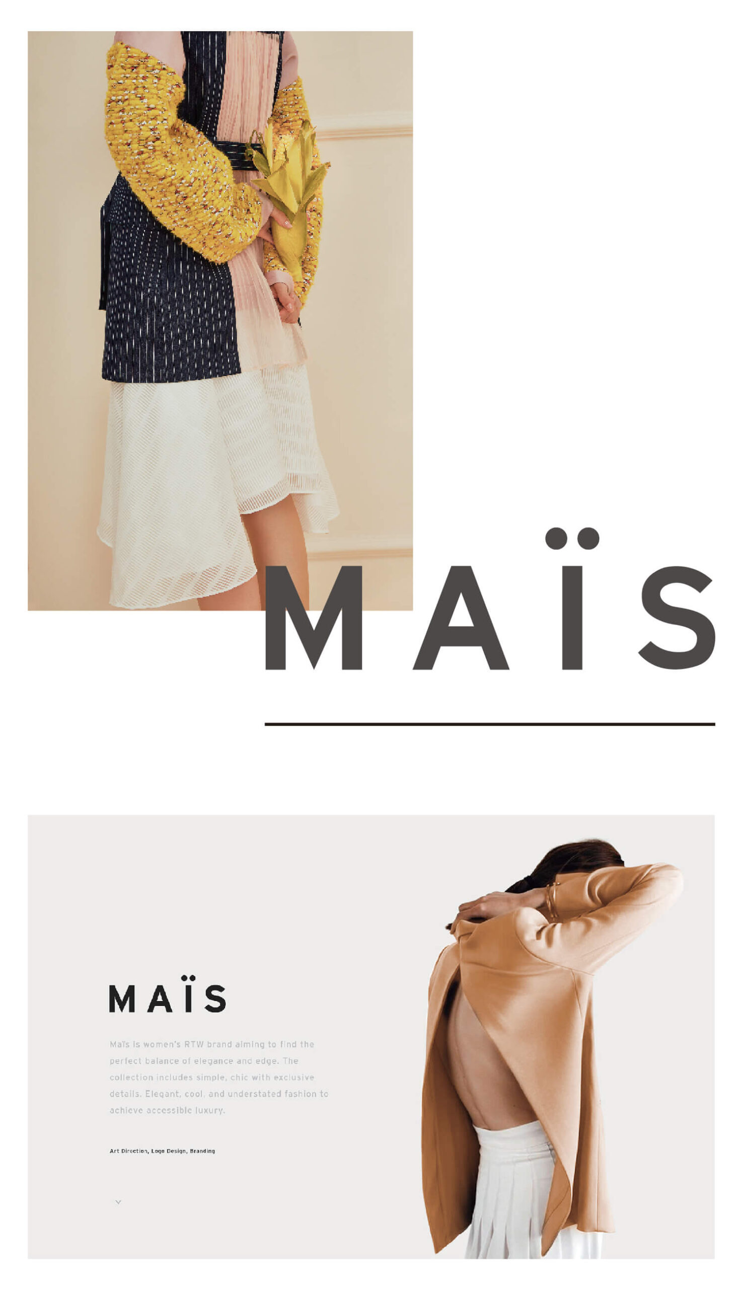
mais
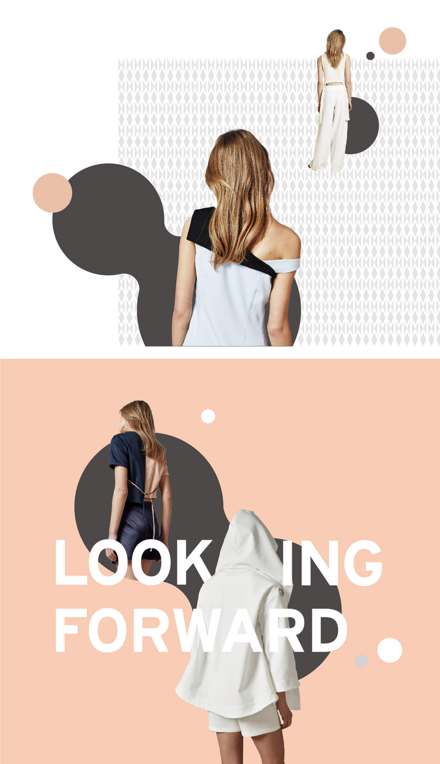
ELEGANCE IN REBELLION
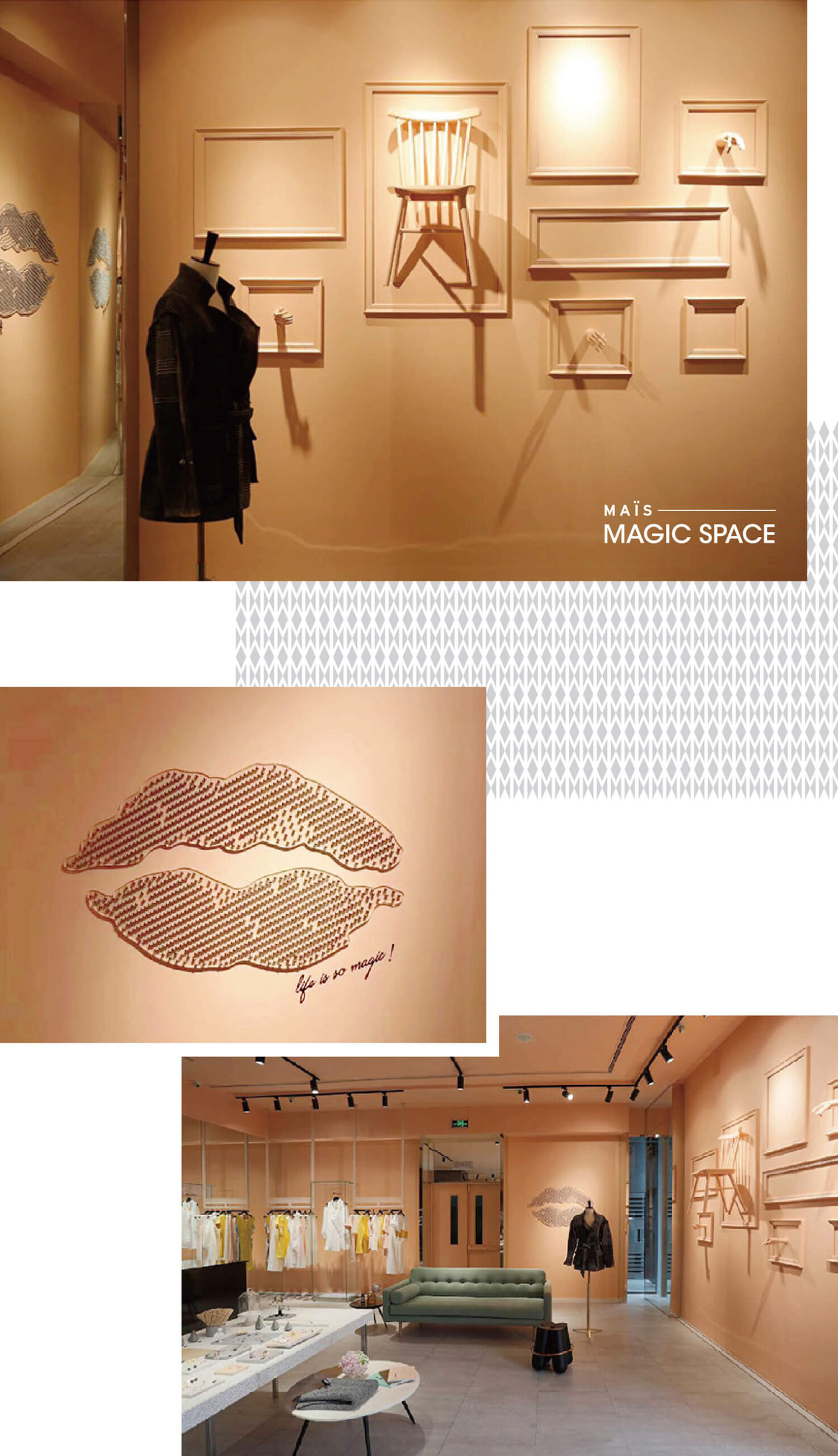
The brand comes from California, USA. In the brand planning and design, we chose pink and gray to emphasize the brand spirit. Interpret a sense of chicness and softness, bringing space for imagination. In the store, we have strengthened the display of art installations and applied them to the walls to create an abstract and dreamy feeling.
We chose the M in the brand name as the main pattern and extended it to all brand materials to form a unified visual symbol.
TIANFU NO.7 HIGH SCHOOL
Design for the generation after 10s
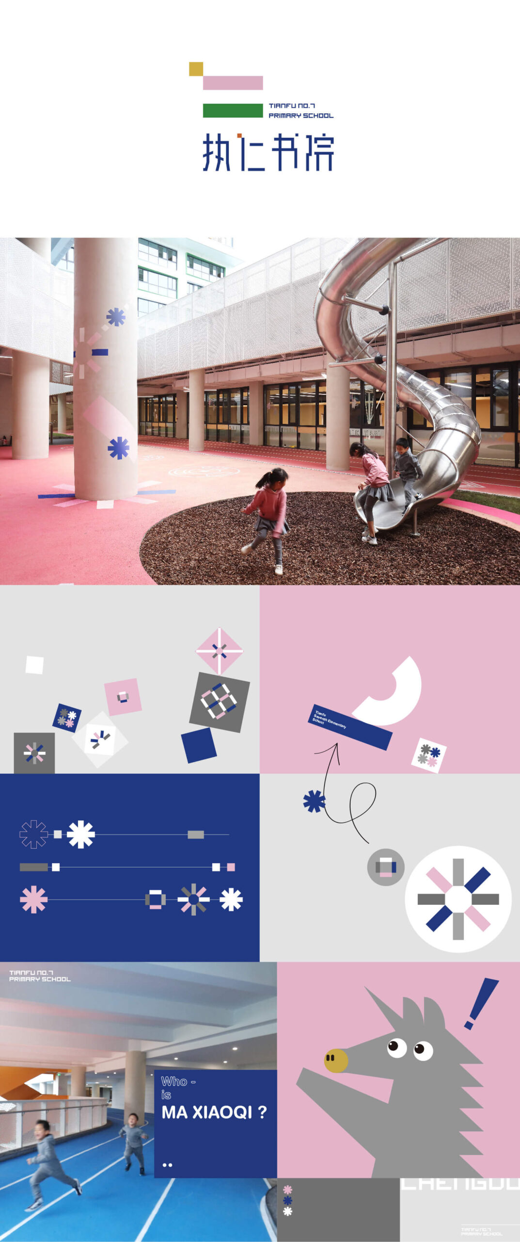
In this case, we believe that the Chinese character “Ren” in the name of the Zhiren primary school is the key to the design concept.
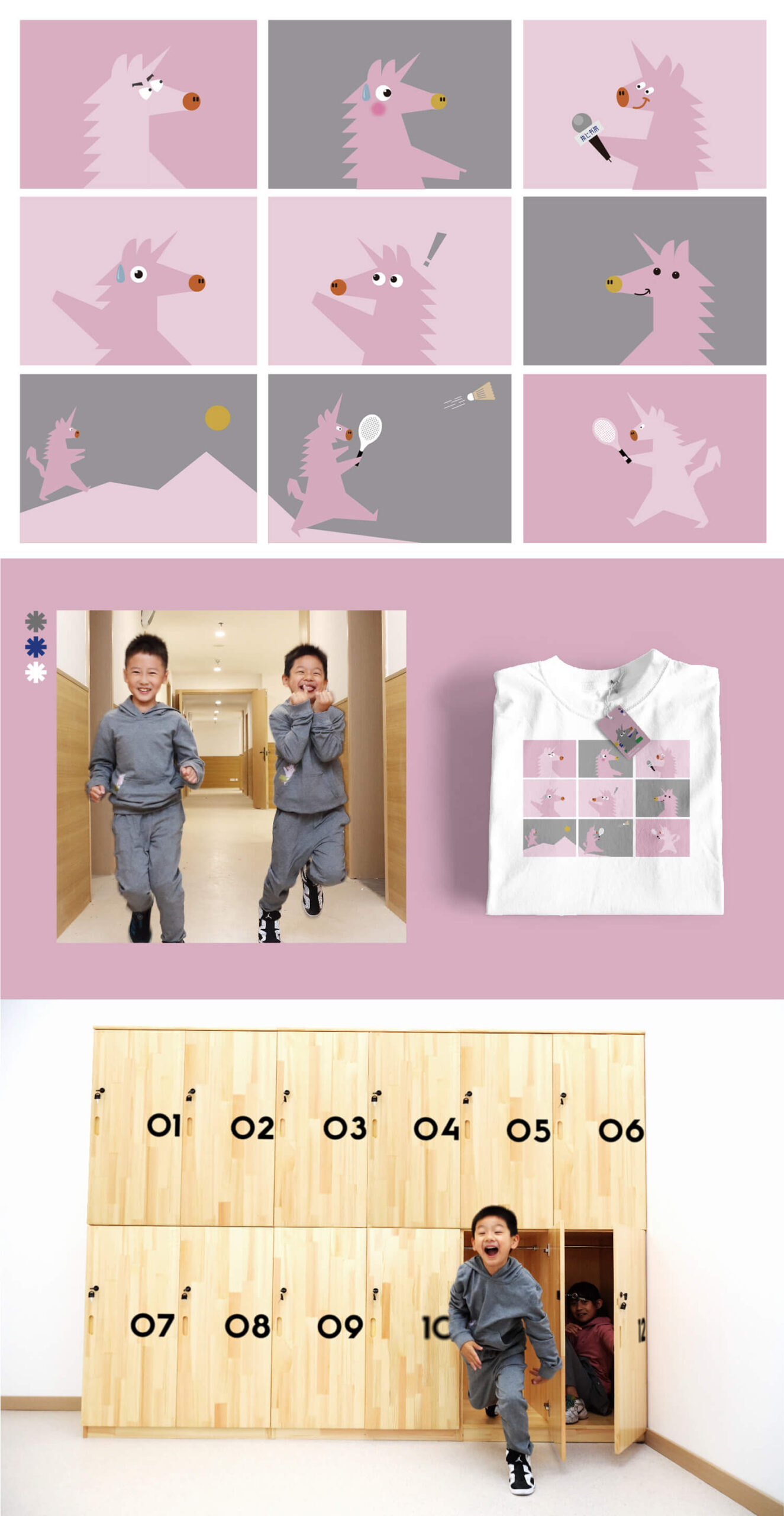
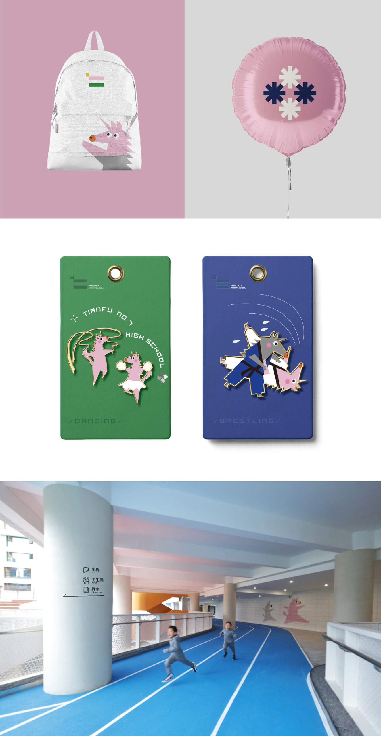
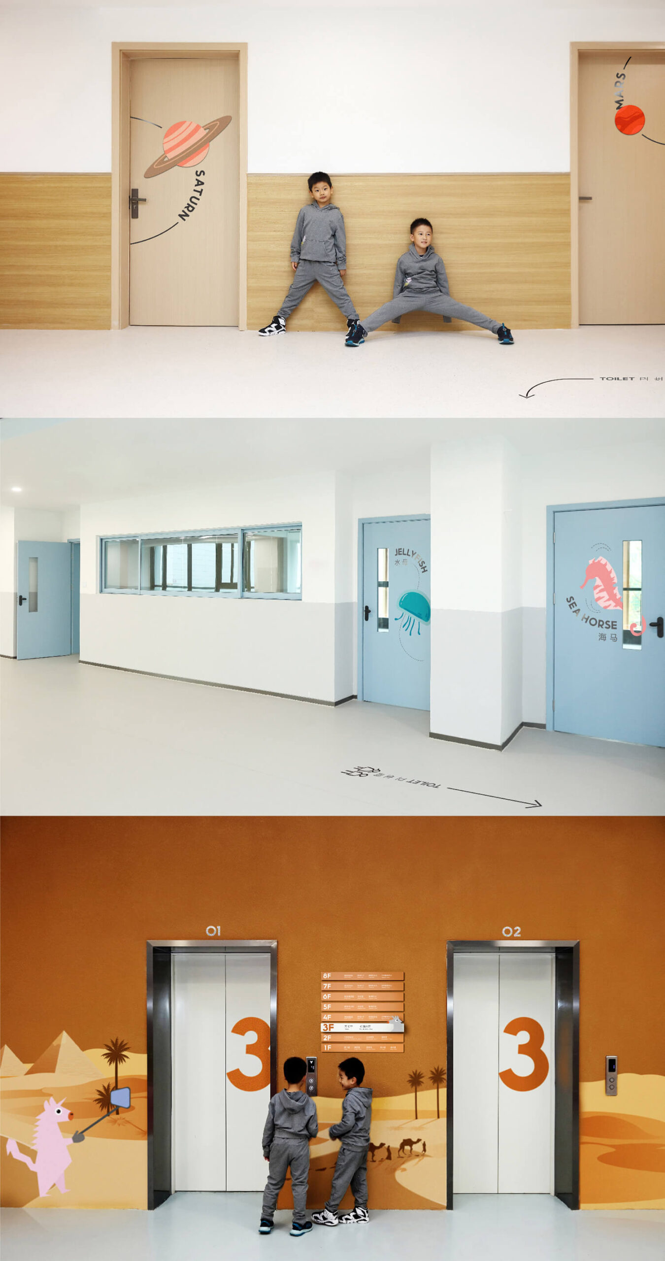
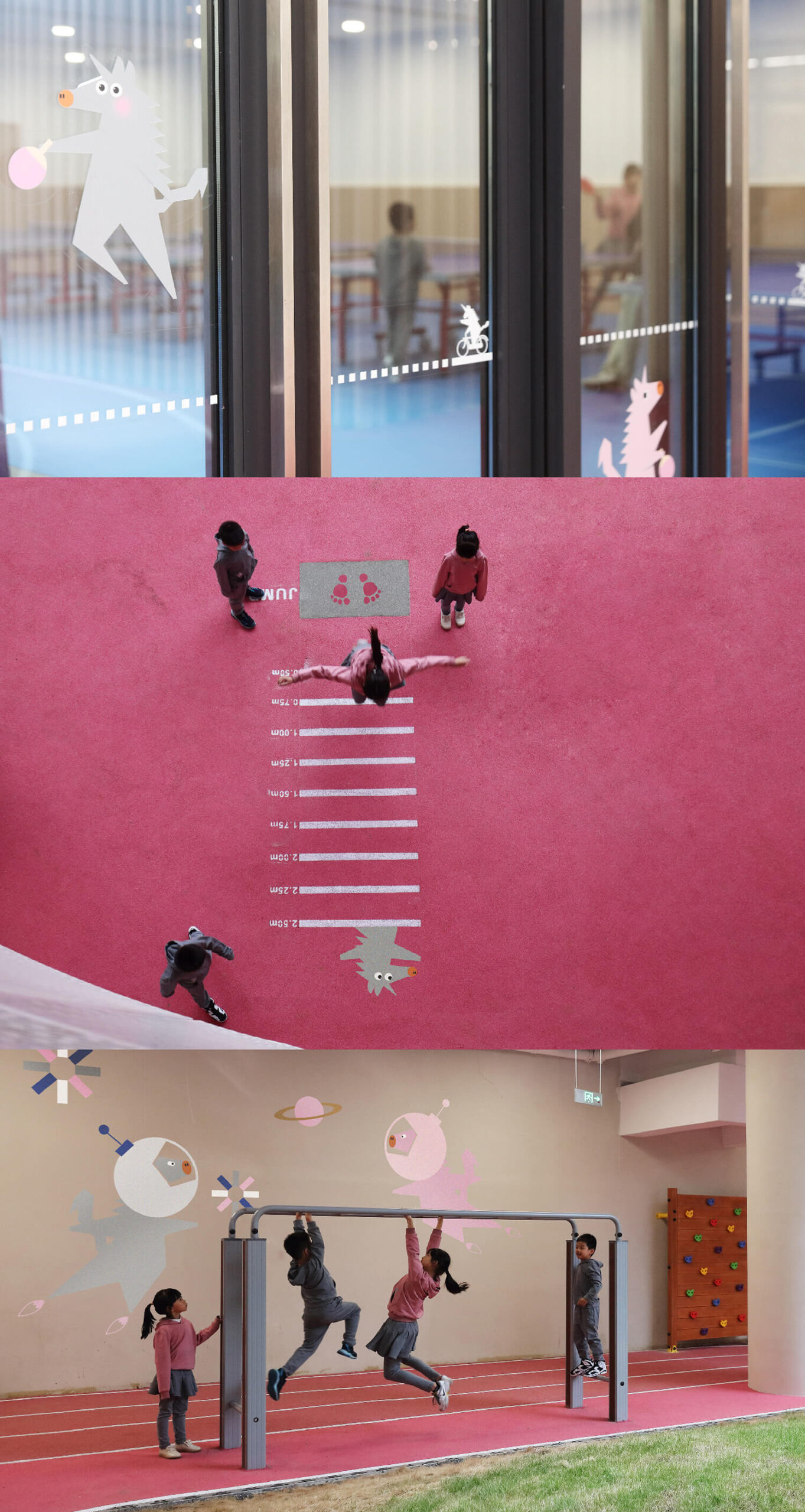
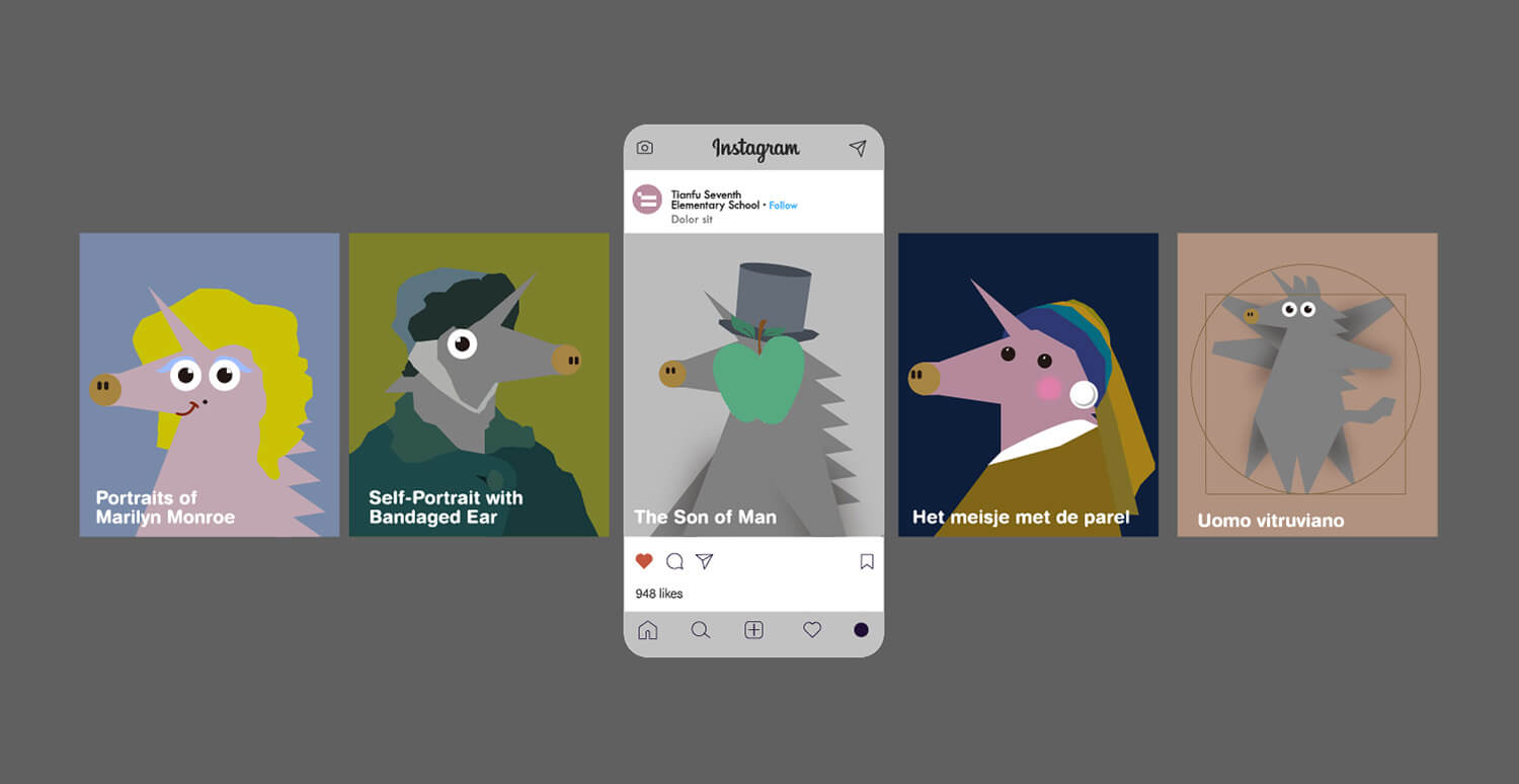
We use low-saturation color bars and blocks like toy bricks in logo design and piece them together into an image-based Chinese character “Ren”, which represents the “benevolence” in children’s mind – simple, kind, not so serious, colorful and interesting.We have also shaped a changeable ghost horse elf as the school’s IP, it has horns on its head and a tail, it is not a horse, nor a unicorn, just like the children of this age, who are open minded, smart and unique, and are eager to prove themselves, but cannot be defined.
Chengdu Natural History Museum
Nature Inside and Out
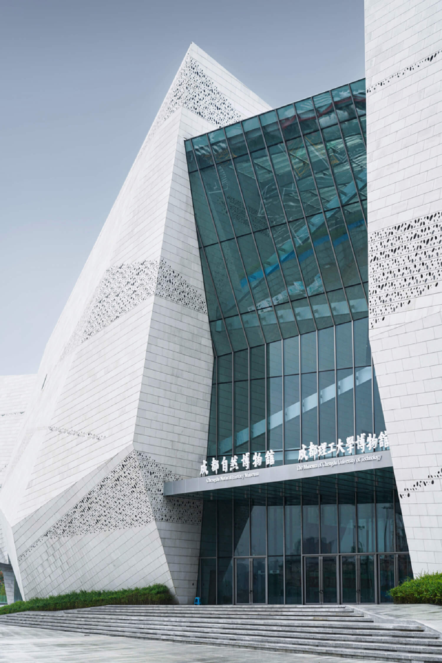
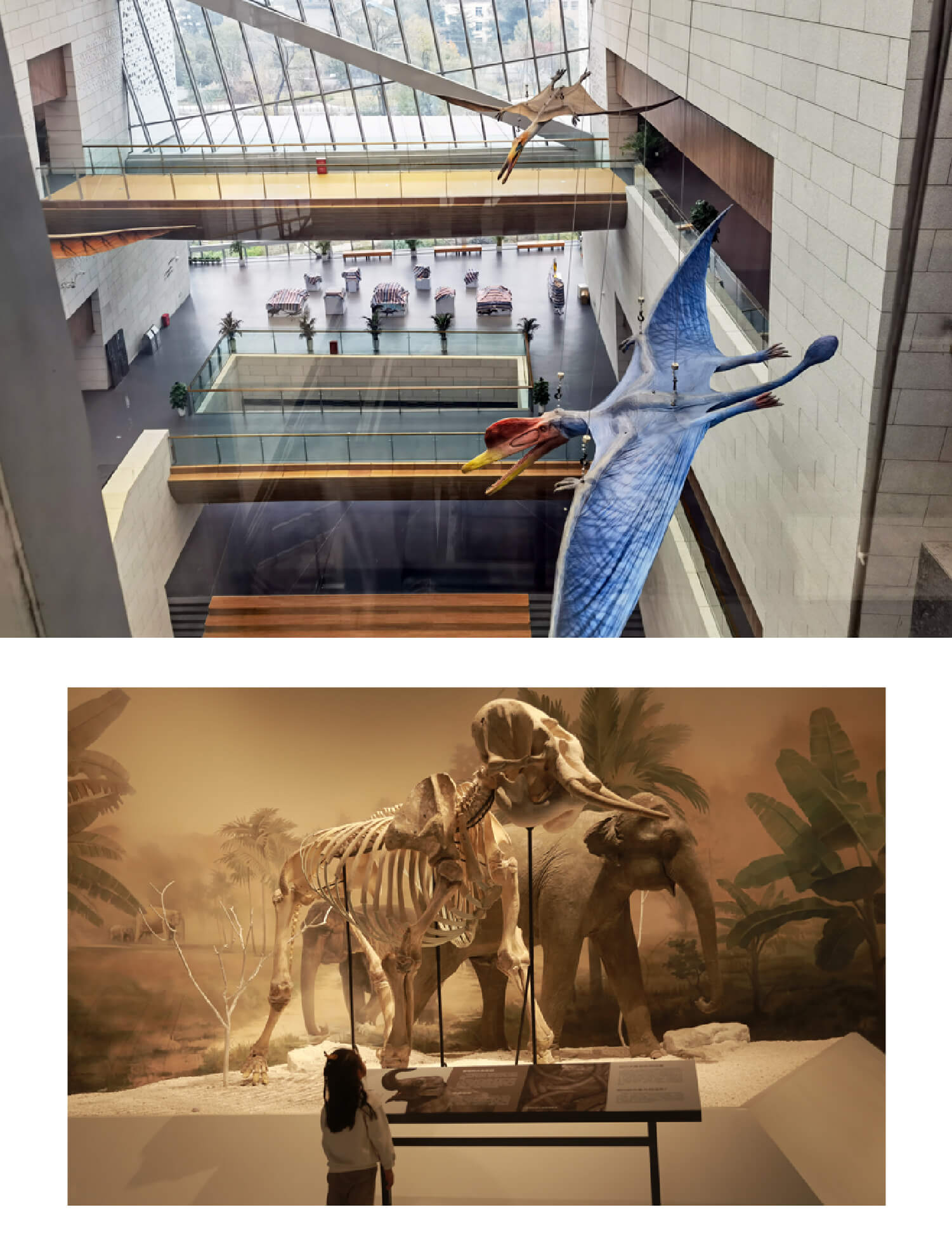
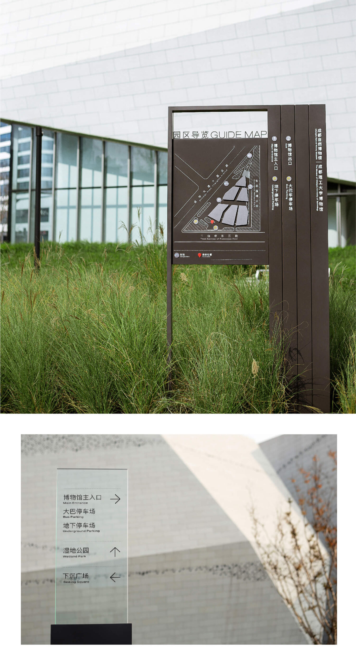
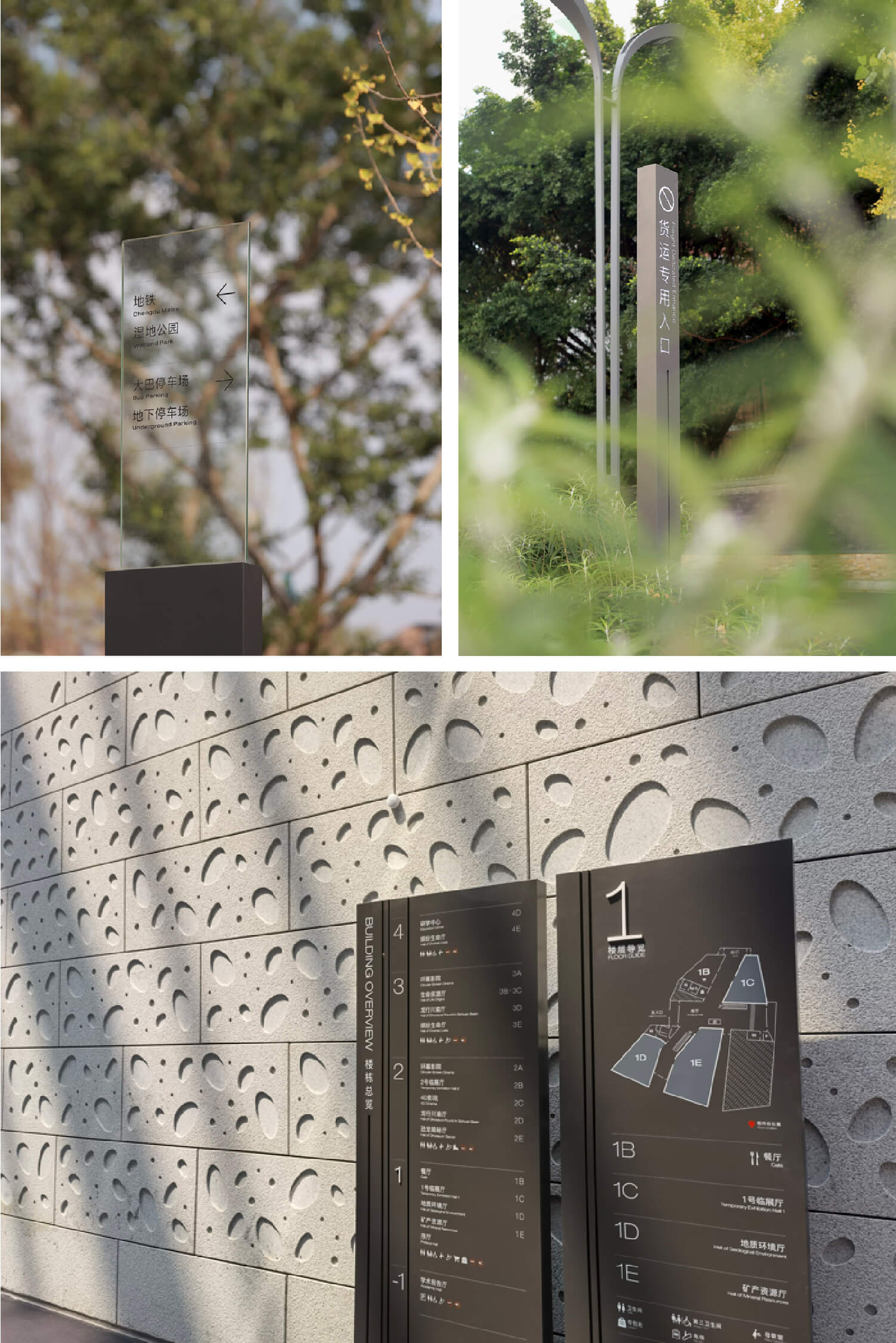
In Chengdu, a massive “stone mountain” rises, with the building abstractly showcasing the grandeur and mystery of nature. This is the Chengdu Natural History Museum. Standing in the museum’s atrium, you’ll see a skybridge above, mimicking the mountain paths of the Shu region. The architect has brought the experience of walking these mountain paths into the museum’s interior, with the skybridge and corridors symbolizing the winding Shu roads, creating a rich visitor experience.
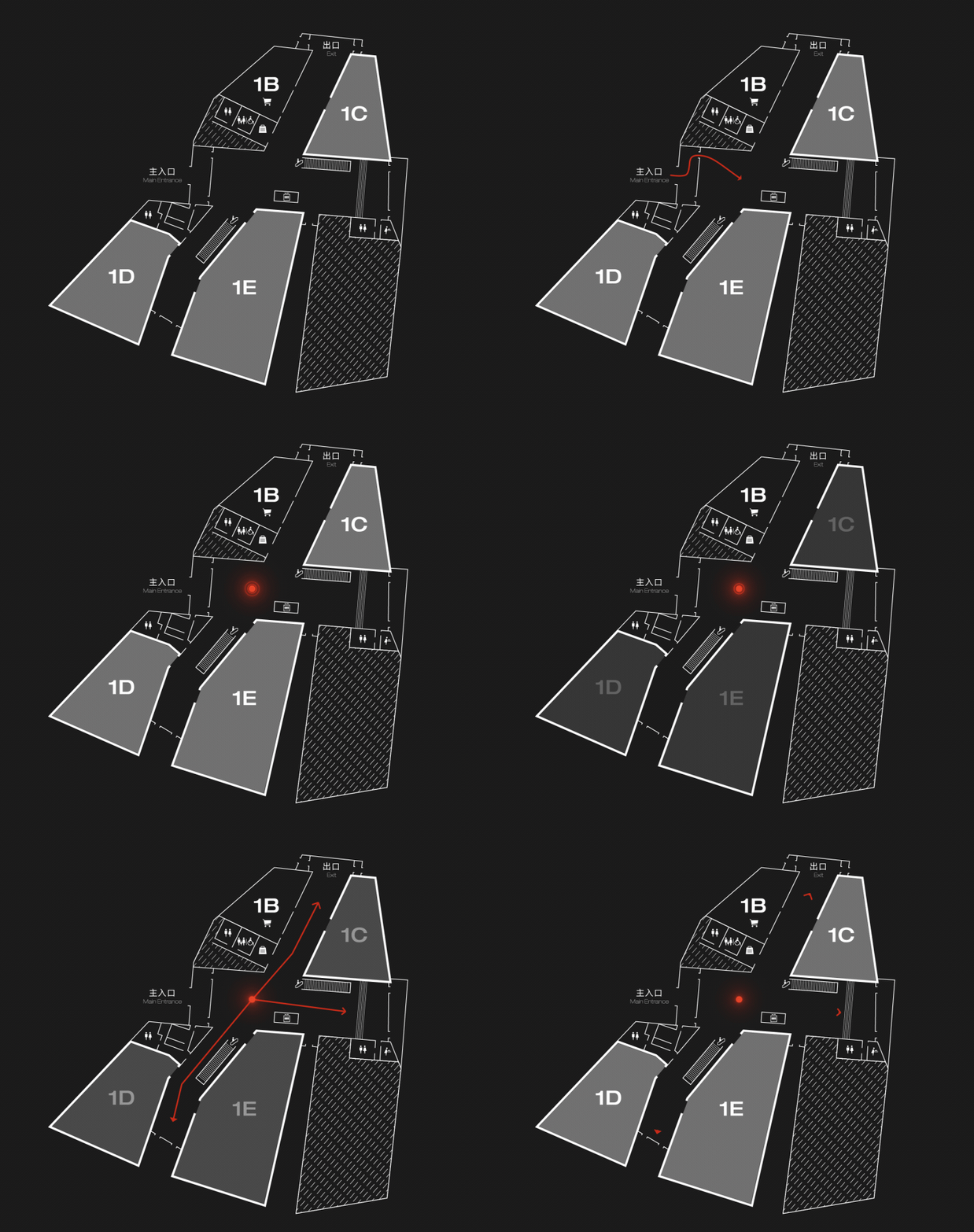
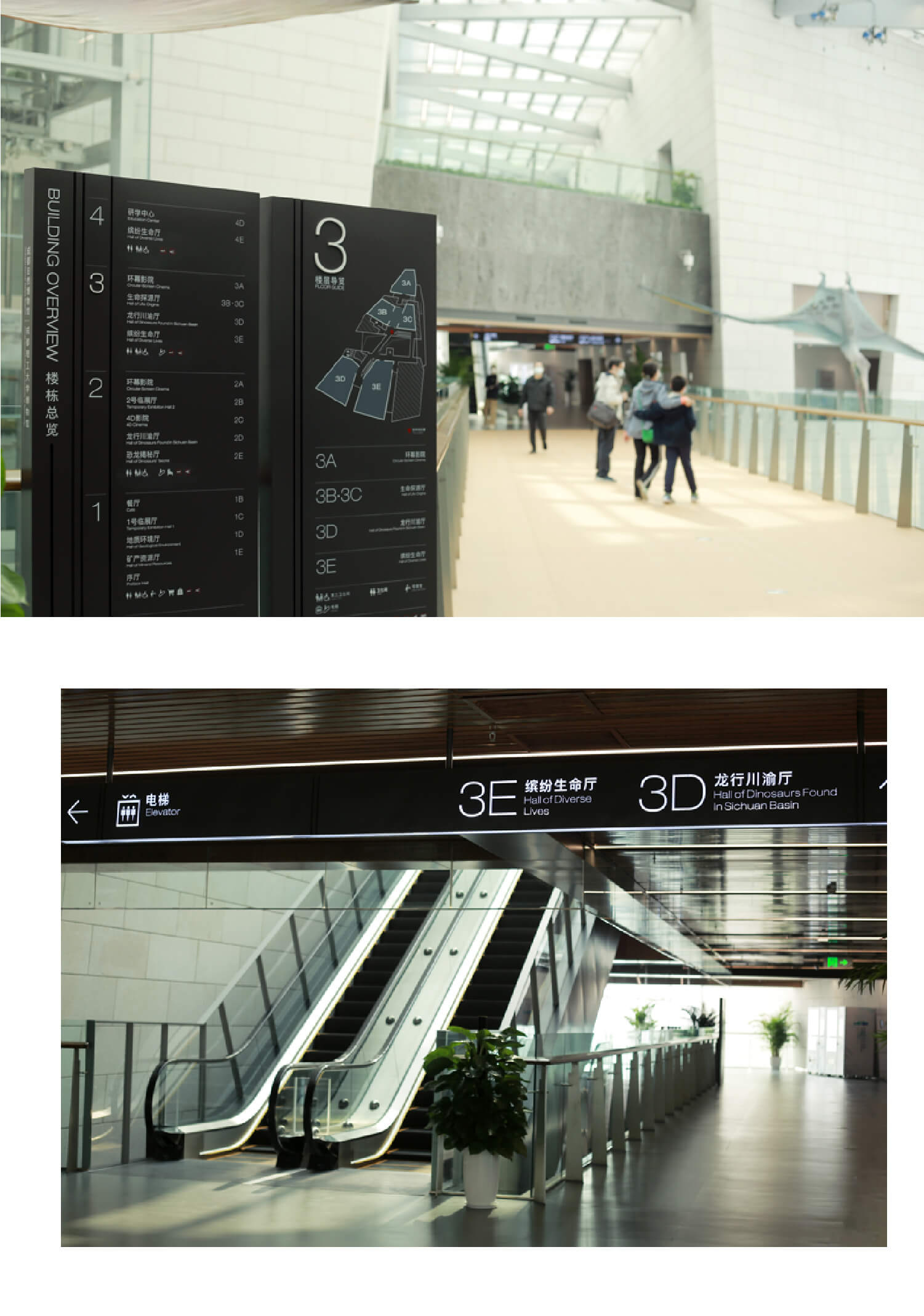
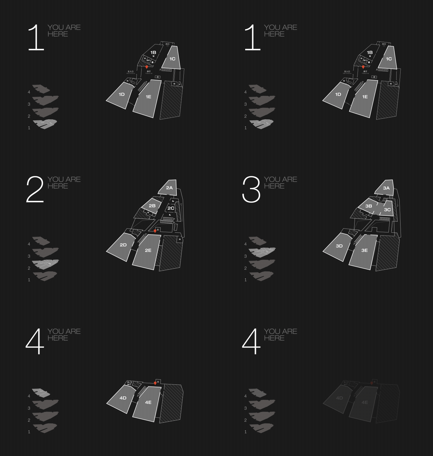
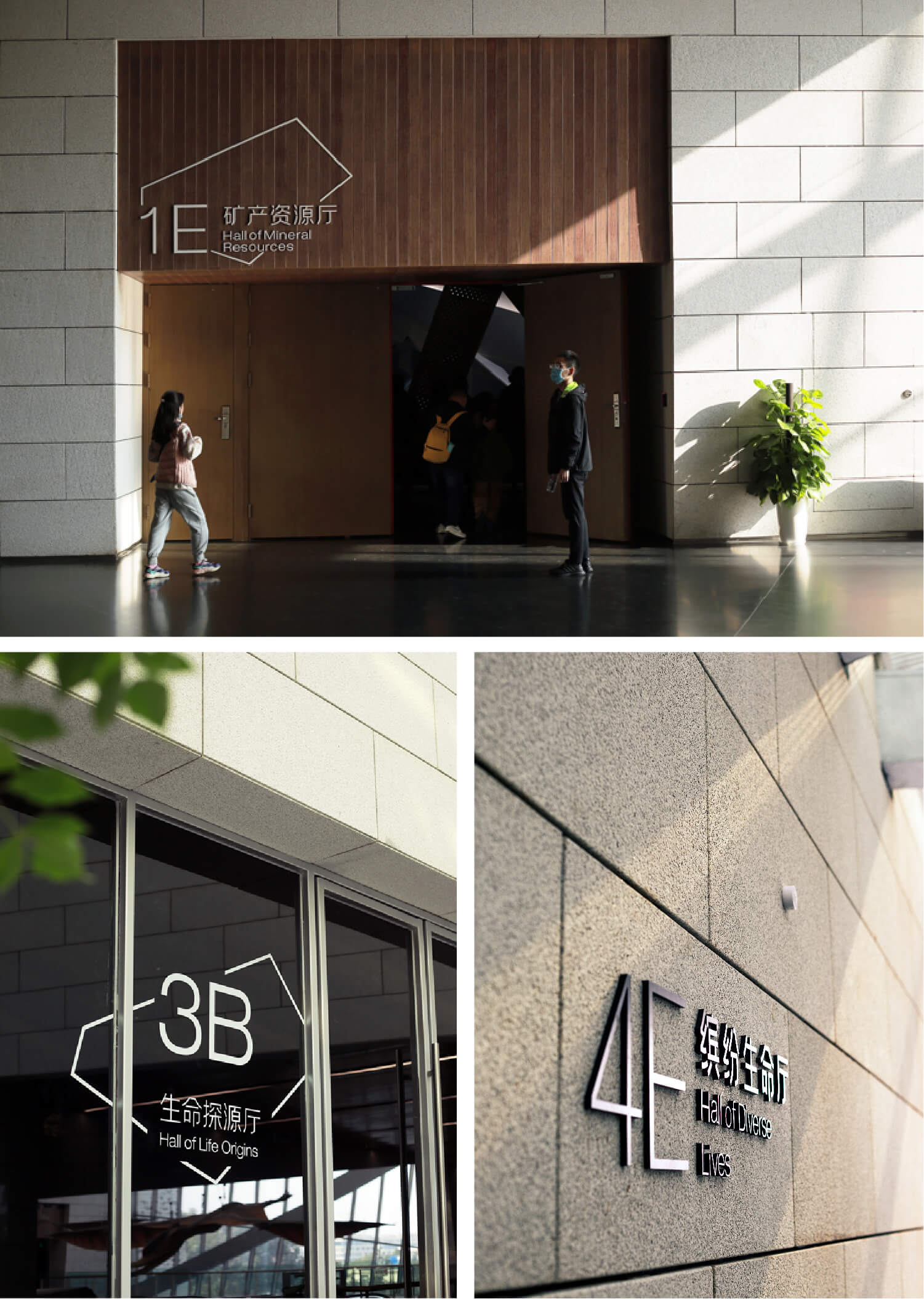
The 60,000 square meter irregular building features a basement level connected to the subway, four above-ground floors, four interconnected corridors, and six exhibition spaces. Navigating through this expansive and complex structure can be daunting for even the most seasoned explorers. In our design, we meticulously redrew each floor plan of the museum, using colour and iconography to make the layout clearer. The building’s irregular silhouette was incorporated into the entrance areas of each exhibition hall, providing a cohesive visual connection from the exterior to the internal details.
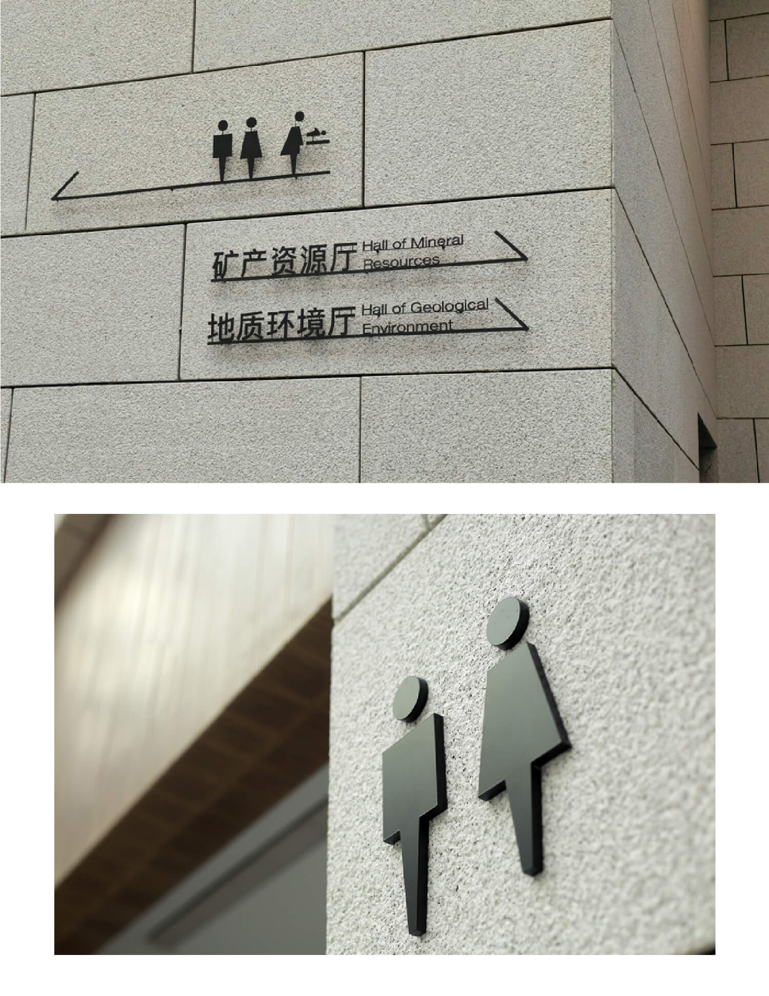
The indoor signage uses deep grey tones, designed with functionality, visitor flow, and the large volume of foot traffic in mind, reflecting the beauty of order. Outdoors, information is seamlessly integrated into the park’s design with a transparent expression, blending naturally into the landscape. As you wander through the museum, you instantly enter a world of rich and wondrous biodiversity.
wwf
A future for people and nature
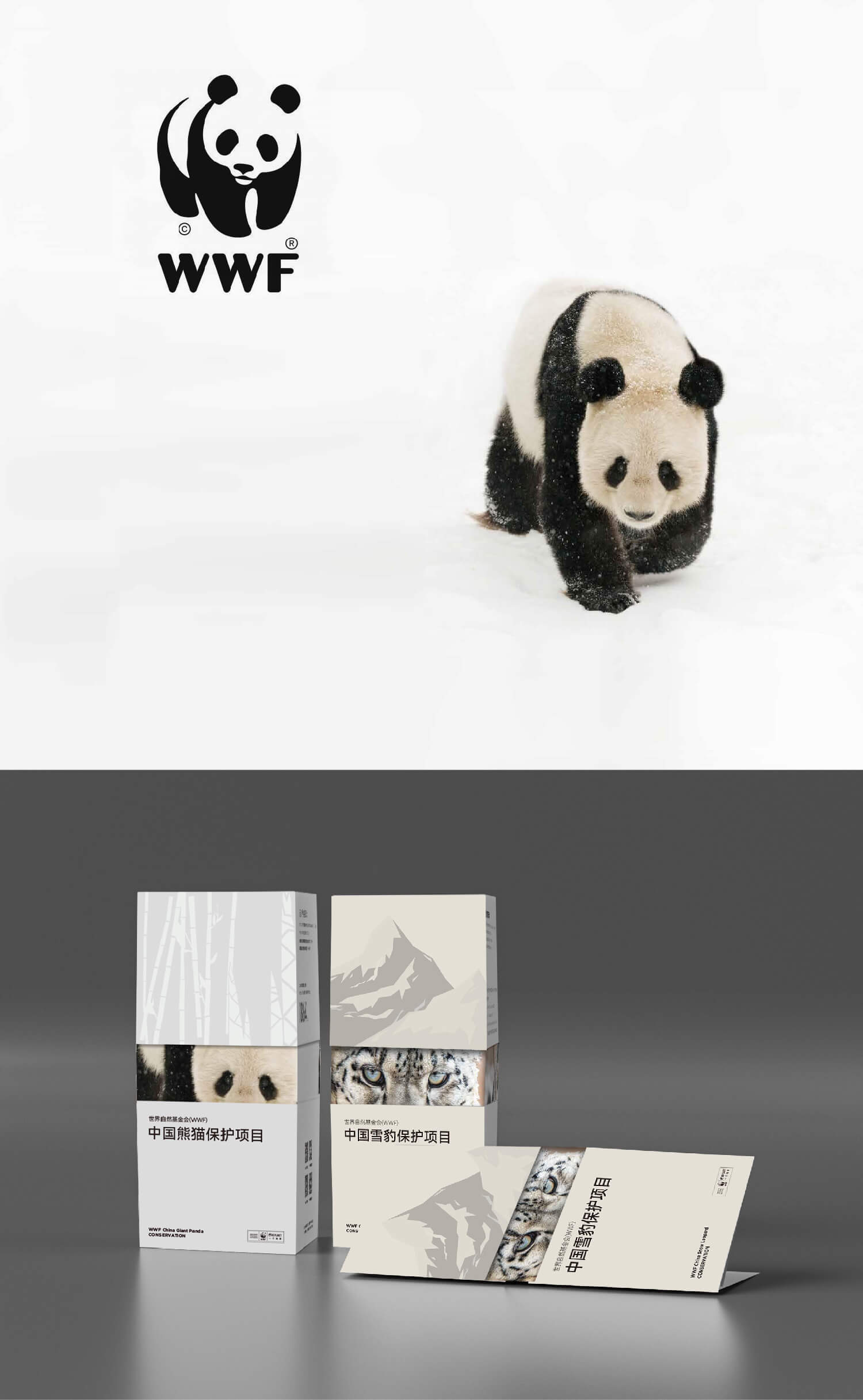
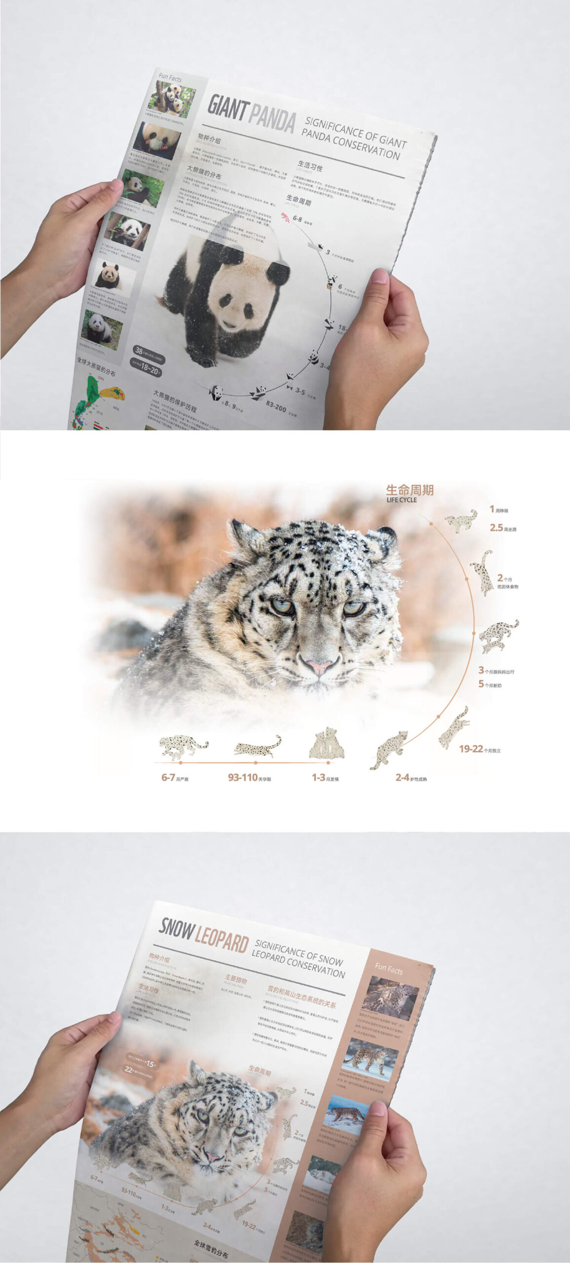
WWF, an independent conservation organization, is a global leader in tackling the world’s most complex environmental challenges facing people and nature.
In China, WWF has many projects underway, among which we participate in Giant panda and Snow Leopard Conservation Program.
We did promotional design for these two projects. Visually, we use pictures to take the lead and increase the visual impact by showing the eyes of animals. In terms of form, we used different folding methods to make the flyer look more interesting.
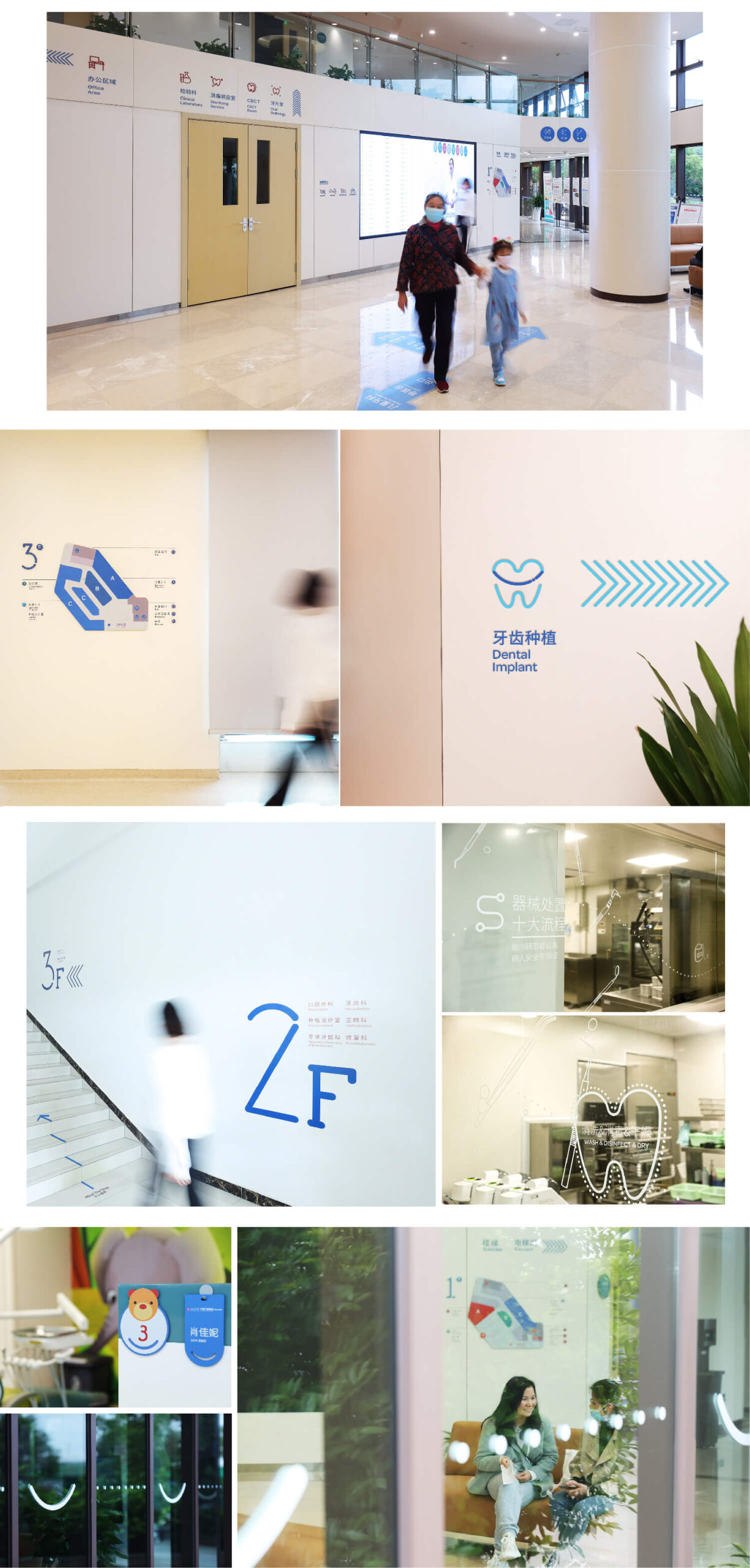
WEST CHINA STOMATOLOGICAL HOSPITAL
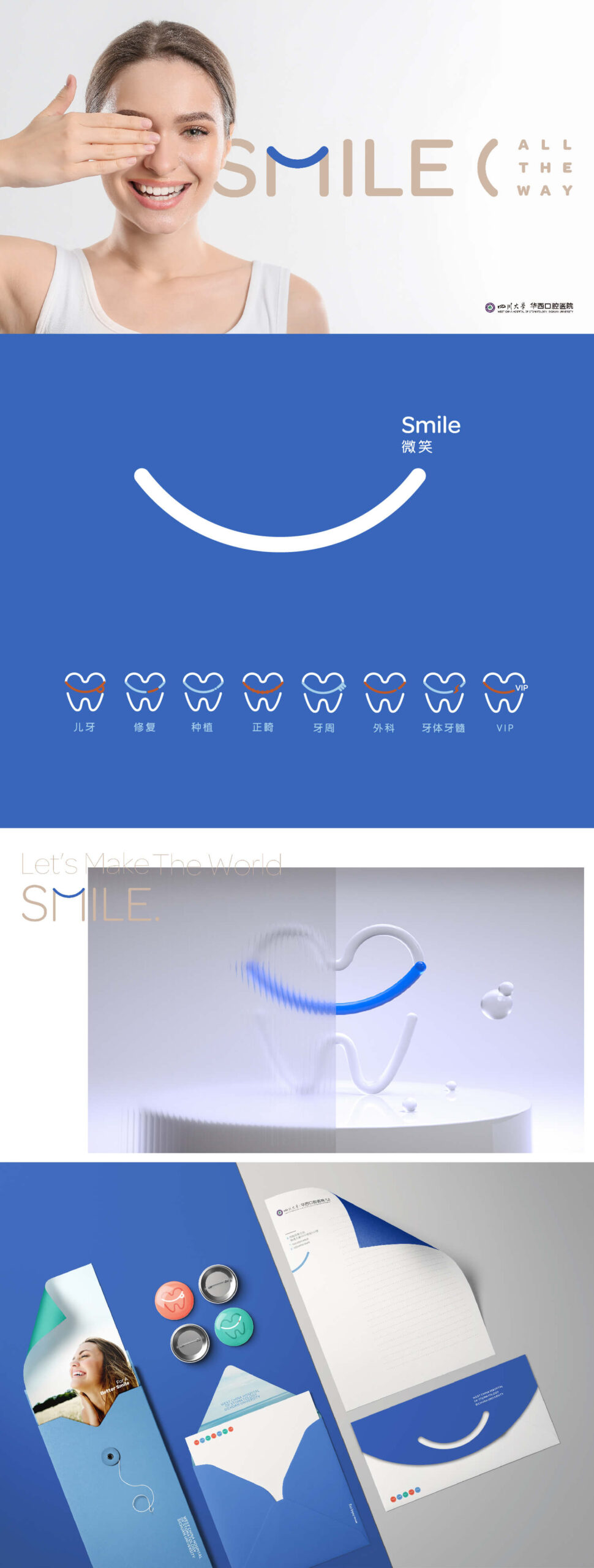
Smiles all the way
West China Dental Hospital was established in 1907. Because the LOGO cannot be changed, we created graphics element of the brand to bring new vitality to this hospital.
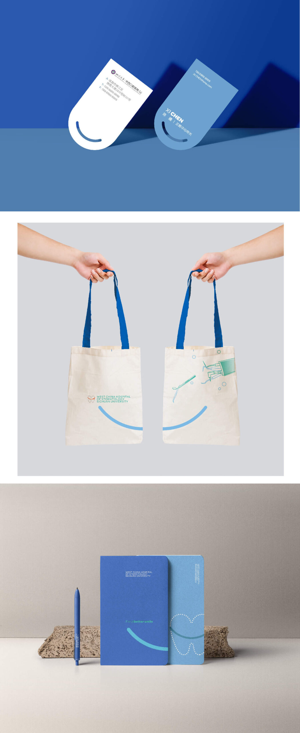
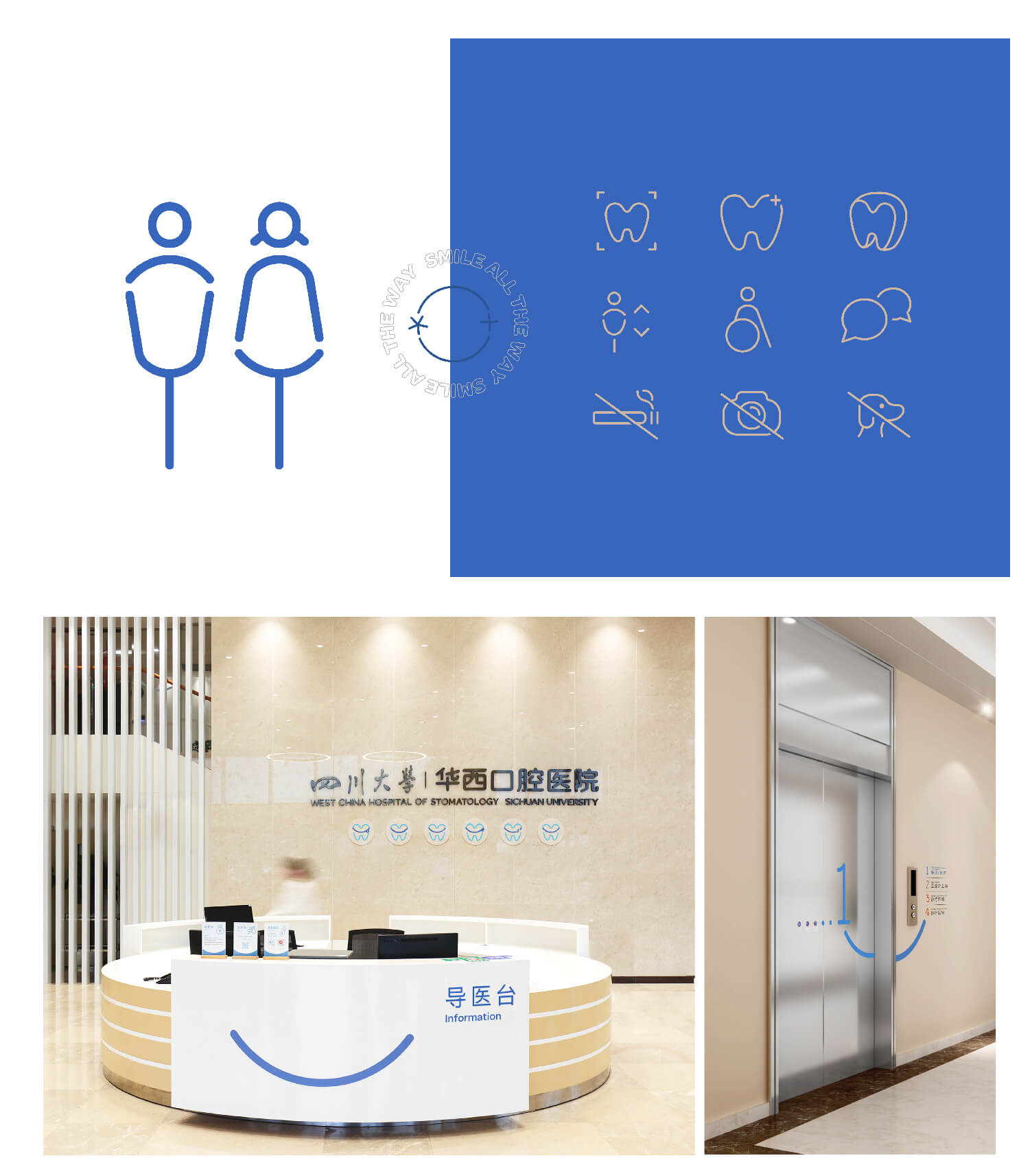
This time, we have injected the concept of “smile” into the hospital’s DNA.We integrated the smile symbol into each department and promotional materials to form a consistent brand experience.At the same time, interesting colors are used to distinguish each department. The shape of our teeth and the symbol of smile are combined to form a unique brand visual system for our hospital.

